EPISODE 2-Christmas 2026 Colour Trends: The Ultimate Palette Guide From Burgundy to Blueberry That Interior Stylists Swear By
Discover Christmas 2026 colour trends from burgundy and cherry cola to biophilic greens, Quality Street jewel tones, warm comfort neutrals, and aged brass.
 🔍 COVER PLATE — CLICK TO EXPAND
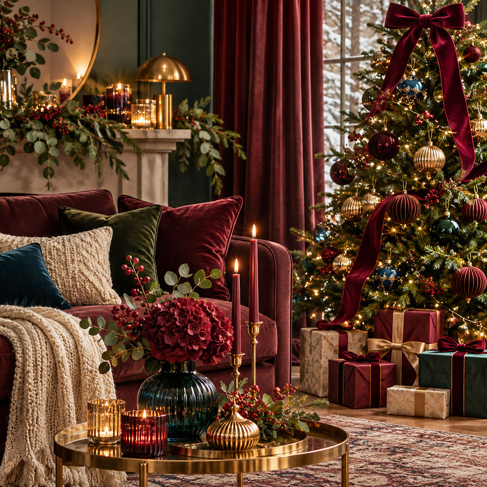
Editorial cover study for Episode 2 ('The 2026 Colour Palette Revolution'): a luxurious festive living room anchored by floor-to-ceiling burgundy velvet drapery, a deep wine-red velvet sofa layered with moss-green velvet, cream bouclé, and midnight-blue cushions, an illuminated Christmas tree crowned with an oversized burgundy velvet bow and fluted brass baubles, and a brushed-brass coffee table styled with burgundy hydrangeas in a ribbed teal glass vase and glowing taper candles.
What if your Christmas colour choices could transform your entire home into an emotional experience rather than simply a decorated space? The truth is, colour selection is the single most important decision you'll make this festive season. It influences every subsequent purchase, sets the emotional tone for your celebrations, and determines whether your home feels cohesively styled or chaotically thrown together.
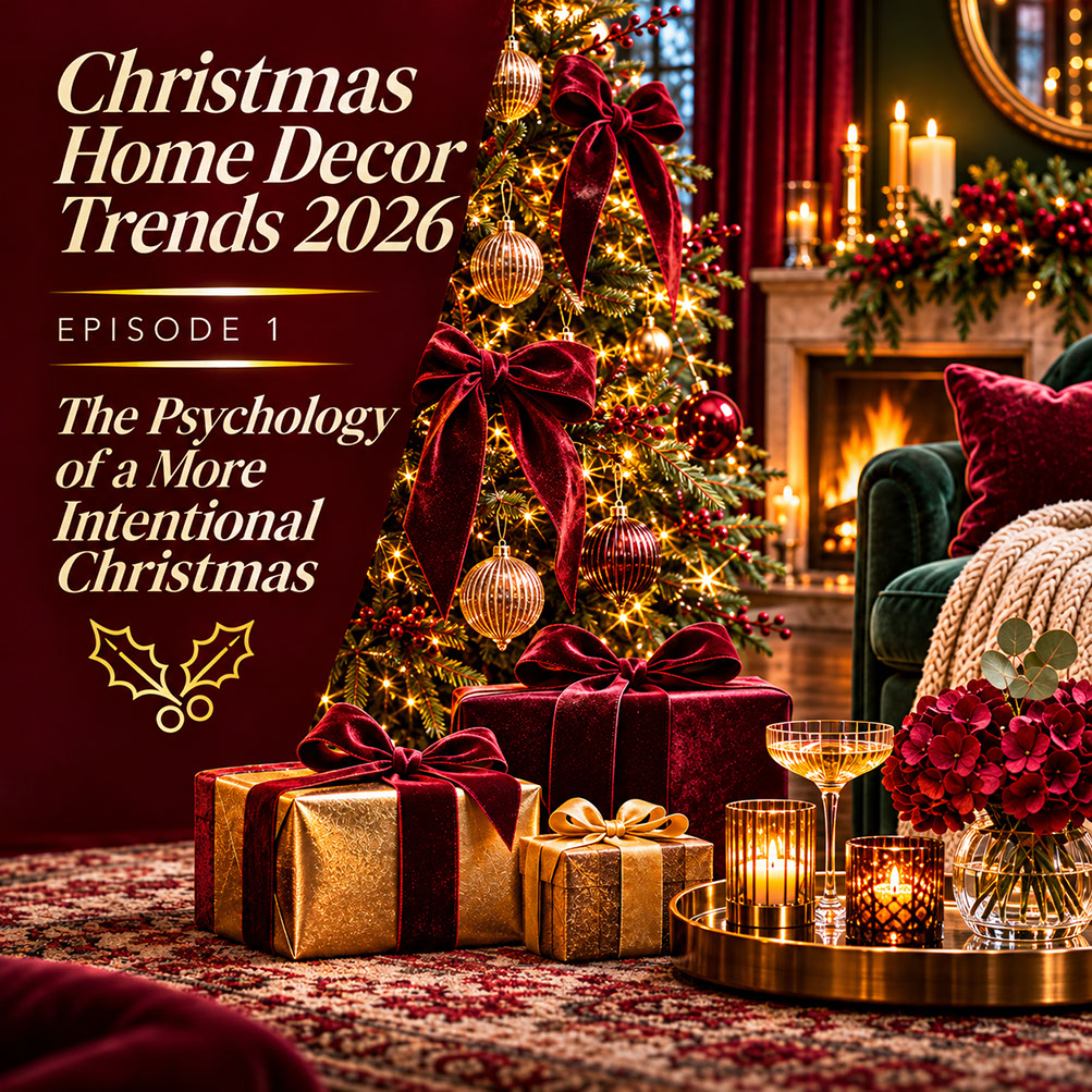
In Episode 1 of this series, we explored the 'Season of Cheer' mood driving Christmas 2026 and the concept of intentional indulgence—the idea that consumers are embracing Christmas as a deliberate cultural permission slip for expressive, meaningful home styling. Now it's time to put that philosophy into practical action, and colour is where we begin.
Whether you're drawn to traditional deep reds, contemporary unexpected pairings, or something entirely unique, 2026 offers options for every taste. Consider this guide your permission to move beyond safe choices and create something truly memorable.
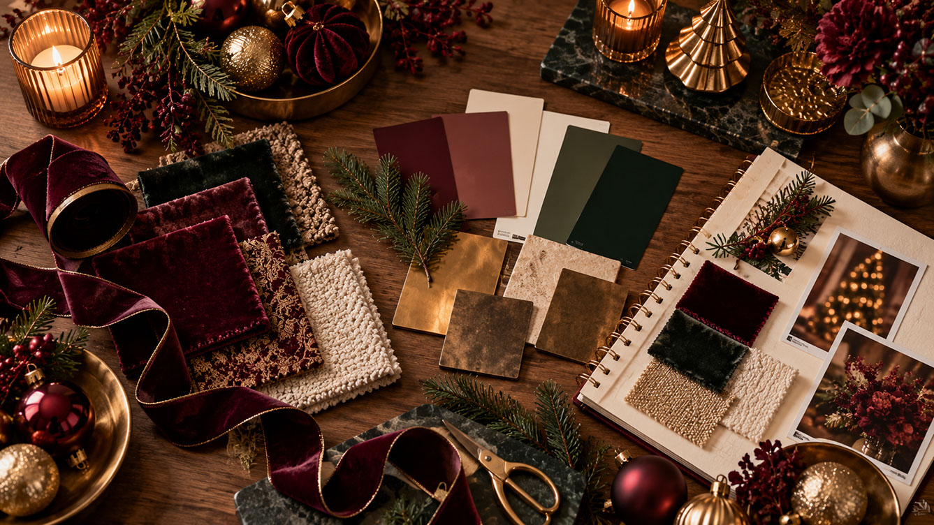 🔍 PLATE 01 — CLICK TO EXPAND
Christmas 2026 Colour Palette Moodboard — Velvet Ribbon Spools, Paint Swatches & Aged Brass Flat-Lay — Overhead interior stylist's flat-lay on a walnut worktable illustrating intentional colour planning for Christmas 2026: gold-edged burgundy velvet ribbon, tactile fabric swatches in wine velvet, deep evergreen, gold brocade, and cream bouclé, paint cards in plum, sage, and hunter green, patinated brass and bronze metal tiles, and a spiral moodboard notebook. Colour Palette: Wine Burgundy (#5A141E), Hunter Green (#192E22), Aged Brass (#B68D40), Cream Bouclé (#EFE6D8)
Deep Grounding Shades: The Anchor Colours of Christmas 2026
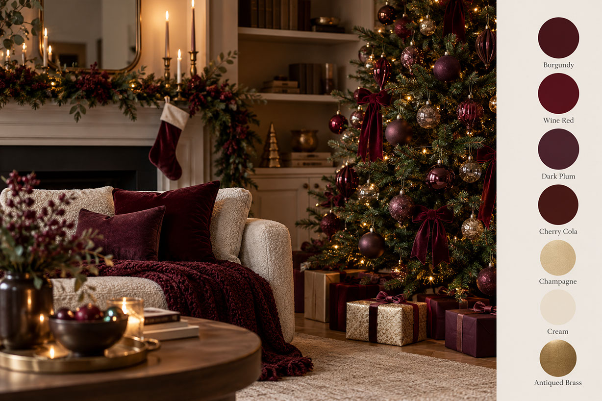
Let's start with the colours that are setting the tone for sophisticated festive interiors this year. Burgundy, wine red, dark plum, and the trending 'cherry cola' shade are emerging as the foundational tones for 2026. Cherry cola, in particular, is worth noting—it combines cola-brown undertones with cherry brightness, creating a depth that feels both familiar and fresh.
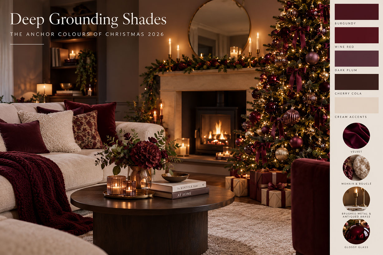 🔍 PLATE 02 — CLICK TO EXPAND
The Anchor Colours of Christmas 2026 — Burgundy, Wine Red, Dark Plum & Cherry Cola Guide — Editorial colour and texture guide for 'Deep Grounding Shades: The Anchor Colours of Christmas 2026', pairing a cosy cream-and-burgundy living room and wood-burning stove with colour swatches for Burgundy, Wine Red, Dark Plum, Cherry Cola, and Cream Accents alongside material callouts for Velvet, Mohair & Bouclé, Brushed Metal & Antiqued Brass, and Glossy Glass. Colour Palette: Burgundy (#4E151F), Wine Red (#5D1420), Dark Plum (#53323E), Cherry Cola (#3E2221), Cream Accents (#E8DEC9)
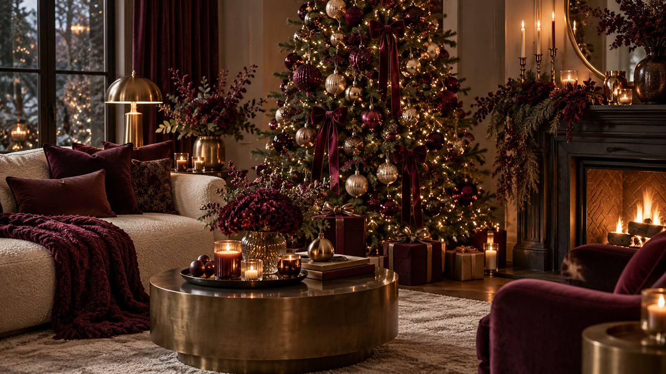 🔍 PLATE 03 — CLICK TO EXPAND
Deep Grounding Shades in Practice — Burgundy Velvet Bows, Cream Bouclé Sofa & Brushed Brass Drum Table — Wide architectural living room demonstrating how deep grounding shades create warm sanctuary: a cream bouclé sofa dressed with wine-red and dark plum velvet cushions and a chunky burgundy knit throw, a circular brushed-brass drum coffee table with dark red hydrangeas and candlelight, and a Christmas tree adorned with trailing burgundy velvet bows. Colour Palette: Deep Wine (#54131D), Dark Plum (#3D1926), Brushed Brass (#AA8749), Warm Cream (#EAE0D0)
These deep grounding shades work beautifully when paired with specific textures. Velvet is the signature fabric for this palette, whether you're choosing cushions, ribbons, or stockings. Mohair and bouclé add tactile depth, whilst brushed metal and antiqued brass accents bring subtle warmth. For contrast, consider glossy glass ornaments that create reflective surfaces against matte velvets.
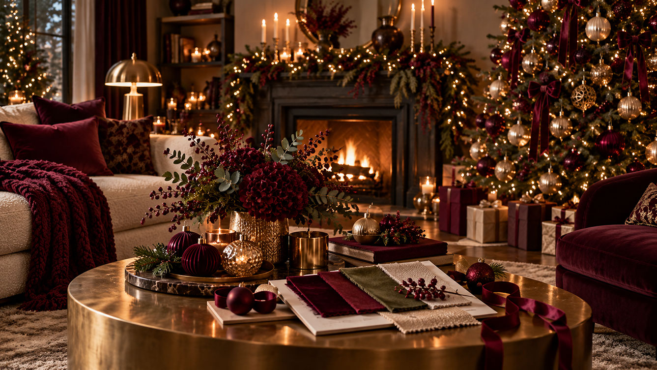 🔍 PLATE 04 — CLICK TO EXPAND
Layering Deep Grounding Textures — Burgundy Velvet, Moss Green & Cream Bouclé Swatch Book on Brass Coffee Table — Detailed styling vignette on a brushed-brass drum coffee table featuring an open textile swatch book comparing burgundy velvet, cherry cola, olive moss, and cream bouclé beside fluted burgundy glass baubles, a hammered brass vase of dark crimson hydrangeas and winter berries, and a candlelit fireplace mantel in the background. Colour Palette: Crimson Burgundy (#5E131E), Cherry Cola (#471D21), Olive Moss (#4B5335), Burnished Brass (#B8924A)
 🔍 PLATE 05 — CLICK TO EXPAND
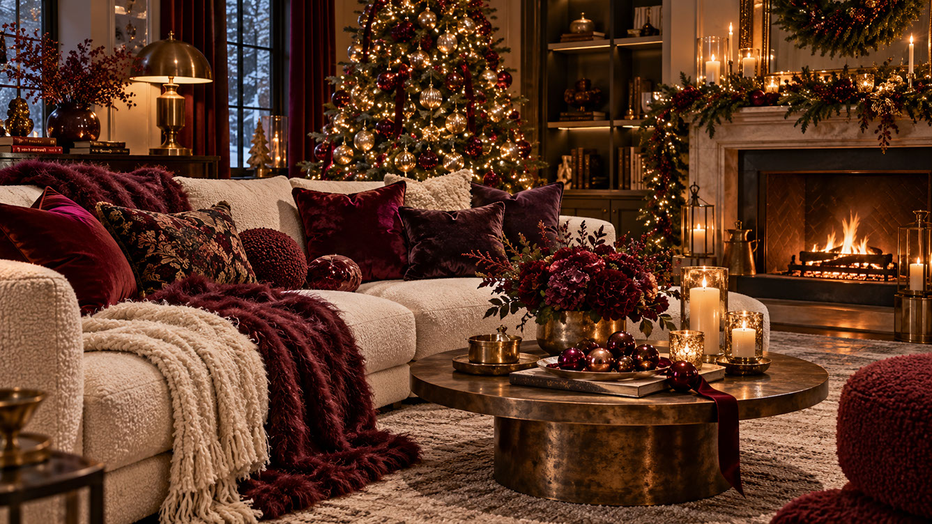
Cherry Cola & Dark Plum Living Room Styling — Ivory Bouclé Sectional, Faux-Fur Throws & Glossy Glass Baubles — Intimate festive lounge showcasing the trending 'cherry cola' and dark plum palette balanced with lighter cream accents: an ivory bouclé sectional sofa layered with deep plum velvet cushions, botanical tapestry pillows, and burgundy faux-fur and cream cable-knit throws alongside a patinated bronze pedestal coffee table with glossy burgundy glass ornaments. Colour Palette: Cherry Cola (#4A1A1E), Dark Aubergine (#391C2B), Patinated Bronze (#7E623B), Ivory Bouclé (#EFE7DA)
Psychologically, these colours create feelings of warmth, enclosure, and indulgent sanctuary. They encourage lingering and relaxation, transforming living rooms and dining spaces into cocooning retreats. The key to preventing these rich shades from feeling heavy or oppressive lies in balancing them with lighter accents—think cream throws or champagne-toned candles that provide visual breathing room.
 🔍 PLATE 06 — CLICK TO EXPAND
Deep Grounding Shades 7-Colour Swatch Card — Burgundy, Wine Red, Dark Plum, Cherry Cola, Champagne, Cream & Brass — Complete seven-swatch colour reference plate for the Deep Grounding Shades family—Burgundy, Wine Red, Dark Plum, Cherry Cola, Champagne, Cream, and Antiqued Brass—paired with a classic fireplace mantel dressed with a burgundy velvet stocking, berry garland, taper candles, and a velvet-ribboned Christmas tree. Colour Palette: Burgundy (#4A191E), Wine Red (#5D1822), Dark Plum (#4D2B36), Cherry Cola (#481F1D), Champagne (#D5BE97), Antiqued Brass (#98804E)
Biophilic Greens: Nature's Christmas Palette
The green spectrum for Christmas 2026 extends far beyond traditional holly and ivy. We're seeing everything from deep fir and spruce tones to softer sage and eucalyptus interpretations, with pistachio emerging as an unexpectedly fresh accent green.
Moss and lichen shades occupy the muted, organic middle ground, whilst forest and hunter green offer heritage-rich options for those wanting a more traditional feel. These greens pair naturally with birch white, ivory, and parchment for softer schemes, or with aged brass and warm gold metallics for added richness. Chocolate and timber tones ground these palettes beautifully.
 🔍 PLATE 07 — CLICK TO EXPAND
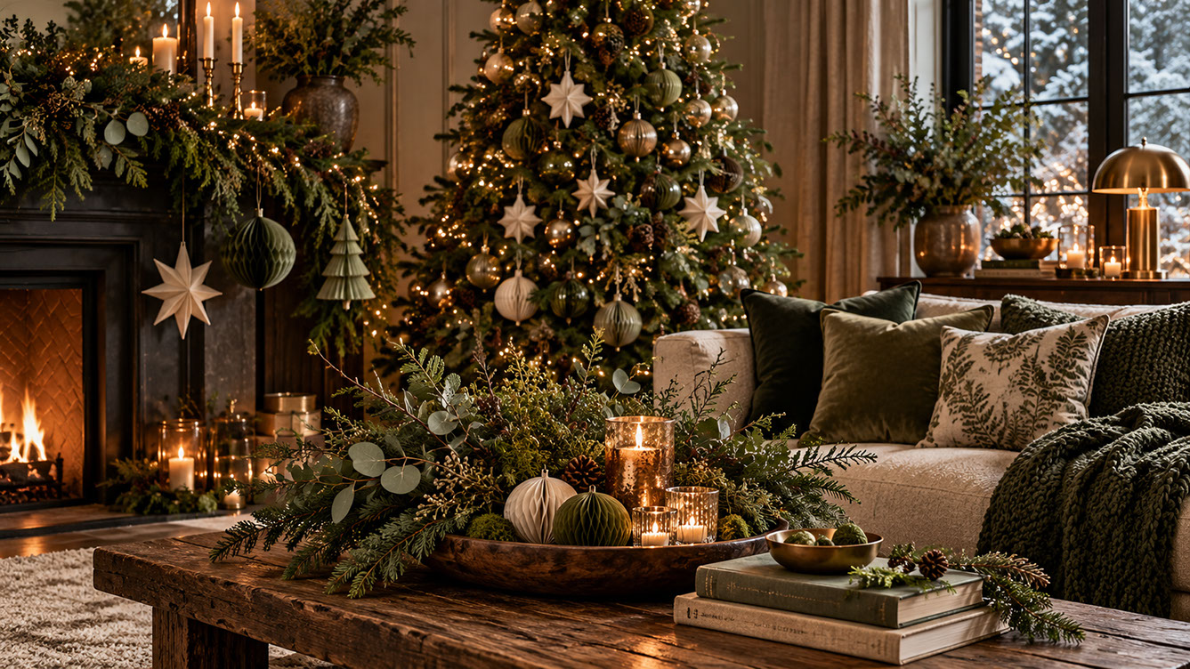
Nature's Christmas 2026 Palette — Fresh Eucalyptus, Honeycomb Paper Ornaments & Nordic Stars — Restorative biophilic Christmas living room combining fir, moss, sage, and eucalyptus greens with unfinished timber and linen: a rustic wood coffee table holds a carved dough bowl filled with silver-dollar eucalyptus, pine sprigs, pleated sage-and-cream honeycomb paper baubles, and mercury glass votives before a fireplace hung with folded Nordic paper stars. Colour Palette: Deep Fir (#1F3322), Moss Green (#4A5937), Eucalyptus Sage (#7A8B74), Birch Parchment (#E8DFCE)
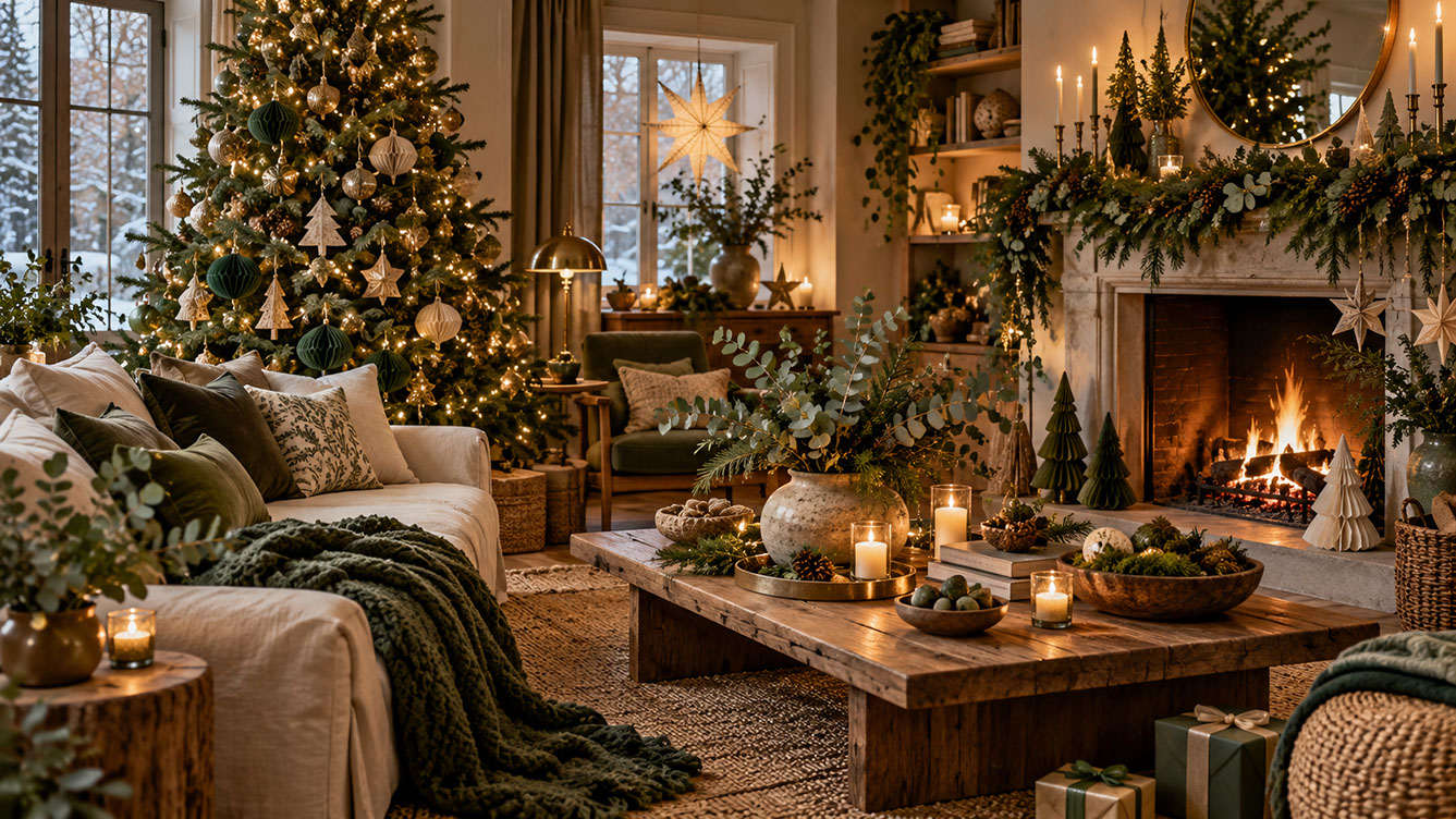
When it comes to textures, think fresh and faux foliage, linen and natural cotton textiles, wool in chunky applications, and paper decorations like honeycombs and origami stars. The biophilic design principle behind this palette recognises that bringing nature indoors resonates psychologically, creating restorative calm within festive abundance.
 🔍 PLATE 08 — CLICK TO EXPAND
Biophilic Green Textures — Moss Chunky Knit Throw, Botanical Cushions, Stoneware Eucalyptus Vase & Pleated Paper Trees — Layered biophilic green styling in a sun-and-firelit living room: an oatmeal linen sofa draped in a chunky moss-green cable-knit throw with botanical fern-print and olive velvet cushions, a woven jute rug, a reclaimed timber table with a stoneware vase of eucalyptus, and pleated forest-green and ivory paper trees flanking the stone hearth. Colour Palette: Forest Hunter (#233724), Lichen Olive (#556443), Pistachio Sage (#8FA083), Unfinished Timber (#7B5A3E)
Saturated Jewel Tones: The Quality Street Effect
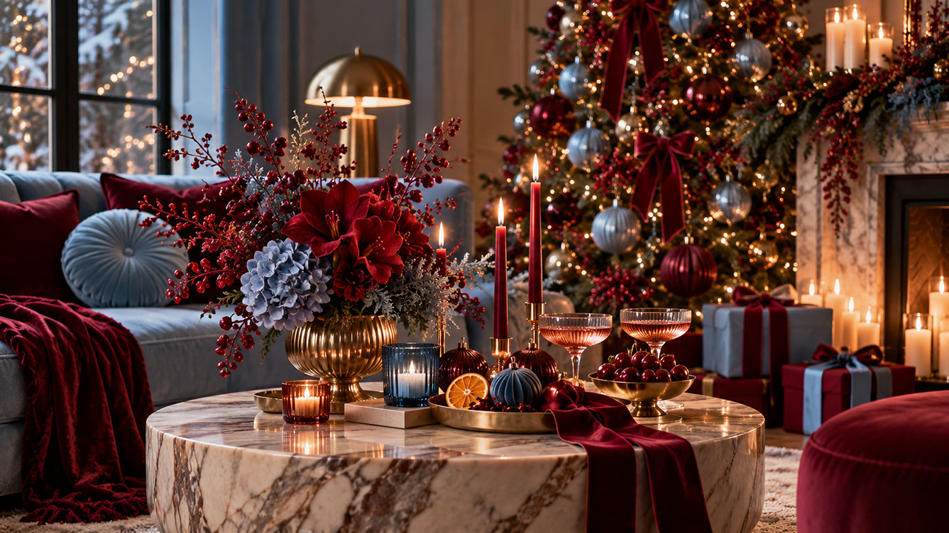
Here's where things get gloriously bold. Fuchsia, magenta, deep teal, peacock blue, sapphire, royal blue, dark purple, and amethyst are all having their moment in 2026. Think of the beloved British Quality Street confectionery tin—that nostalgic-meets-luxury combination of saturated, unapologetic colour.
 🔍 PLATE 09 — CLICK TO EXPAND
Saturated Jewel Tones & High-Contrast Glamour — Ruby Amaryllis, Powder-Sapphire Velvet Sofa & Brass Coupe Styling — Saturated jewel-toned vignette pairing a tufted powder-sapphire velvet sofa and deep ruby-burgundy velvet throw with a veined marble drum coffee table displaying red amaryllis and blue hydrangea blooms in a fluted brass urn, rosé champagne coupes, glossy cherries, dried orange slices, and a tree adorned with silver-blue baubles and burgundy velvet bows. Colour Palette: Ruby Crimson (#7B111E), Powder Sapphire (#6E88A1), Burnished Brass (#C49A45), Veined Calacatta (#E5DDD3)
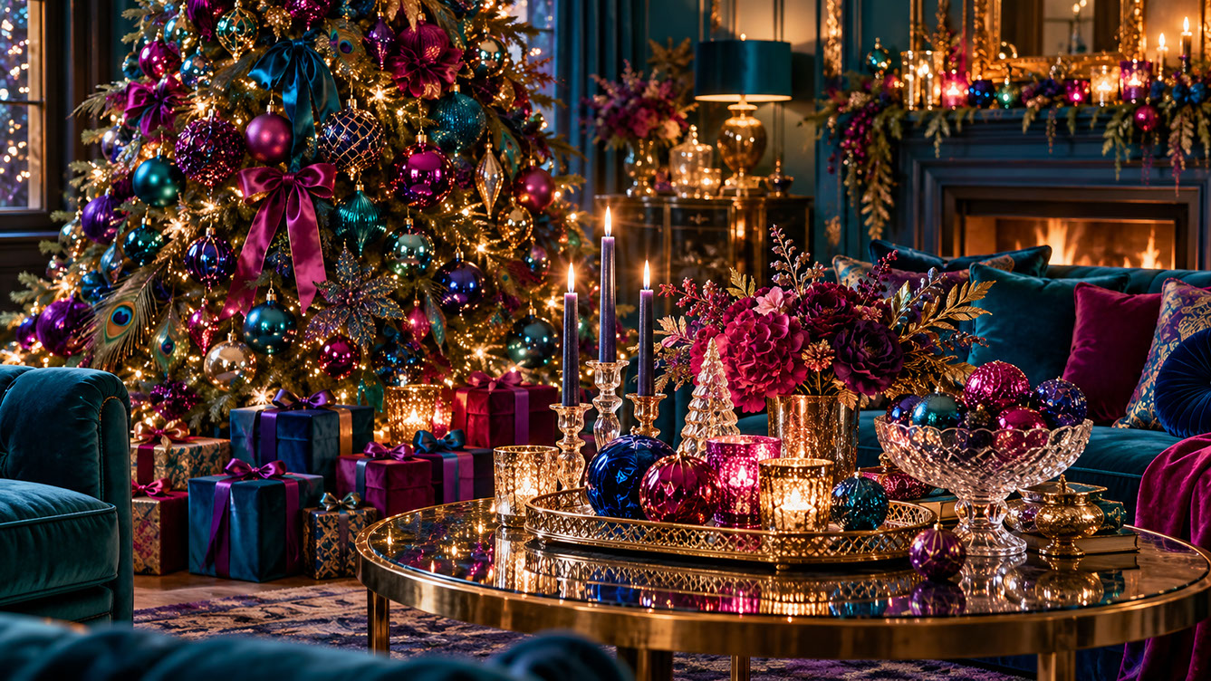
This cultural touchpoint gives permission for bold choices. These jewel tones work best with high-shine finishes: lacquered ornaments, sequined and beaded decorations, mirrored and mercury glass elements, cut glass and crystal for light refraction, and satin or silk-effect fabrics.
 🔍 PLATE 10 — CLICK TO EXPAND
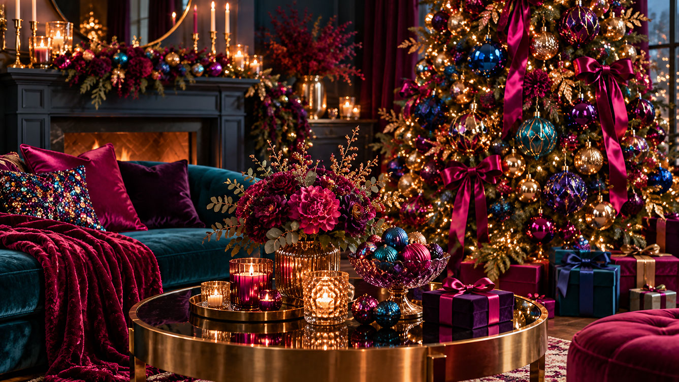
The Quality Street Effect — Deep Teal Velvet Sofa, Magenta Satin Tree Bows & Sequined Jewel-Tone Cushions — Celebratory maximalist living room capturing the nostalgic British 'Quality Street Effect': a deep teal velvet sofa layered with vivid magenta and royal purple velvet pillows and a multi-colour jewel sequin cushion, a brass coffee table with a cut-crystal compote of sapphire, emerald, and fuchsia baubles, and a Christmas tree dressed with magenta satin bows. Colour Palette: Vivid Magenta (#9E1452), Peacock Teal (#0D4C5C), Royal Sapphire (#163278), Amethyst Purple (#4B1D52)
The styling principle here is crucial: choose one dominant jewel shade with supporting accents rather than attempting to incorporate every colour. This approach creates richness rather than chaos. Jewel tones work particularly well for tree decoration, table styling, and focal point displays where you want maximum visual impact.
 🔍 PLATE 11 — CLICK TO EXPAND
Jewel-Box Light Refraction — Peacock Velvet Armchairs, Amethyst Taper Candles, Cut Crystal & Mirrored Brass Tray — Opulent jewel-toned lounge demonstrating high-shine finishes and light refraction: teal panelled walls, peacock-blue velvet armchairs, tall amethyst taper candles in crystal holders, a filigree brass mirrored tray holding faceted sapphire, ruby, and emerald glass ornaments, peacock feathers on the tree, and velvet-wrapped gifts. Colour Palette: Peacock Blue (#0A5264), Fuchsia Berry (#A81758), Amethyst Violet (#482359), Filigree Gold (#CFA349)
Warm Comfort Neutrals: The Cocooning Palette
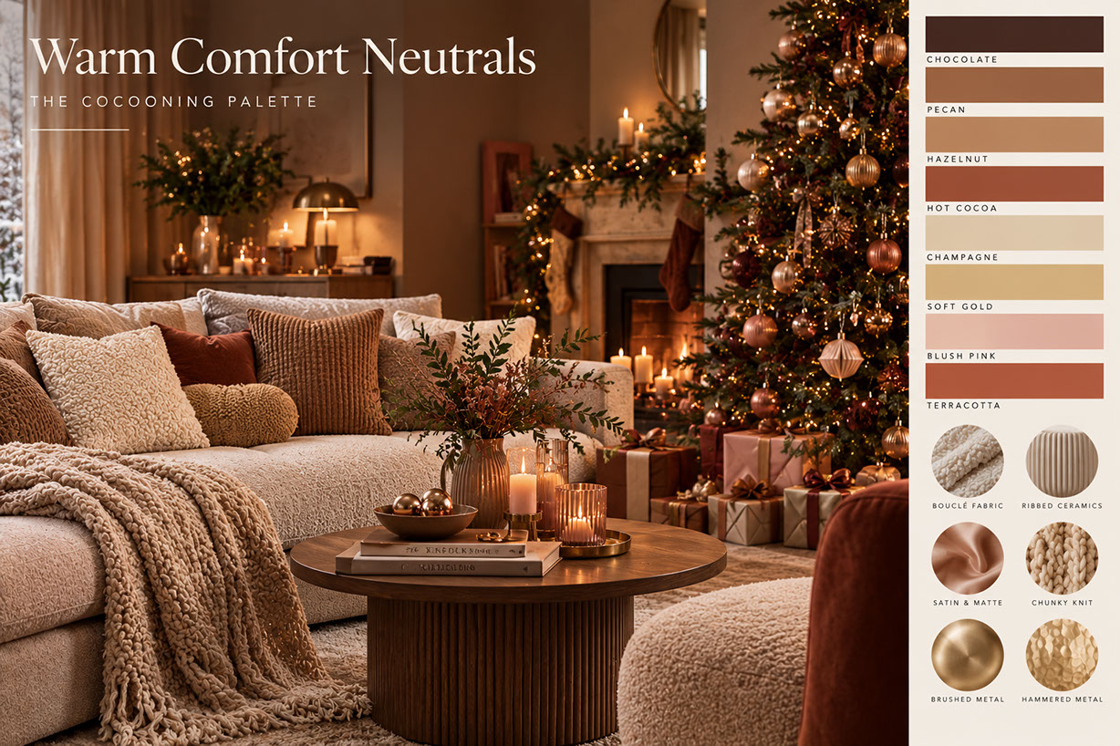
For those seeking warmth without drama, the warm comfort neutrals offer a different kind of festive sophistication. Chocolate and cocoa browns, pecan and hazelnut mid-tones, hot cocoa with its warmer red undertone, champagne and soft gold, caramel and toffee—these colours create what can only be described as a hug in colour scheme form.
 🔍 PLATE 12 — CLICK TO EXPAND
The Cocooning Palette — Chocolate, Pecan, Hazelnut, Champagne & Tactile Material Guide — Editorial design board for 'Warm Comfort Neutrals: The Cocooning Palette', pairing a serene neutral Christmas living room with eight core colour swatches (Chocolate, Pecan, Hazelnut, Hot Cocoa, Champagne, Soft Gold, Blush Pink, and Terracotta) and six signature textures (Bouclé Fabric, Ribbed Ceramics, Satin & Matte, Chunky Knit, Brushed Metal, and Hammered Metal). Colour Palette: Chocolate (#3D2821), Pecan (#936342), Hazelnut (#B48863), Champagne (#DDD1B8), Blush Pink (#DFB4AA), Terracotta (#B0553B)
Add blush pink for romantic warmth, cream and ivory for lightness, or terracotta as an earthier alternative. Signature textures include bouclé fabric in throws and cushions, ribbed ceramics for vases and candle holders, satin and matte contrasts, chunky knit patterns, and brushed or hammered metal finishes.
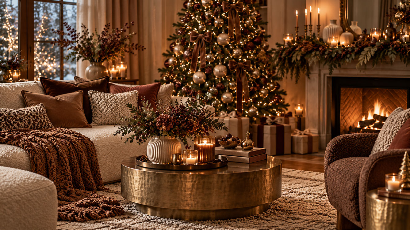 🔍 PLATE 13 — CLICK TO EXPAND
The Cocooning Palette in the Living Room — Cream Bouclé Sofa, Pecan Velvet Pillows, Caramel Knit Throw & Hammered Brass — Inviting open-plan living room styled in the Warm Comfort Neutrals palette: a cream bouclé sofa layered with chocolate brown and pecan velvet cushions and a chunky caramel knit throw, a brown bouclé armchair, a hammered aged-brass drum coffee table with a ribbed ivory ceramic vase and amber candle votives, and a Christmas tree trimmed with mocha satin bows and champagne baubles. Colour Palette: Cocoa Brown (#4A2C1D), Caramel Toffee (#8C5530), Soft Gold (#C8A971), Cream Ivory (#EFE7DA)
This palette excels at creating inviting spaces for intimate gatherings. The neutral base allows other decorative elements—tree ornaments, table centrepieces, lighting—to take centre stage. It's particularly well-suited to open-plan spaces where visual calm is essential.
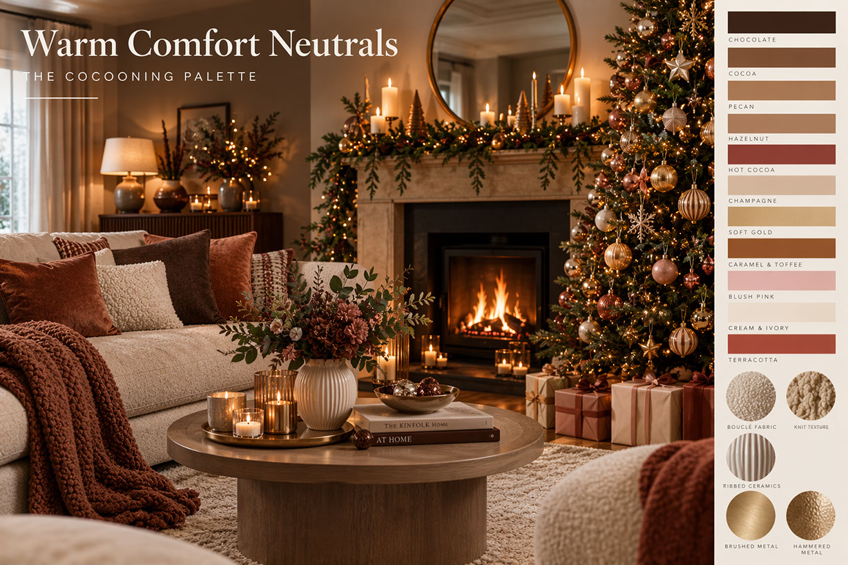 🔍 PLATE 14 — CLICK TO EXPAND
Extended 11-Shade Warm Comfort Neutrals Chart — From Deep Chocolate & Hot Cocoa to Caramel, Blush Pink & Terracotta — Expanded eleven-shade reference chart for 'Warm Comfort Neutrals: The Cocooning Palette'—detailing Chocolate, Cocoa, Pecan, Hazelnut, Hot Cocoa, Champagne, Soft Gold, Caramel & Toffee, Blush Pink, Cream & Ivory, and Terracotta alongside close-up studies of bouclé upholstery, chunky knitwear, ribbed stoneware ceramics, and brushed and hammered brass. Colour Palette: Chocolate (#3B261E), Hot Cocoa (#894335), Caramel & Toffee (#9A5F36), Cream & Ivory (#EAE0D0), Terracotta (#AD503B)
High-Contrast and Unexpected Pairings: The Fashion-Forward Approach
Now for the truly adventurous. Christmas 2026 is embracing some genuinely unexpected colour combinations, and they're absolutely stunning when executed well.
Powder Blue and Cherry Red creates a fresh, graphic quality with nostalgic vintage Americana references. The key is balancing the two colours—typically using one as the dominant shade and the other as punctuation.
Blueberry and Citrus Yellow is optimistic and surprising. Despite seeming unconventional, this pairing works because of the energy and joy it creates through colour surprise. It's perfect for those wanting to break entirely from traditional festive palettes.
Mulled-Wine Burgundy and Dried Orange offers a traditional foundation with modern execution. The natural, organic quality of this pairing bridges heritage and contemporary sensibilities beautifully. Pair with dried botanicals and warm metals for full effect.
Rose Pink, Soft Lilac, and Powder Blue creates a dreamy, fashion-editorial quality. This palette has been trending beyond traditional Christmas colours, offering a sophisticated alternative to classic red and green. It's the runway-to-living-room translation many contemporary homes are embracing.
These unexpected choices can be incredibly sophisticated. They photograph beautifully and feel distinctive—perfect for creating memorable festive interiors.
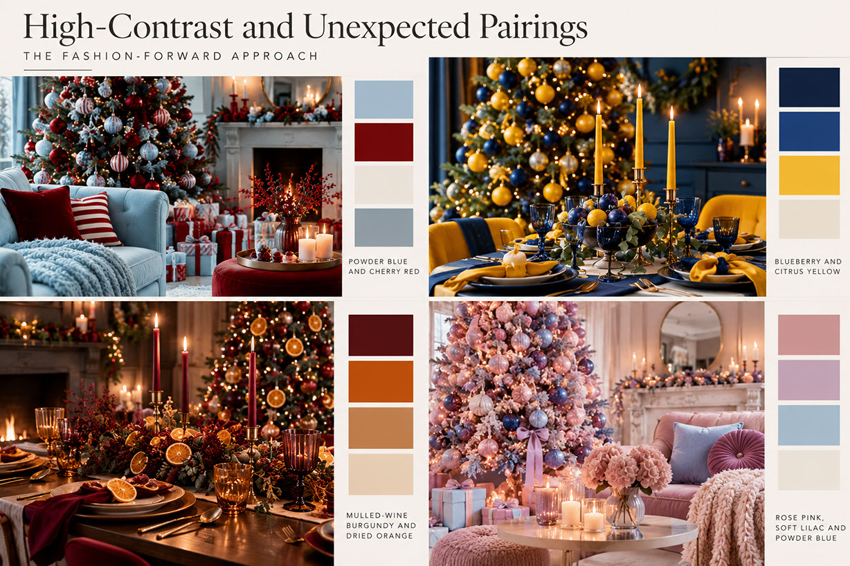 🔍 PLATE 15 — CLICK TO EXPAND
The Fashion-Forward Approach — 4 Designer Christmas 2026 Colour Combinations — Four-quadrant editorial lookbook illustrating Christmas 2026's standout fashion-forward colour pairings with room photography and 4-swatch strips: (1) Powder Blue and Cherry Red for crisp vintage-Americana contrast, (2) Blueberry and Citrus Yellow for optimistic dining energy, (3) Mulled-Wine Burgundy and Dried Orange for organic heritage warmth, and (4) Rose Pink, Soft Lilac and Powder Blue for dreamy runway-to-living-room sophistication. Colour Palette: Powder Blue (#A2BDD0), Cherry Red (#7A0D14), Blueberry (#1D3B70), Citrus Yellow (#EAB930), Dried Orange (#C35B17), Soft Lilac (#C8AFC2)
Metallics: The Finishing Touch That Completes Your Scheme
The metallic direction for 2026 is moving away from bright, shiny gold and silver toward aged, patinated, and organic metallic finishes. Aged brass brings warm heritage quality, oxidised bronze offers darker drama, brushed gold feels softer than polished alternatives, and pearl finishes provide iridescent contemporary appeal. Copper, rose gold, antique silver, and pewter round out the options.
Apply metallics through tree ornaments and baubles, candle holders and lighting fixtures, ribbon and trim accents, tableware and serving pieces, and frame and accessory details. The principle of less is more applies here—choose one dominant metallic family per scheme rather than mixing too many tones.
Different metallics complement different colour palettes: warm palettes (burgundy, neutrals) pair with brass and gold, whilst cool palettes (blues, greens) work better with silver, pewter, or pearl.
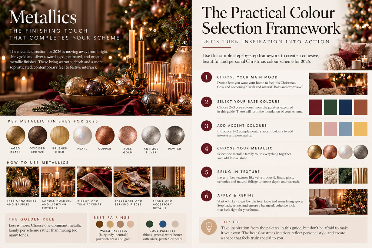 🔍 PLATE 16 — CLICK TO EXPAND
The Finishing Touch That Completes Your Scheme — 8 Patinated Finishes, 5 Styling Applications & Pairing Rules — Dual-panel editorial guide to Christmas 2026 metallics and colour planning: showcasing the eight key patinated and organic finishes (Aged Brass, Oxidised Bronze, Brushed Gold, Pearl, Copper, Rose Gold, Antique Silver, and Pewter), five application zones (Tree Ornaments, Candle Holders, Ribbon & Trim, Tableware, and Frame Details), warm vs. cool palette pairing rules, and a six-step action overview. Colour Palette: Aged Brass (#9E8046), Oxidised Bronze (#4E3929), Brushed Gold (#C5A869), Iridescent Pearl (#E5E2DC), Antique Silver (#A8A9AD)
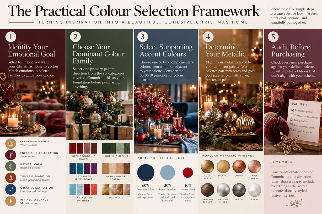
The Practical Colour Selection Framework
Let's turn all this inspiration into actionable steps.
Step 1: Identify Your Emotional Goal. What feeling do you want your Christmas home to evoke? Match emotions to palette families—cocooning warmth calls for warm neutrals, energising celebration suits jewel tones, natural calm aligns with biophilic greens.
Step 2: Choose Your Dominant Colour Family. Select one primary palette direction from the six categories covered. Commit to this as your foundation before purchasing anything.
Step 3: Select Supporting Accent Colours. Choose one or two complementary colours from within or adjacent to your palette. Consider the 60-30-10 principle for colour distribution: 60% dominant colour, 30% secondary colour, 10% accent.
Step 4: Determine Your Metallic. Match your metallic choice to your dominant palette. Warm palettes pair with brass and gold; cool palettes pair with silver, pewter, or pearl.
Step 5: Audit Before Purchasing. Check every new purchase against your defined palette. Resist impulse additions that don't align with your scheme.
Remember: constraints create cohesion. Committing to a direction rather than trying to include everything is the secret to professionally styled festive interiors.
 🔍 PLATE 17 — CLICK TO EXPAND
The Practical Colour Selection Framework — 5-Step Method, 60-30-10 Distribution Rule & Pre-Purchase Audit Checklist — Five-column master framework infographic turning inspiration into a cohesive Christmas 2026 home: (1) Identify Your Emotional Goal across six mood archetypes, (2) Choose Your Dominant Colour Family, (3) Select Supporting Accent Colours using the 60-30-10 distribution rule (60% Dominant, 30% Secondary, 10% Accent), (4) Determine Your Metallic across eight finishes, and (5) Audit Before Purchasing with a five-point 'Does It Fit?' compatibility checklist. Colour Palette: Dominant Navy (#18304C), Secondary Powder Blue (#8AA8C2), Accent Crimson (#87121B), Brushed Brass (#B6924E)
Your Colour Foundation Is Set
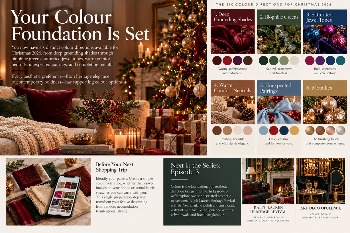
You now have six distinct colour directions available for Christmas 2026, from deep grounding shades through biophilic greens, saturated jewel tones, warm comfort neutrals, unexpected pairings, and completing metallics. Every aesthetic preference—from heritage elegance to contemporary boldness—has supporting colour options.
Before your next shopping trip, identify your palette. Create a simple colour reference, whether that's saved images on your phone or actual fabric swatches you can carry with you. This single preparation step will transform your festive decorating from random accumulation to intentional styling.
Colour is the foundation, but aesthetic direction brings it to life. In Episode 3, we'll explore two sophisticated aesthetic movements: Ralph Lauren Heritage Revival with its New England polish and aristocratic restraint, and Art Deco Opulence with its velvet royale and hotel-bar glamour. You'll see these colour palettes transformed into complete, cohesive looks you can recreate in your own home.
This is Part 2 of 8 in our Christmas 2026 Home Decor Trends series. Bookmark this page and join us for the complete journey to your most stylish Christmas yet.
 🔍 PLATE 18 — CLICK TO EXPAND
Your Colour Foundation Is Set — Complete Summary of the 6 Christmas 2026 Colour Directions & Episode 3 Preview — Concluding reference board titled 'Your Colour Foundation Is Set', summarising all six Christmas 2026 colour directions (1. Deep Grounding Shades, 2. Biophilic Greens, 3. Saturated Jewel Tones, 4. Warm Comfort Neutrals, 5. Unexpected Pairings, and 6. Metallics), how to prepare a digital or fabric swatch reference before shopping, and a preview of Episode 3's Ralph Lauren Heritage Revival and Art Deco Opulence aesthetics. Colour Palette: Heritage Burgundy (#5B131E), Biophilic Forest (#233927), Jewel Teal (#0B4F60), Warm Pecan (#8F5E3D), Aged Brass (#B8934A)
⚡ 5 Strategies to Consider
STUDIO PLAYBOOK // 5 DIRECTIVES❓ Frequently Asked Questions — 5 Q&As (5 Q&As)
SCHEMA.ORG/FAQPAGE // 5 Q&As (5 Q&As)Q1. What colours are trending for Christmas 2026?
Christmas 2026 features six key colour directions: deep grounding shades like burgundy, wine red, and cherry cola; biophilic greens from fir to sage to pistachio; saturated jewel tones reminiscent of Quality Street confectionery; warm comfort neutrals including chocolate, pecan, and champagne; unexpected high-contrast pairings such as powder blue with cherry red or blueberry with citrus yellow; and aged metallics like brass, oxidised bronze, and pearl finishes replacing bright shiny gold and silver.
Q2. How do I choose a cohesive Christmas colour scheme?
Follow a five-step framework: First, identify your emotional goal and match it to a palette family. Second, choose one dominant colour family and commit to it. Third, select one or two supporting accent colours using the 60-30-10 principle. Fourth, determine your metallic family based on palette warmth. Finally, audit every purchase against your defined scheme before buying to maintain cohesion.
Q3. Can I mix traditional and contemporary colours for Christmas?
Absolutely. The mulled-wine burgundy with dried orange pairing is an excellent example of bridging heritage and contemporary sensibilities. Use traditional colours like reds and greens in contemporary finishes or unexpected pairings. The key is maintaining consistency in your metallic choices and texture approaches across mixed colour schemes to ensure visual harmony.
Q4. What is the cherry cola colour trend for Christmas 2026?
Cherry cola is a specific trending shade that combines cola-brown undertones with cherry brightness, creating depth that feels both familiar and fresh. It sits within the deep grounding shades palette and pairs beautifully with velvet textures, mohair, bouclé, and antiqued brass accents. This tone creates warmth and sophisticated enclosure in living spaces.
Q5. Which metallics should I use for Christmas 2026 decorating?
Christmas 2026 metallics are moving toward aged, patinated, and organic finishes rather than bright shiny gold and silver. Key options include aged brass for warm heritage quality, oxidised bronze for darker drama, brushed gold for softer appeal, and pearl finishes for iridescent contemporary looks. Match warm metallics like brass and gold with warm colour palettes, and silver, pewter, or pearl with cooler schemes.