EPISODE 8-Beyond Static Images: How Modular Illustration Systems Are Reshaping Visual Design in 2027
Discover how modular illustration systems reshape visual design in 2027. Learn adaptable component design, subtle animation, and cross-platform workflows.
 🔍 COVER PLATE — CLICK TO EXPAND
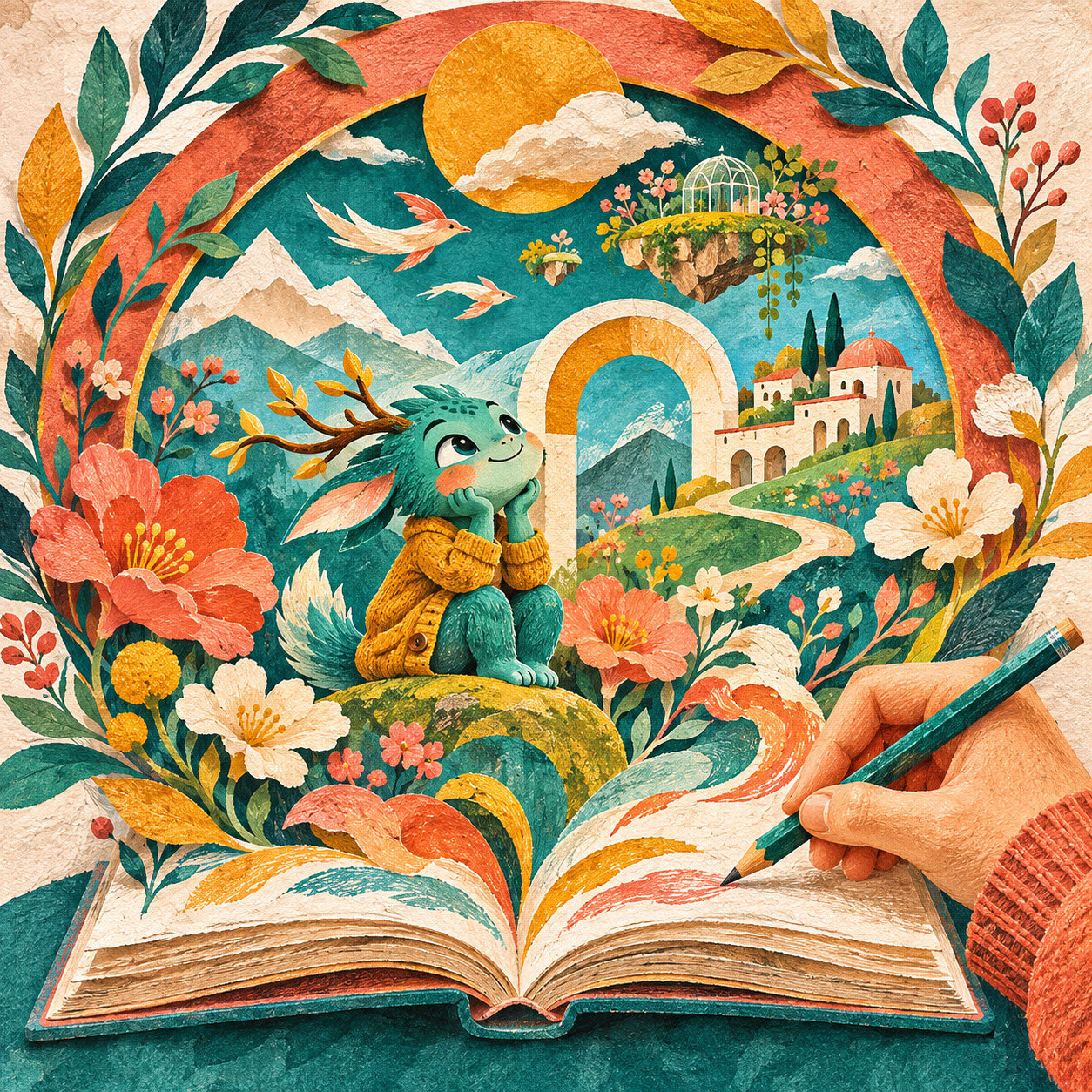
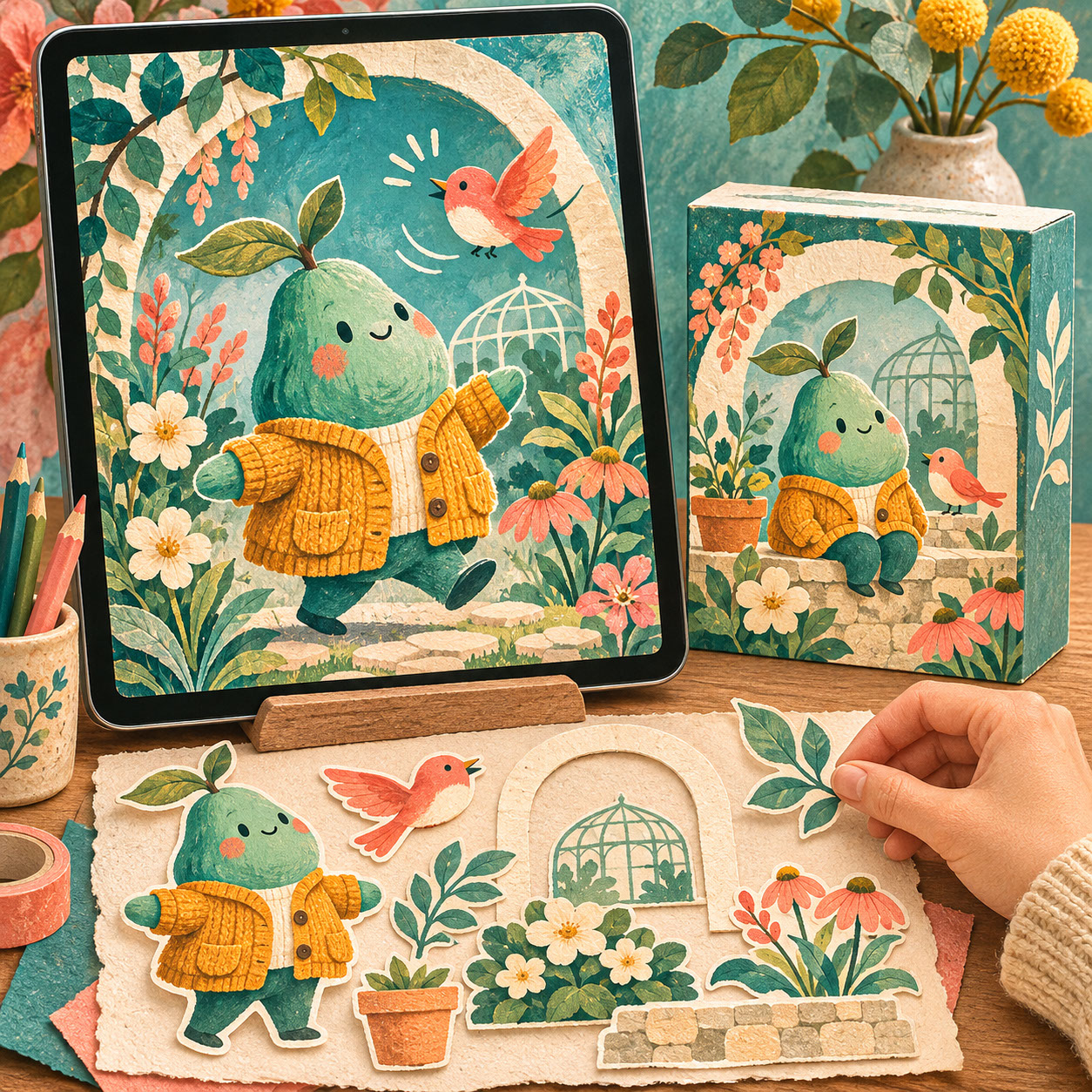
Square hero cover for Episode 8 ('Beyond Static Images: How Modular Illustration Systems Are Reshaping Visual Design in 2027'): an upright digital tablet and a printed package both showcase our recurring teal character in a mustard cardigan and coral bird rearranged from reusable painted cutouts.
Picture this scenario: you've created a stunning illustration for a client, and now they need it to work as a website hero image, an animated social media post, a product label, an app loading screen, and a printed poster. Oh, and it all needs to maintain consistent brand identity across every single touchpoint. Sound familiar? Welcome to the reality of illustration in 2027, where creating one beautiful image simply isn't enough anymore.
The most valuable illustration work today isn't a single perfect piece—it's a thoughtfully designed system of interconnected elements that maintains character and quality across every application. In this final episode of our Illustration Trends 2027 series, we're exploring how modular thinking, subtle animation techniques, and adaptive design approaches are transforming what it means to be an illustrator.
 🔍 PLATE 01 — CLICK TO EXPAND
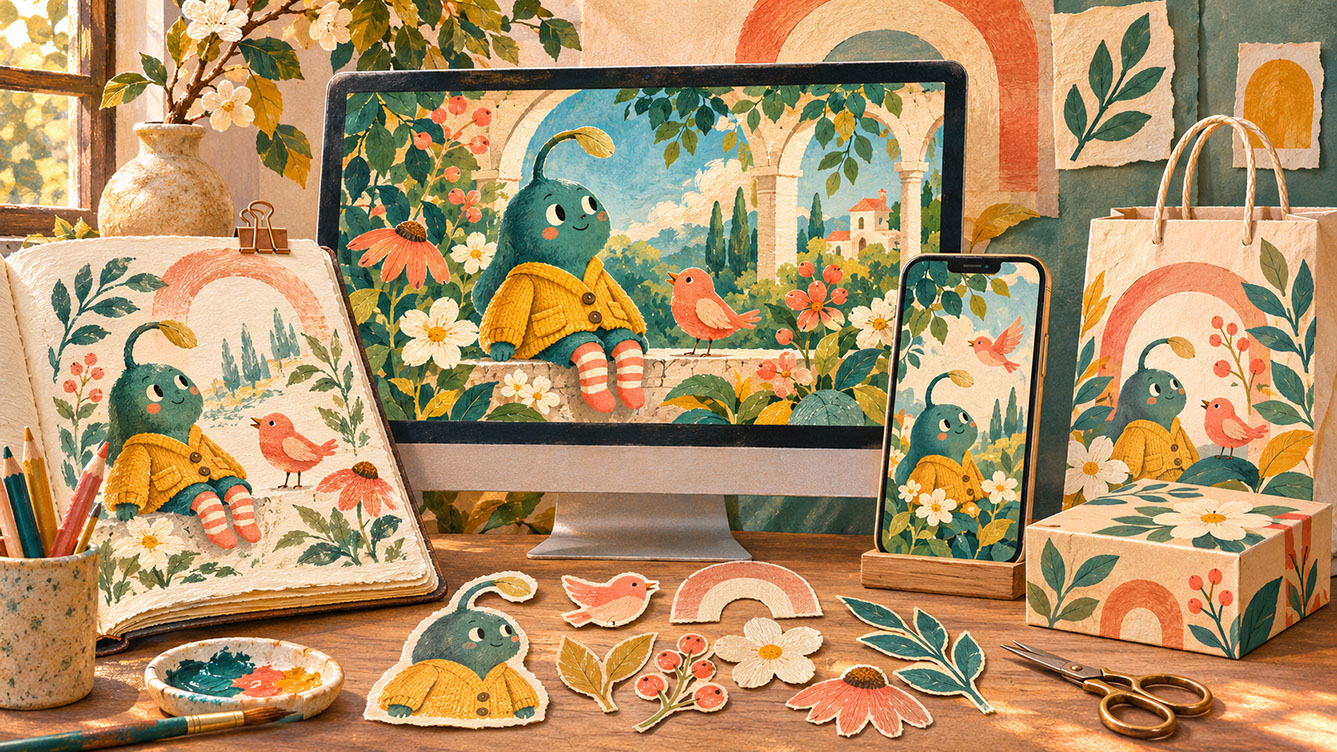
How Modular Illustration Systems Are Reshaping Visual Design in 2027 — Lead editorial plate for Episode 8: a physical sketchbook illustration of our recurring teal character in a botanical garden extends seamlessly across a widescreen desktop display, mobile phone, and printed packaging using reusable hand-painted component cutouts. Colour Palette: Deep Teal (#134E4A), Warm Coral (#F26A4B), Golden Ochre (#D99B26), Soft Studio Cream (#F6EFE2)
The Shift from Single Image to Visual System
Let's be honest about how dramatically the landscape has changed. Illustrators now routinely need to serve websites, mobile applications, social media platforms, printed materials, packaging, merchandise, and animated content—all from related visual assets. A single commissioned project might require dozens of variations and adaptations. The traditional model of creating one finished illustration for one specific purpose? That's becoming increasingly rare.
So what exactly defines an illustration system? Think of it as a coordinated collection of visual elements designed to work together across multiple applications. These are core components that can be combined, scaled, and adapted whilst maintaining a recognisable identity. The key difference is deliberate planning for flexibility rather than retrofitting existing artwork after the fact.
The benefits here are substantial for everyone involved. Illustrators gain greater efficiency when creating multiple deliverables. Clients enjoy stronger brand consistency across touchpoints. And the commercial value of creative work extends far beyond that initial single-use commission. It's genuinely a win-win approach.
If you've been following our series, you'll recognize how this connects with earlier episodes. The character libraries we explored in Episode 4 become even more powerful when designed as modular systems. The cultural authenticity we discussed in Episode 7 can form beautiful foundations for flexible yet meaningful visual identities.
 🔍 PLATE 02 — CLICK TO EXPAND
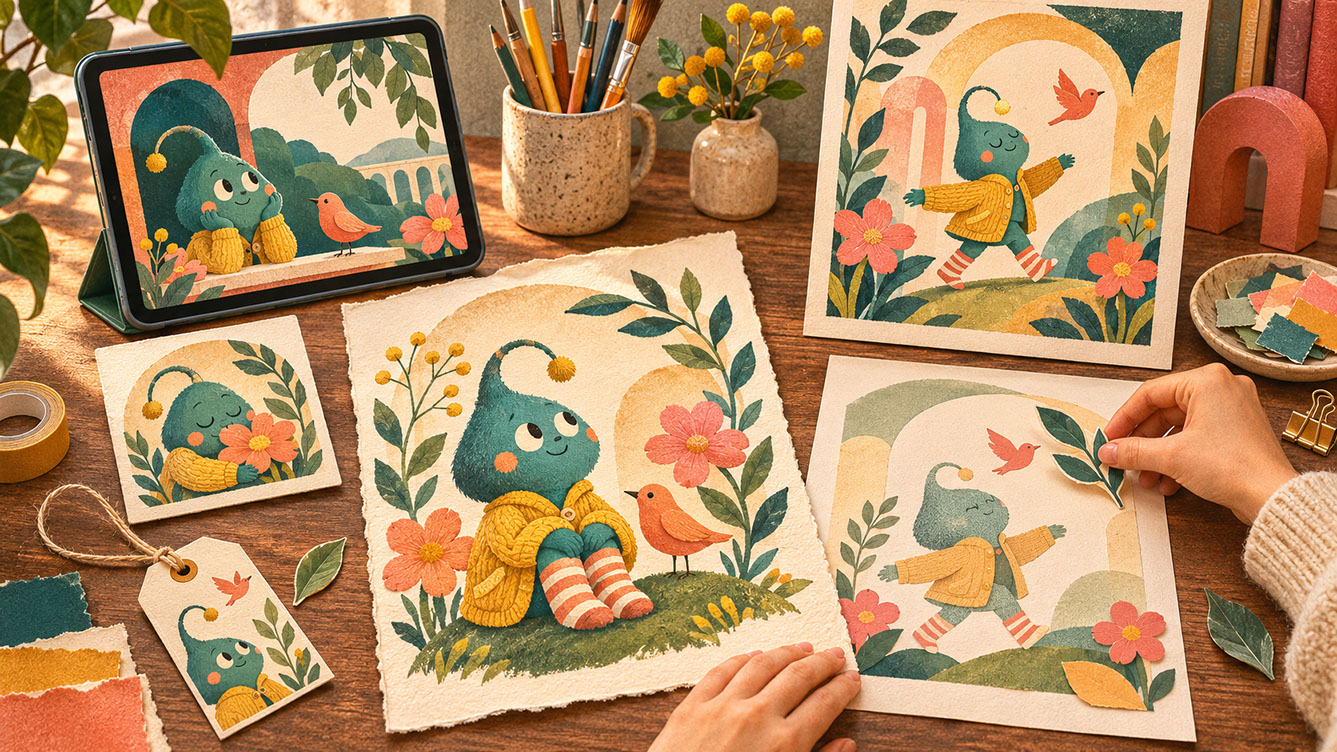
The Shift from Single Image to Visual System — Planned Reuse & Cohesive Identity — System thinking study for 'The Shift from Single Image to Visual System': one central character-and-botanical drawing anchors a coordinated upright poster, square card, small product label, and tablet layout as a designer places a reusable leaf cutout. Colour Palette: Deep Teal (#134E4A), Warm Coral (#F26A4B), Golden Ochre (#D99B26), Soft Studio Cream (#F6EFE2)
Modular Thinking: Building Blocks for Flexible Design
Right, let's get practical. Modular illustration thinking centers on creating reusable components that work together in multiple configurations. Here are the core elements you'll want to develop:
Reusable Shapes form your visual vocabulary—geometric forms, organic shapes, and decorative elements that can be combined in various ways. Think of these as your illustration alphabet.
Character Libraries take the expressive figures we explored in Episode 4 and extend them with interchangeable poses, expressions, clothing, and accessories. A single character might have twenty variations, all maintaining consistent personality.
Pattern Components are elements designed to tile, repeat, or combine into larger pattern systems. These become incredibly valuable for backgrounds, borders, and decorative applications.
Background Systems consist of layered environments that can be simplified or expanded based on context. A detailed scene might work for a poster whilst a simplified version serves as an app background.
Transitional Elements are the connecting devices, borders, and frames that unify disparate components. These often get overlooked but they're essential for cohesive systems.
When developing your own modular approach, start by identifying ten to fifteen fundamental shapes or elements that define your visual language. Create a clear hierarchy: determine which elements are primary (always present), secondary (frequently used), and tertiary (occasional accents). Test combinations thoroughly to ensure elements work together in unexpected pairings. And crucially, plan for scale—design components that remain recognisable from favicon size right through to billboard scale.
Maintaining consistency without monotony requires establishing clear visual rules whilst allowing for variation. Use colour as a unifying system, connecting back to the expressive palettes we explored in Episode 3. Balance repetition with surprise to keep things engaging.
 🔍 PLATE 03 — CLICK TO EXPAND
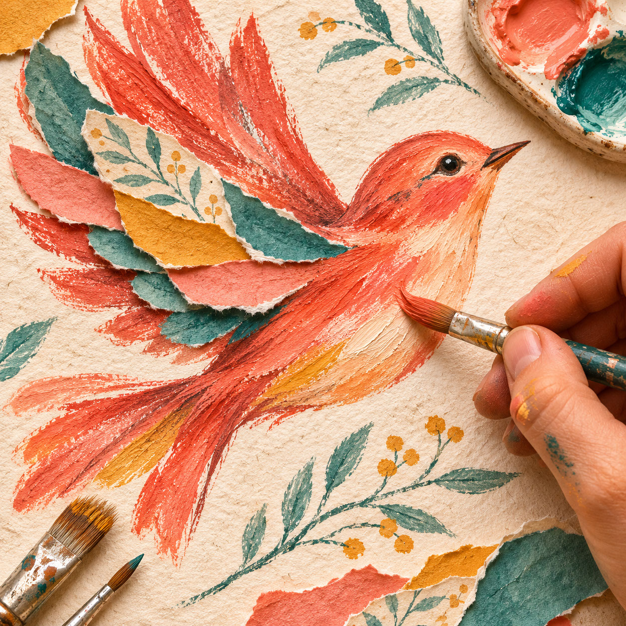
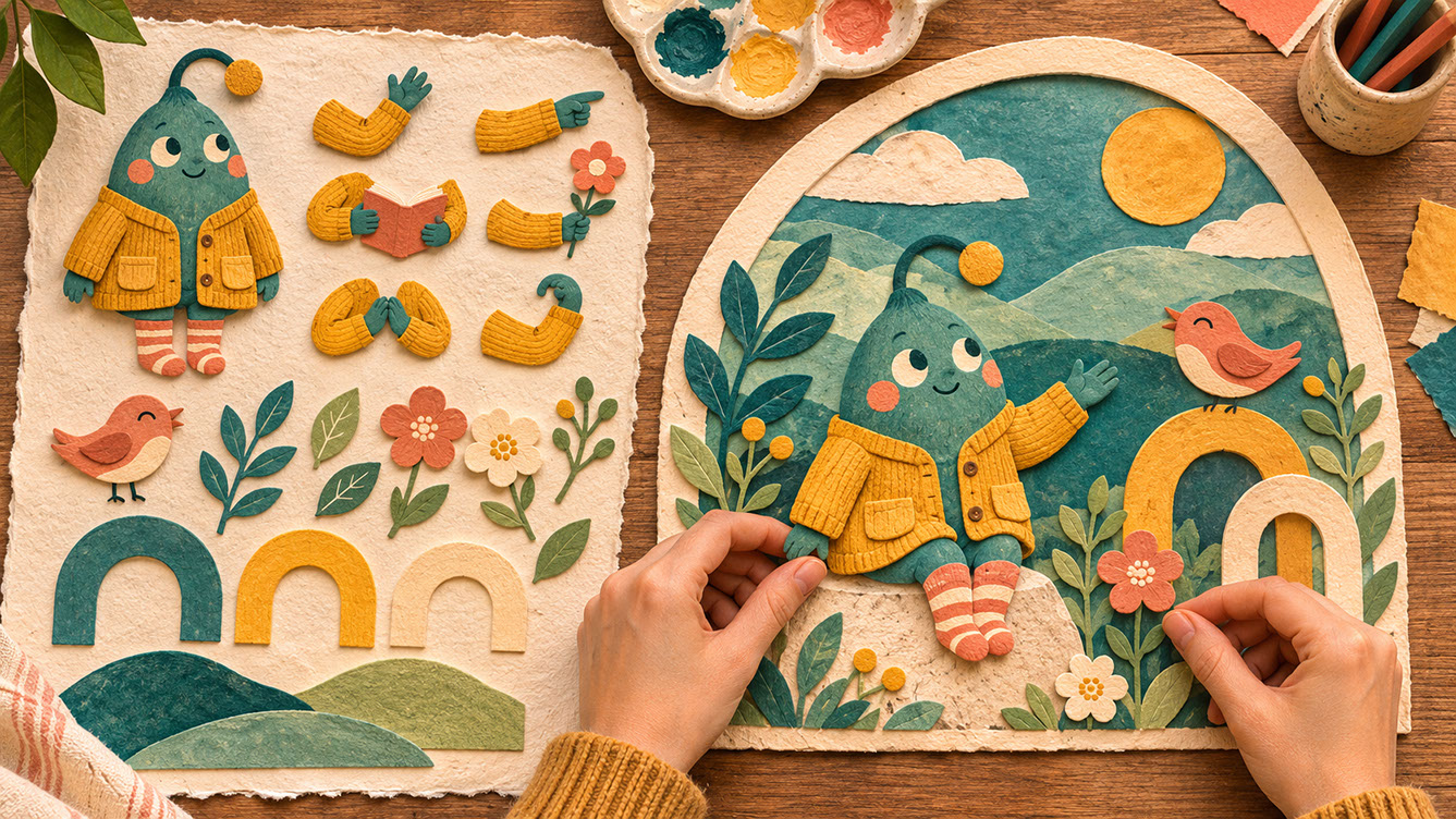
Building Blocks for Flexible Design — Interchangeable Poses & Motifs — Component library plate for 'Modular Thinking: Building Blocks for Flexible Design': an overhead view of neatly arranged painted-paper building blocks—interchangeable character poses, coral birds, leaves, blooms, and arches—being assembled into a cohesive scene. Colour Palette: Deep Teal (#134E4A), Warm Coral (#F26A4B), Golden Ochre (#D99B26), Soft Studio Cream (#F6EFE2)
Subtle Animation Techniques That Enhance Without Overwhelming
Here's where things get really exciting—and potentially overwhelming if you're not careful. The philosophy of subtle movement is crucial: animation should enhance emotional connection and guide attention, not distract or overwhelm. The most effective animated illustration often features the smallest movements. Movement should feel natural to the illustration's character, not imposed upon it.
Let me walk you through specific techniques that work beautifully:
Gentle Line Shifts allow hand-drawn outlines to breathe slightly, suggesting the imperfect quality of traditional media. This connects wonderfully with the tactile aesthetics we explored in Episode 2.
Character Micro-Expressions bring figures to life through blinking eyes, shifting glances, and subtle smile changes. These tiny movements create genuine emotional connection without requiring complex animation.
Scrolling Patterns use repeating elements that move continuously, creating rhythm and visual interest. Think of a field of illustrated flowers gently swaying or geometric shapes rotating slowly.
Layered Parallax takes the collage techniques from Episode 5 and allows elements to slide at different speeds, adding wonderful depth. Foreground pieces move faster than background elements, creating a sense of dimension.
Colour Transitions introduce subtle palette shifts that respond to time, interaction, or mood. An illustration might gradually warm as a user scrolls down a page.
Scale Pulses create organic breathing effects through elements that gently grow and shrink. This works particularly well for organic shapes and character elements.
On the technical side, you'll need to consider file formats and their limitations. GIF remains useful for simple animations but has colour restrictions. MP4 offers better quality for complex movement. Lottie files are brilliant for scalable, lightweight web animations. SVG animation provides crisp results at any size but requires more technical knowledge.
Always consider loop points and seamless transitions—jarring loops break the spell entirely. And don't forget performance considerations for web and mobile applications. A beautiful animation that slows down a website helps nobody.
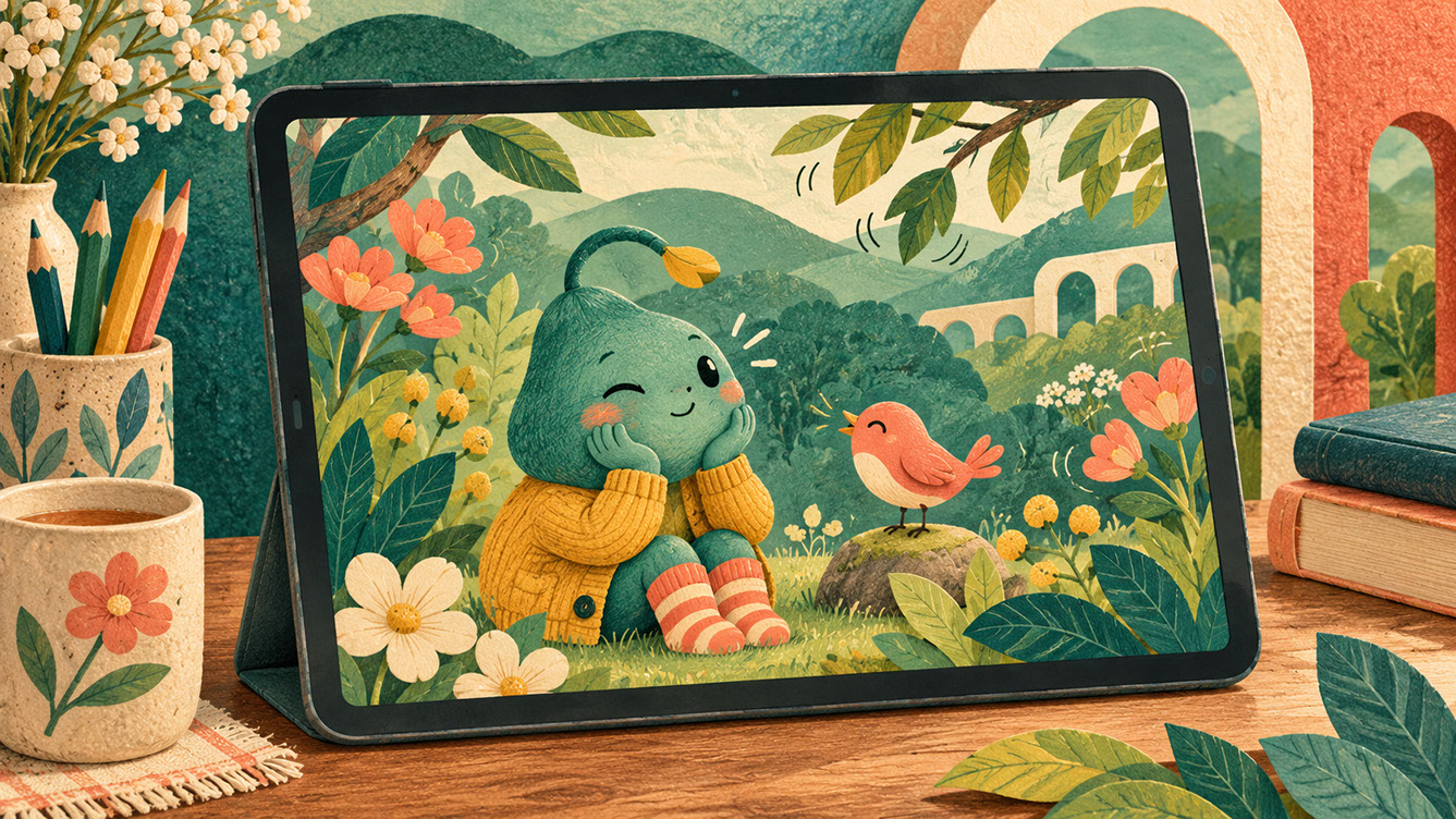 🔍 PLATE 04 — CLICK TO EXPAND
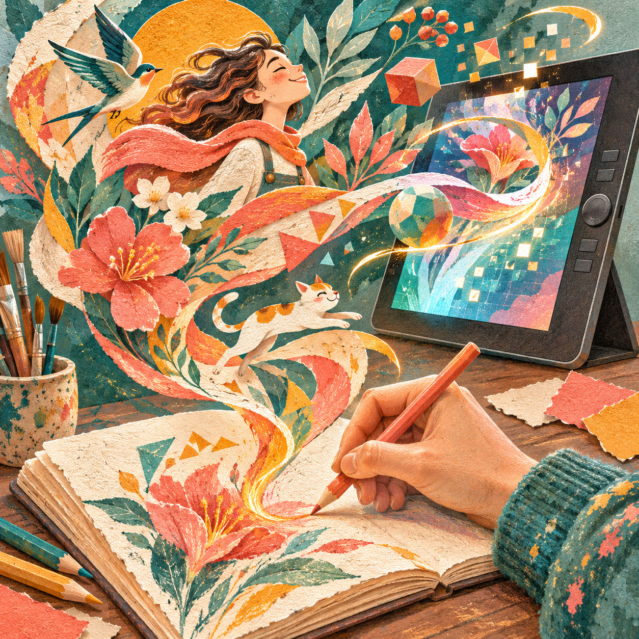
Subtle Animation Techniques That Enhance Without Overwhelming — Micro-Motion & Parallax — Gentle motion study for 'Subtle Animation Techniques That Enhance Without Overwhelming': a tablet displays our recurring teal character with delicate curved motion cues indicating a soft blink and swaying foliage beside physical parallax paper layers. Colour Palette: Deep Teal (#134E4A), Warm Coral (#F26A4B), Golden Ochre (#D99B26), Soft Studio Cream (#F6EFE2)
Planning Collections with Adaptability in Mind
Strategic planning makes all the difference. Before beginning creative development, map all potential applications. Identify the most challenging format—often the smallest or most constrained—and design to satisfy it first. If your illustration works at favicon size, it'll work everywhere.
Consider aspect ratios carefully: square for Instagram, portrait for Stories and TikTok, landscape for websites, extreme horizontal for Twitter headers, extreme vertical for Pinterest. Each format has its own requirements, and planning ahead prevents painful compromises later.
Documentation and organization might feel tedious, but they're essential for systems that scale. Create clear naming conventions and asset libraries. Document colour values, proportions, and spacing rules. Build style guides that allow others to work within your system—whether that's a client's in-house team or collaborators joining your project.
Client communication deserves attention too. Many clients don't yet understand the value of systems thinking, so educating them becomes part of your role. Pricing illustration systems versus single images requires different approaches—you're providing greater value and extended usage, which should be reflected in your fees. Establish usage rights that accommodate adaptive applications from the outset.
Practical workflow adjustments help enormously. Work in layers from the very beginning. Keep elements editable rather than flattening artwork prematurely. Build revision efficiency into your process so changes don't require starting from scratch.
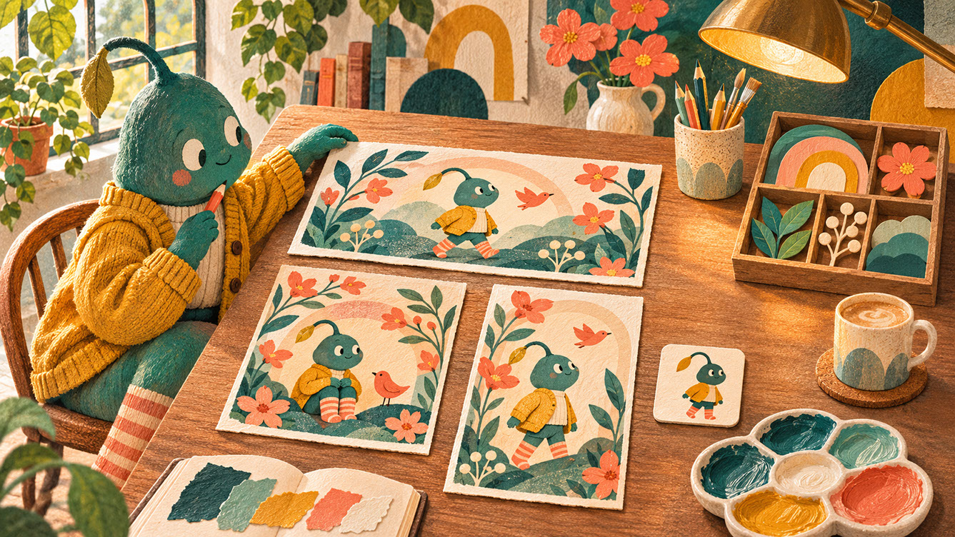 🔍 PLATE 05 — CLICK TO EXPAND
Planning Collections with Adaptability in Mind — Landscape, Square, Portrait & Icon Scales — Multi-aspect planning plate for 'Planning Collections with Adaptability in Mind': a designer tests landscape, square, portrait, and small icon-sized mockups on a worktable, ensuring the teal character and botanical motifs read clearly at every proportion. Colour Palette: Deep Teal (#134E4A), Warm Coral (#F26A4B), Golden Ochre (#D99B26), Soft Studio Cream (#F6EFE2)
The Relationship Between Static and Animated Work
Here's something important: strong animated illustration begins with strong static composition. Animation should never compensate for weak underlying design. The same illustration should work effectively with or without movement—this is your test for quality.
Preserving the handmade quality we explored in Episode 2 becomes particularly important when adding animation. Ensure movement doesn't introduce artificial perfection that contradicts handmade character. There are techniques for maintaining textural authenticity in animated formats, such as keeping grain and imperfections visible even in motion.
And here's reassurance for anyone feeling overwhelmed: not every illustrator needs to become an animator. Collaboration models between illustrators and motion designers work brilliantly. Many successful illustrators focus on creating animation-ready assets rather than executing final animations themselves. Know your strengths and play to them.
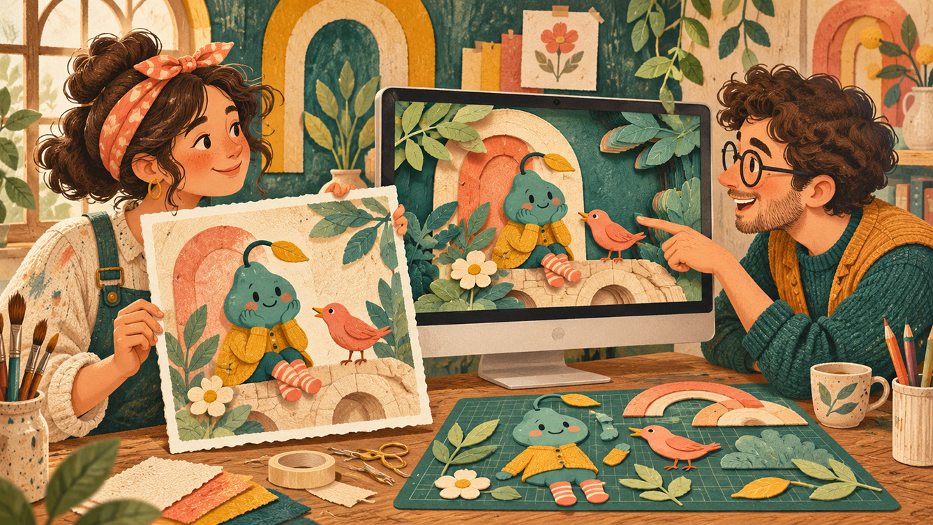 🔍 PLATE 06 — CLICK TO EXPAND
The Relationship Between Static and Animated Work — Illustrator & Motion Designer Collaboration — Creative partnership plate for 'The Relationship Between Static and Animated Work': an illustrator holding a finished paper original collaborates side-by-side with a motion designer working on the matching layered scene on a desktop monitor. Colour Palette: Deep Teal (#134E4A), Warm Coral (#F26A4B), Golden Ochre (#D99B26), Soft Studio Cream (#F6EFE2)
Future-Proofing Your Illustration Skills
As we look ahead, certain skills become increasingly valuable. Understanding basic animation principles matters even if you're not executing animation personally—it helps you create better assets for animators. Familiarity with digital format requirements and limitations prevents frustrating technical issues. Systems thinking and component-based design approaches will serve you across every project.
But here's what remains constant: strong drawing fundamentals and observational skills never go out of fashion. A distinctive creative voice and visual personality become more valuable, not less, as AI-generated imagery becomes more widespread. Understanding emotional communication through imagery—the very heart of illustration—remains essential.
Embrace evolution without abandoning your core practice. New formats create opportunities rather than threats. Illustration's value lies in human creativity, not technical execution alone. The most adaptable illustrators maintain curiosity about new possibilities whilst protecting their distinctive vision.
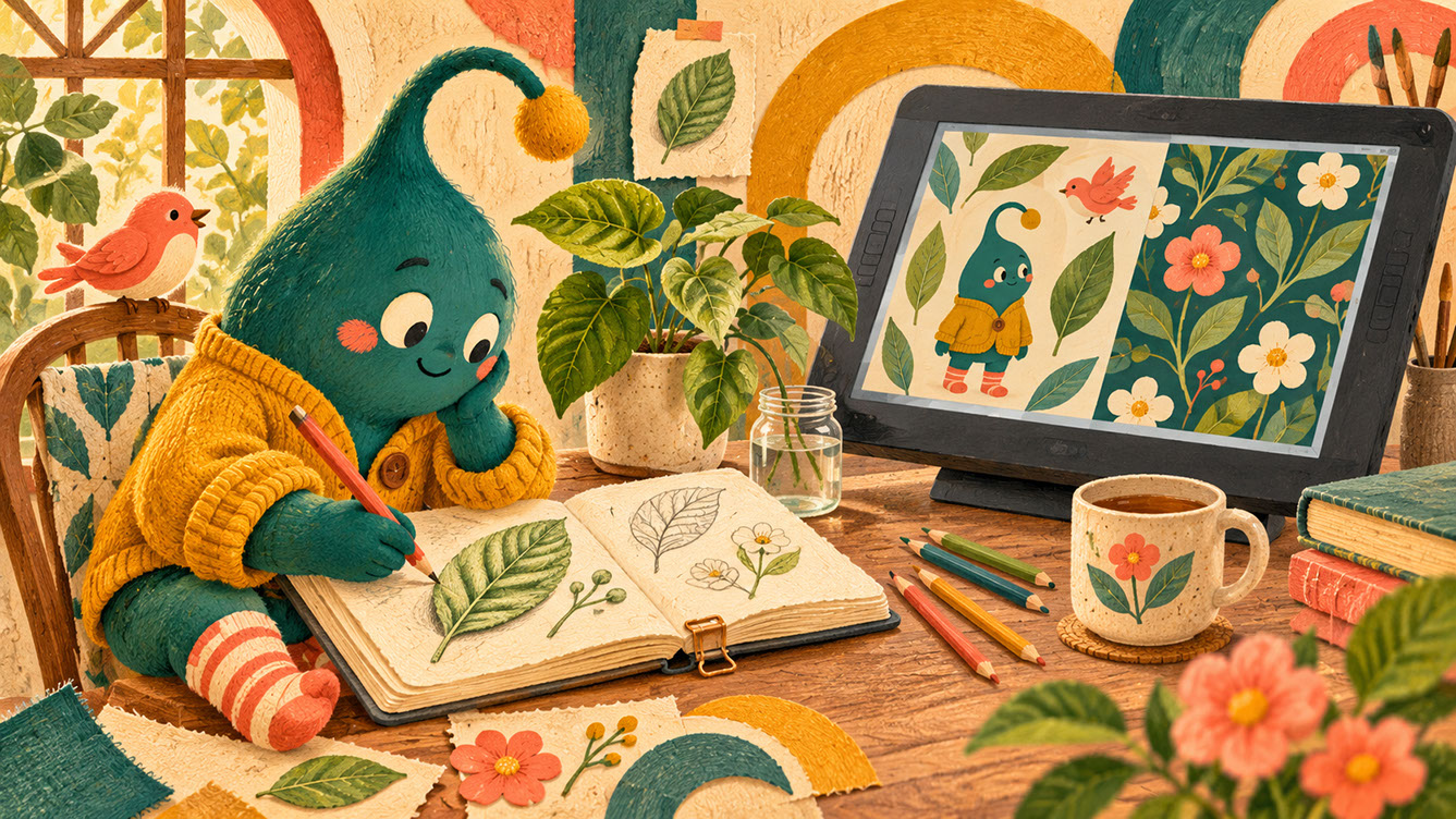 🔍 PLATE 07 — CLICK TO EXPAND
Future-Proofing Your Illustration Skills — Enduring Observational Drawing Meets Modular Systems — Skill evolution plate for 'Future-Proofing Your Illustration Skills': an illustrator draws a real potted plant from direct observation in a sketchbook while a digital pen display nearby translates those authentic marks into a modular character-and-pattern system. Colour Palette: Deep Teal (#134E4A), Warm Coral (#F26A4B), Golden Ochre (#D99B26), Soft Studio Cream (#F6EFE2)
Frequently Asked Questions
Do I need to learn animation software to remain competitive as an illustrator?
Not necessarily. Creating animation-ready assets is often more valuable than executing animation yourself. Many illustrators collaborate with motion designers rather than developing animation skills personally. Focus on understanding animation principles so your work translates well, even if someone else handles the technical execution.
How do I price illustration systems versus single images?
Value the additional planning and versatility your system provides. Consider usage scope and application variety—a system serving twelve touchpoints delivers more value than a single image. Many illustrators charge a base fee for the system development plus additional fees for each specific application or format delivered.
What's the minimum viable illustration system for a small brand project?
Start with core characters, a unified colour palette, five to ten modular elements, and basic pattern capability. This provides enough flexibility for most small brand applications whilst remaining manageable to create. You can always expand the system later as needs grow.
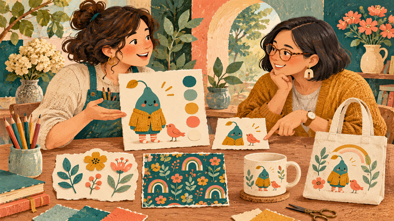 🔍 PLATE 08 — CLICK TO EXPAND
Frequently Asked Questions About Modular Illustration Systems in 2027 — Client consultation plate for 'Frequently Asked Questions': an illustrator and client review a manageable starter visual identity kit containing one core teal character, colour swatches, reusable botanical cutouts, a repeat pattern sample, and two product mockups. Colour Palette: Deep Teal (#134E4A), Warm Coral (#F26A4B), Golden Ochre (#D99B26), Soft Studio Cream (#F6EFE2)
Conclusion: The Future Belongs to Adaptable Creators
We've journeyed through eight episodes together, from tactile handmade aesthetics through expressive colour, playful characters, experimental collage, contemporary surrealism, and cultural authenticity—arriving here at adaptable systems. These directions share common values: authenticity, human creativity, emotional connection, and purposeful design.
The future belongs to illustrators who combine distinctive creative vision with practical adaptability. Systems thinking doesn't constrain creativity—it amplifies it across more contexts and audiences than ever before. Your unique artistic voice, expressed through thoughtfully designed modular systems, can reach people through their phones, their walls, their packaging, their screens, and their products.
I encourage you to experiment with modular approaches in your next project, however small. Create a character with three interchangeable expressions. Design a pattern that works at multiple scales. Plan an illustration that could animate beautifully even if it never does. These small experiments build the skills that will serve you throughout 2027 and beyond.
Thank you for joining us throughout this series. The illustration landscape continues to evolve in exciting directions, and I genuinely believe the most rewarding creative work lies ahead for those who embrace both timeless craft and contemporary possibilities.
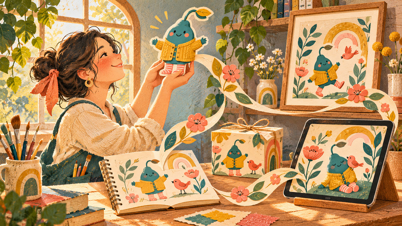 🔍 PLATE 09 — CLICK TO EXPAND
The Future Belongs to Adaptable Creators — Series Grand Finale — Grand finale plate for 'Conclusion: The Future Belongs to Adaptable Creators': an illustrator at a sunlit workbench lifts a handmade paper character as a flowing ribbon of botanical shapes unites a sketchbook, framed print, packaging box, and digital tablet. Colour Palette: Deep Teal (#134E4A), Warm Coral (#F26A4B), Golden Ochre (#D99B26), Soft Studio Cream (#F6EFE2)
⚡ 5 Strategies to Consider
STUDIO PLAYBOOK // 5 DIRECTIVES❓ Frequently Asked Questions — 5 Q&As (5 Q&As)
SCHEMA.ORG/FAQPAGE // 5 Q&As (5 Q&As)Q1. What exactly is a modular illustration system and how does it differ from traditional illustration?
A modular illustration system is a coordinated collection of visual elements designed to work together across multiple applications, rather than a single finished artwork. Unlike traditional illustration where you create one image for one specific purpose, modular systems include reusable shapes, character libraries, pattern components, background systems, and transitional elements that can be combined, scaled, and adapted whilst maintaining recognisable brand identity. The key difference is deliberate planning for flexibility from the outset rather than retrofitting existing artwork.
Q2. Do illustrators need to learn animation software to stay competitive in 2027?
Not necessarily. Creating animation-ready assets is often more valuable than executing animation yourself. Many successful illustrators collaborate with motion designers rather than developing comprehensive animation skills personally. The key is understanding basic animation principles so your work translates well into motion, even if someone else handles the technical execution. Focus on creating layered, well-organised files with elements that can be animated effectively.
Q3. What are the essential components needed for a minimum viable illustration system?
A minimum viable illustration system for a small brand project should include core characters, a unified colour palette, five to ten modular elements, and basic pattern capability. This provides enough flexibility for most small brand applications whilst remaining manageable to create. You can always expand the system later as client needs grow, adding more character variations, additional patterns, or new modular elements based on actual usage requirements.
Q4. How should illustrators price modular systems compared to single images?
Pricing should reflect the additional planning, versatility, and extended usage value that systems provide. Consider the usage scope and application variety—a system serving twelve touchpoints delivers substantially more value than a single image. Many illustrators charge a base fee for system development plus additional fees for each specific application or format delivered. Establish clear usage rights that accommodate adaptive applications from the outset to avoid complications later.
Q5. What subtle animation techniques work best for illustrated content?
The most effective techniques include gentle line shifts where hand-drawn outlines breathe slightly, character micro-expressions like blinking eyes and shifting glances, scrolling patterns with repeating elements that move continuously, layered parallax where collage elements slide at different speeds, subtle colour transitions that respond to interaction, and scale pulses where elements gently grow and shrink. The philosophy is that animation should enhance emotional connection and guide attention rather than overwhelm or distract.