EPISODE 2-Tactile Illustration in 2027: Why Handmade Aesthetics Are Captivating Audiences and How to Master the Craft
Discover why tactile illustration with visible brushstrokes and handmade aesthetics defines 2027, plus practical techniques for authentic commercial art.
 🔍 COVER PLATE — CLICK TO EXPAND
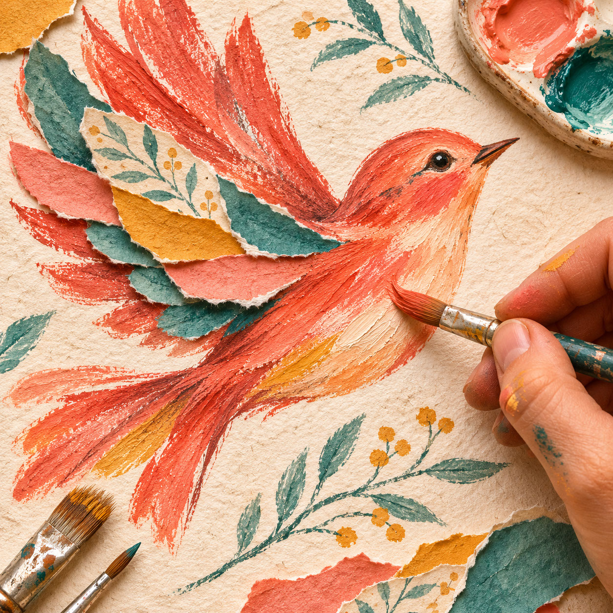
Square hero cover for Episode 2 ('Tactile Illustration in 2027: Why Handmade Aesthetics Are Captivating Audiences and How to Master the Craft'): an intimate macro study of a hand painting a coral bird using textured gouache, rough coloured pencil, and a torn-paper wing on coarse cream paper.
Here's a fascinating paradox for you: as AI-generated imagery becomes increasingly sophisticated, audiences are developing an almost instinctive appreciation for visible evidence of the human hand. The rough pencil mark, the uneven outline, the paper grain showing through — these imperfections have become markers of authenticity in a world drowning in digital perfection.
Welcome to Episode 2 of our Illustration Trends 2027 series. In our opening episode, we explored the broader cultural, technological, and commercial forces reshaping illustration this year, introducing the seven emerging directions that will define visual creativity. Today, we're diving deep into one of the most compelling of these directions: tactile illustration and the beautiful resurgence of handmade aesthetics.
Whether you're looking to incorporate more traditional elements into your digital workflow, seeking to differentiate your work in a crowded market, or wanting to understand why clients are increasingly requesting that handcrafted feel, this episode is packed with practical techniques and commercial insights you can use straight away.
 🔍 PLATE 01 — CLICK TO EXPAND
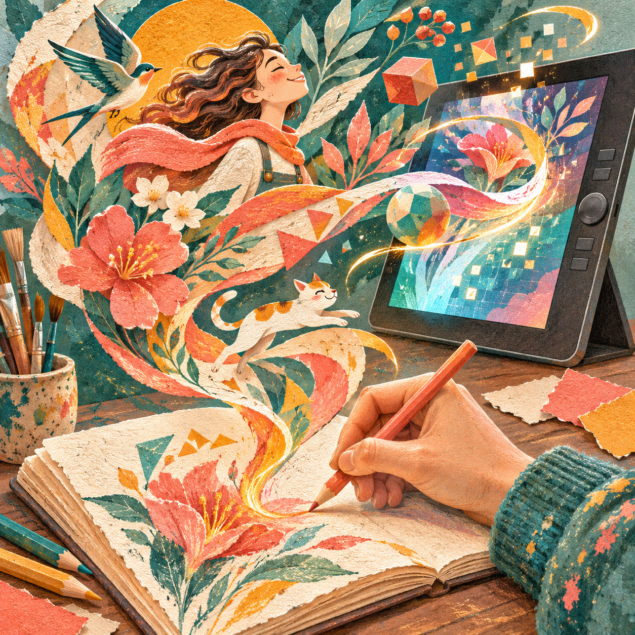
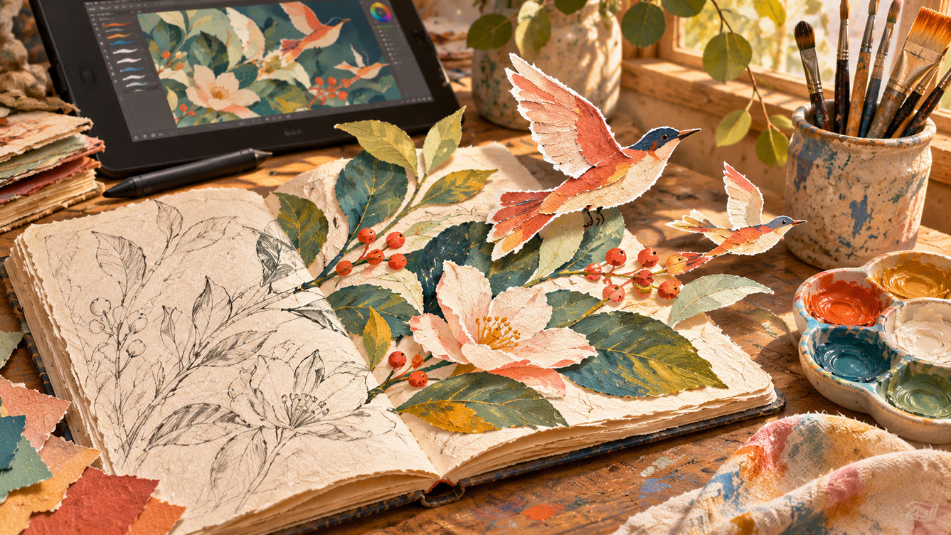
Why Handmade Aesthetics Are Captivating Audiences — Lead workbench plate for Episode 2: an open sketchbook's rough pencil botanical drawing blossoms into richly textured gouache leaves and hand-cut paper birds, with a digital drawing tablet echoing the same tactile artwork in the background. Colour Palette: Deep Teal (#134E4A), Warm Coral (#F26A4B), Golden Ochre (#D99B26), Soft Studio Cream (#F6EFE2)
The Authenticity of Imperfection — Why Handmade Matters Now
Let's be honest — we're all experiencing a bit of visual fatigue. The proliferation of AI-generated imagery has created a landscape where technically perfect visuals are everywhere, and audiences have developed an intuitive ability to sense when something was created by human hands versus algorithmically generated.
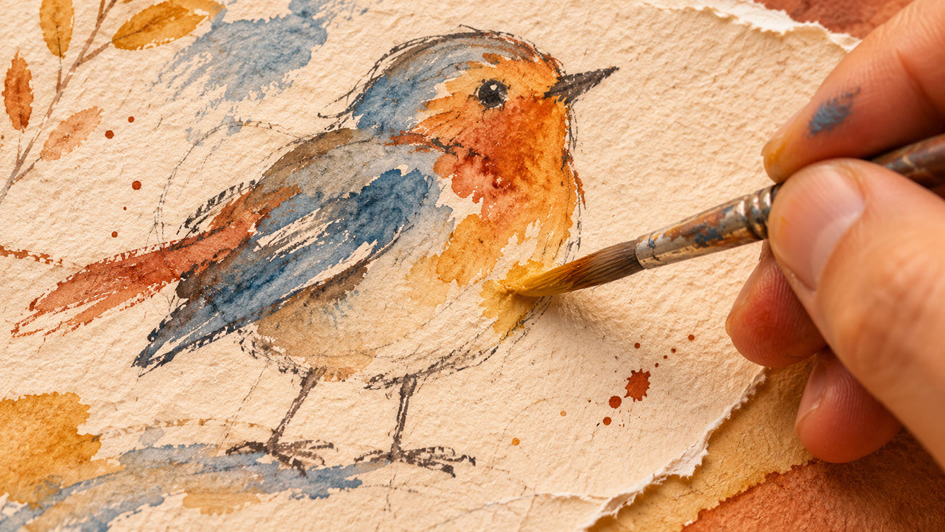
This matters enormously for illustrators. When someone encounters rough pencil marks, uneven outlines, or visible brushstrokes, something shifts in their perception. These visible imperfections communicate care, time, and genuine human intention in ways that polished digital imagery simply cannot match.
Think about why this resonates so deeply. Paper grain visible through digital reproduction tells a story of physical creation. Brushstrokes reveal the actual movement of a hand holding a brush. Natural colour variations from traditional media show that real pigments touched real surfaces. These aren't flaws to be corrected — they're evidence of authentic craftsmanship.
The contrast with overly smooth, perfect imagery is striking. While technical precision has its place, it can feel emotionally cold and distant. Visible imperfections create warmth and approachability, making viewers feel they're connecting with another human being rather than a machine. This distinction between technical skill and soulless precision is becoming increasingly important to commissioners and audiences alike.
 🔍 PLATE 02 — CLICK TO EXPAND
The Authenticity of Imperfection — Why Handmade Marks & Pooled Pigment Matter Now — Close-up craft study for 'The Authenticity of Imperfection — Why Handmade Matters Now': highlighting uneven outlines, pooled watercolour washes, dry-brush streaks, pencil construction lines, and tiny ink splatters on coarse paper. Colour Palette: Ochre Pigment (#D99B26), Soft Slate Blue (#3B6E8C), Russet Coral (#D95F43), Coarse Paper (#F6EFE2)
Combining Traditional Media with Digital Production — A Practical Guide
Now let's get properly practical. The key insight here is that traditional and digital approaches aren't opposing forces — they're beautifully complementary tools. The magic happens when you create original marks by hand whilst leveraging digital tools for colour, composition, and production efficiency.
Creating the Traditional Foundation
Start by selecting traditional media that suits your natural style. Pencil, ink, watercolour, gouache, and charcoal all translate wonderfully when scanned. Work on textured papers that will capture well — smooth Bristol board is fine for clean lines, but if you want that tactile quality, consider watercolour paper, cartridge paper, or even kraft paper.
Here's something crucial: embrace accidents and unexpected marks rather than immediately reaching for the eraser. That wobbly line? That splatter? That moment when the ink bled slightly? These are often the very elements that will make your final piece feel alive and human.
The Digital Integration Process
When scanning your traditional work, resolution matters. Aim for at least 300 dpi for print work, and consider scanning at 600 dpi if you want maximum flexibility for future use. Scan in colour mode even for black and white work — this gives you more control over tonal adjustments later.
The most common mistake I see is over-processing scanned artwork until it loses the very qualities that made it valuable in the first place. When cleaning up scanned images, resist the urge to smooth everything out. Retain that grain, those natural variations, those slightly irregular edges. Your goal is enhancement, not sterilisation.
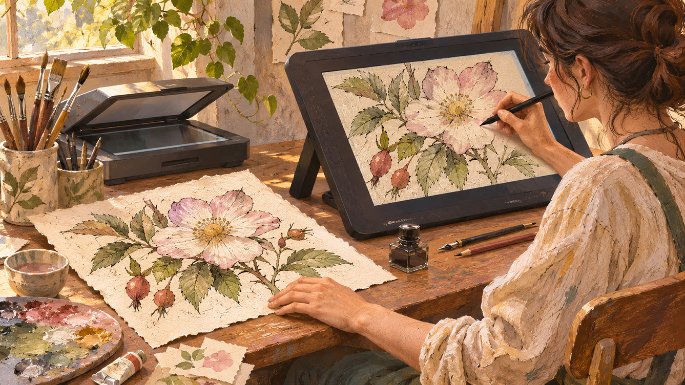
When adding digital colour, work in layers that sit beneath your hand-drawn lines. This preserves the organic quality of your mark-making whilst giving you the flexibility of digital colour adjustment. Blending modes like Multiply for linework allow your traditional marks to interact naturally with digital colour beneath.
 🔍 PLATE 03 — CLICK TO EXPAND
Combining Traditional Media with Digital Production — A Practical Hybrid Workflow — Hybrid workflow guide for 'Combining Traditional Media with Digital Production — A Practical Guide': an artist pairs a physical ink-and-gouache botanical original with a digital pen display that preserves every scratchy line and paper fibre while layering colour underneath. Colour Palette: Deep Teal (#134E4A), Warm Coral (#F26A4B), Golden Ochre (#D99B26), Soft Studio Cream (#F6EFE2)
Scanning Real Textures — Paper, Fabric, Wood and Print Effects
Building a personal texture library is one of the most valuable investments you can make in your practice. These scanned textures become unique assets that distinguish your work and add genuine tactile quality to digital pieces.
Materials Worth Scanning
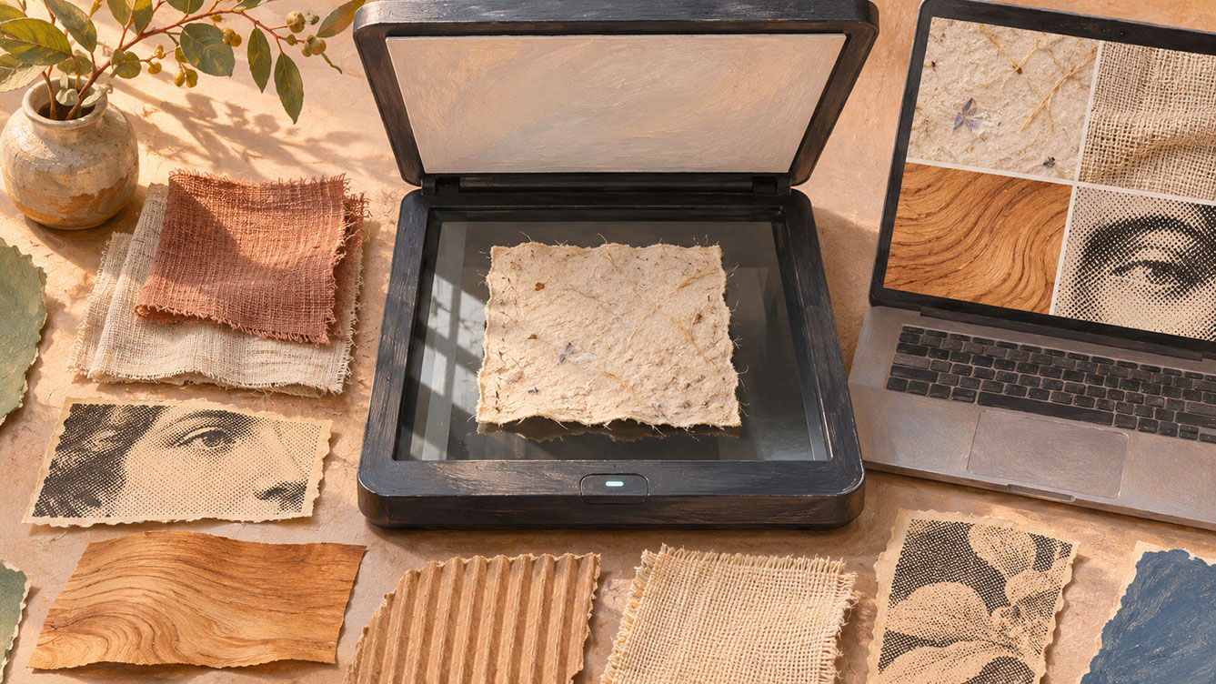
Consider collecting and scanning handmade papers with visible fibres and irregular surfaces, fabric swatches with interesting weaves and patterns, wood grain samples showing natural variations, vintage print materials with their characteristic dot patterns and imperfections, cardboard and corrugated surfaces, and canvas textures. Charity shops and craft suppliers are goldmines for interesting materials.
Scanning Techniques for Maximum Authenticity
When scanning three-dimensional textures like fabric or wood, experiment with scanner lid positioning. Sometimes leaving the lid slightly open creates subtle shadows that enhance the dimensional quality. For flat materials, ensure even pressure across the surface.
Scan at high resolution — you can always reduce later, but you cannot recover detail that wasn't captured. Consider scanning the same material multiple times at different angles to create variations.
Integrating Textures into Your Work
Use textures as backgrounds, overlays, or masked elements within specific shapes. Blending modes like Multiply, Overlay, and Soft Light each create different relationships between texture and illustration. The key is restraint — a subtle paper grain across an entire piece often works better than heavy texture competing with your main imagery.
Match texture scale to your illustration elements. Enormous wood grain behind delicate linework can overwhelm the composition, whilst appropriately scaled texture enhances without dominating.
 🔍 PLATE 04 — CLICK TO EXPAND
Scanning Real Textures — Paper, Linen Fabric, Wood Veneer & Vintage Halftone Print Effects — Material archive flat-lay for 'Scanning Real Textures — Paper, Fabric, Wood and Print Effects': an open flatbed scanner with fibrous handmade paper surrounded by woven linen swatches, wood veneer grain, corrugated card, and vintage halftone print textures. Colour Palette: Natural Linen (#E5DCCB), Walnut Veneer (#6E4B32), Indigo Swatch (#1E3A5F), Terracotta Card (#C85A3E)
Retaining Natural Variations and Creating a Recognisable Visual Signature
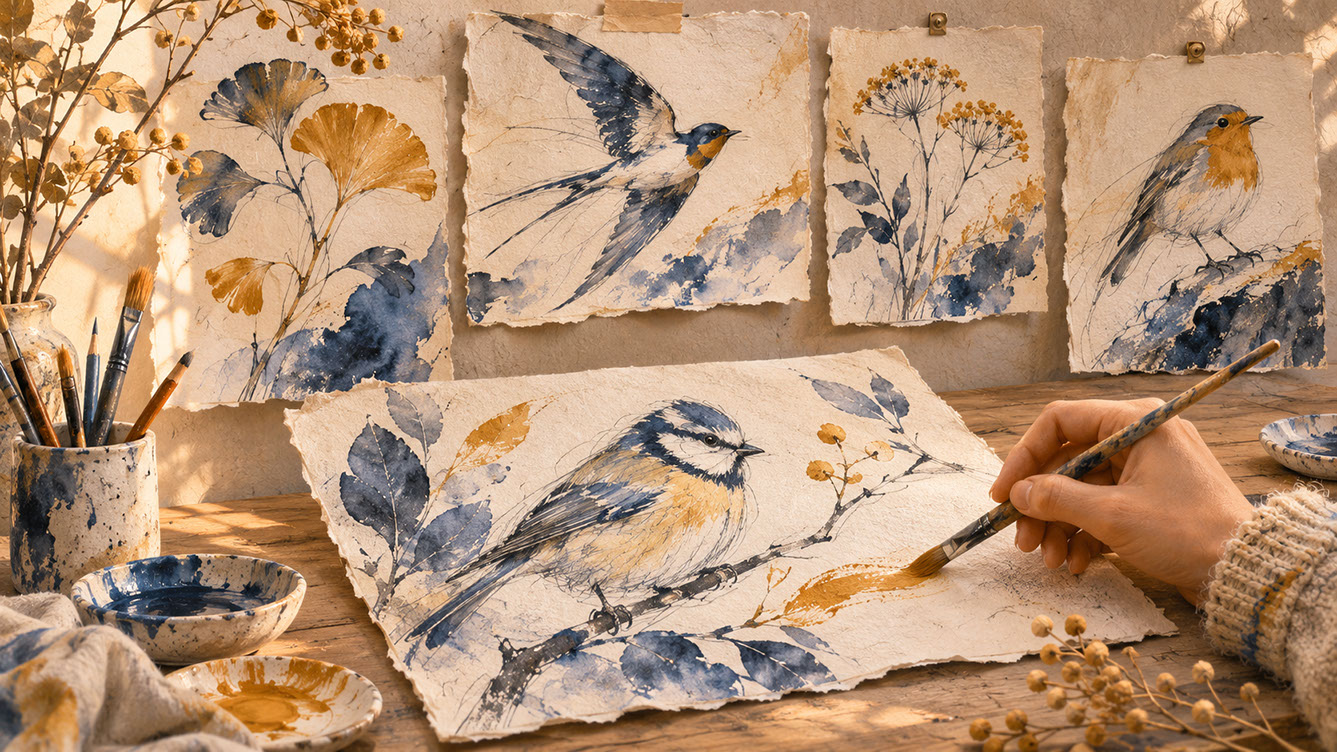
One of the most valuable aspects of embracing tactile qualities is how natural variations become part of your recognisable artistic voice. Rather than striving for rigid uniformity across pieces, consider how consistent approaches to imperfection can actually unify a body of work.
Developing Your Signature Through Intentional Imperfection
Pay attention to which accidents and variations you naturally gravitate towards. Perhaps your lines tend to thicken at the ends of strokes. Maybe your watercolour always pools slightly at certain angles. These aren't problems to solve — they're the beginnings of your visual signature.
Document your natural tendencies and consider amplifying them intentionally. If your pencil work naturally has a scratchy quality, lean into that rather than fighting it. If your brushwork tends towards visible strokes rather than smooth gradients, make that a feature rather than a bug.
Cohesion Across Collections
When creating multiple pieces for a collection — whether for a greetings card range, a children's book, or a pattern collection — your signature imperfections become the thread that ties everything together. Consistent approaches to line weight, texture application, and colour relationships create professional cohesion whilst allowing individual pieces to breathe.
Set boundaries for digital cleanup and stick to them. Decide in advance what you'll remove (genuine errors, unwanted marks) and what you'll preserve (character-giving variations, textural qualities). This prevents the gradual erosion of personality through over-editing.
 🔍 PLATE 05 — CLICK TO EXPAND
Retaining Natural Variations and Creating a Recognisable Visual Signature — Portfolio consistency study for 'Retaining Natural Variations and Creating a Recognisable Visual Signature': a studio wall and tabletop displaying a family of bird and botanical artworks unified by scratchy pencil contours, pooled indigo washes, and ochre dry-brush accents. Colour Palette: Pooled Indigo (#1E3F5A), Ochre Dry-Brush (#DC9B28), Coral Accent (#E86044), Warm Paper (#F5EFE2)
Limited Palettes and Intentional Constraints as Creative Tools
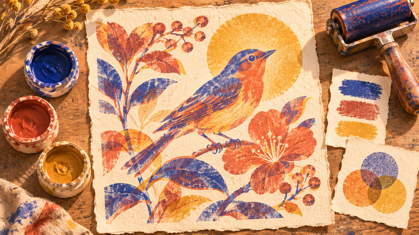
There's genuine creative power in limitation. Working with restricted colour palettes — perhaps three to five colours as your foundation — forces more thoughtful colour relationships and creates natural harmony across collections.
Limited palettes connect beautifully to traditional print processes like risograph, screen printing, and letterpress, all of which naturally involve working with fewer colours. This aesthetic resonates with contemporary audiences who appreciate sustainable, considered design approaches.
When developing limited palettes, consider using your paper or background colour as an active element rather than simply white space. Allow tonal variations within your restricted palette — a single blue can appear in multiple tones whilst still maintaining palette discipline. This approach creates sophisticated visual interest without colour chaos.
 🔍 PLATE 06 — CLICK TO EXPAND
Limited Palettes and Intentional Constraints as Creative Tools — Risograph Overprint Study — Disciplined colour study for 'Limited Palettes and Intentional Constraints as Creative Tools': a printmaker's worktable showcasing a bold botanical-and-bird risograph print created with just three transparent inks—deep ultramarine, terracotta red, and golden ochre—plus warm cream paper negative space. Colour Palette: Ultramarine Ink (#1D3B8B), Terracotta Red (#D14E38), Golden Ochre (#E09F2A), Unbleached Cream (#F6EFE2)
Commercial Applications — Where Tactile Illustration Thrives
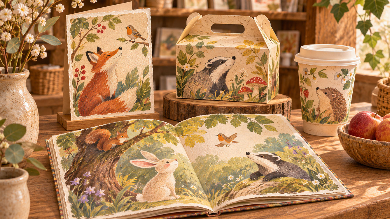
Tactile illustration isn't just aesthetically pleasing — it's commercially powerful across numerous sectors.
Greetings Cards and Stationery
The handmade aesthetic aligns perfectly with the personal nature of card-giving. When someone purchases a greeting card, they're often seeking something that feels thoughtful and considered. Visible brushstrokes and pencil marks communicate exactly the kind of care appropriate for personal communication. The tactile quality of the illustration creates coherence with the physical product being held.
Children's Publishing
Children respond beautifully to warmth and accessibility in imagery. Visible brushstrokes create engaging visual texture that holds attention, whilst hand-drawn aesthetics feel friendlier than clinical digital perfection. In a crowded publishing market, distinctive tactile work helps books stand out on shelves and creates memorable reading experiences.
Independent Packaging
Small batch and artisan brands increasingly seek visual language that matches their values. Whether it's food packaging, cosmetics, or craft products, handmade illustration aesthetics communicate quality and care in ways that reinforce brand positioning. The imperfection says this product was made with attention and intention.
Lifestyle Branding
Boutique hotels, independent cafés, and small retailers are discovering that tactile illustration creates distinctive brand identities that feel premium without being corporate. This positioning enables higher perceived value whilst maintaining approachability.
When working with commercial clients, communicate clearly about the value of imperfection. Help them understand that those visible marks and variations aren't laziness — they're the very qualities that will make their products feel authentic and human.
 🔍 PLATE 07 — CLICK TO EXPAND
Commercial Applications — Where Tactile Illustration Thrives Across Packaging & Publishing — Retail merchandising study for 'Commercial Applications — Where Tactile Illustration Thrives': an artisan shop shelf displaying a greeting card, open children's book, food packaging carton, and café cup united by hand-painted woodland illustration with visible gouache grain. Colour Palette: Deep Teal (#134E4A), Warm Coral (#F26A4B), Golden Ochre (#D99B26), Soft Studio Cream (#F6EFE2)
Wrapping Up
The return of the human hand in illustration isn't nostalgia — it's a direct response to our current visual landscape. As AI-generated imagery becomes ubiquitous, visible craftsmanship and authentic imperfection have become powerful differentiators.
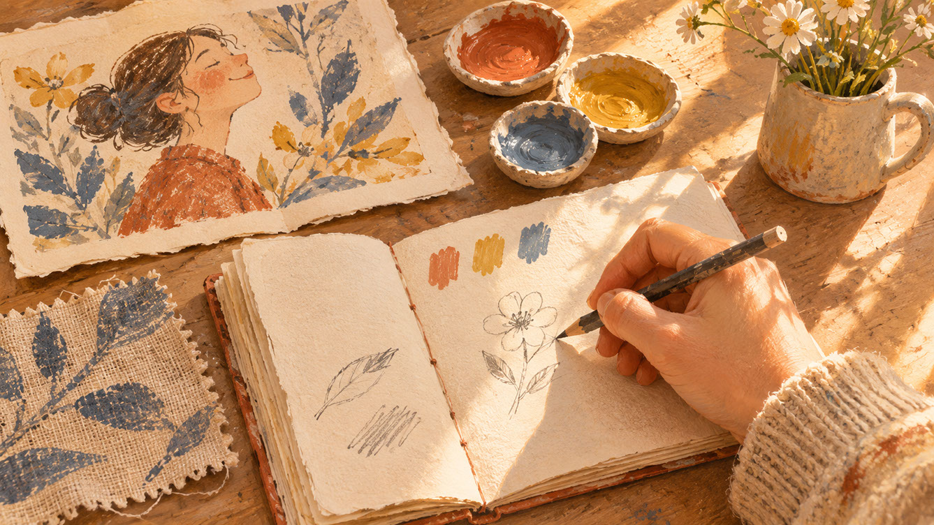
You don't need to completely transform your workflow overnight. Start small: scan a texture you love, embrace an accidental mark, experiment with a limited palette. These incremental steps build towards a more tactile, more personal, more human approach to your illustration practice.
The most memorable illustration of 2027 won't necessarily be the most technically sophisticated — it will be work that combines distinctive craftsmanship with genuine emotional resonance. Your imperfections, when intentional and skilful, become the very qualities that make your work unforgettable.
 🔍 PLATE 08 — CLICK TO EXPAND
Wrapping Up — Embracing Distinctive Craftsmanship & Imperfection in 2027 — Closing reflection plate for 'Wrapping Up': morning sunlight falls across an artist's hand beginning a fresh sketchbook drawing beside a woven fabric texture sample, three gouache pigment pots, and a completed handmade bird illustration. Colour Palette: Deep Teal (#134E4A), Warm Coral (#F26A4B), Golden Ochre (#D99B26), Soft Studio Cream (#F6EFE2)
⚡ 5 Strategies to Consider
STUDIO PLAYBOOK // 5 DIRECTIVES❓ Frequently Asked Questions — 5 Q&As (5 Q&As)
SCHEMA.ORG/FAQPAGE // 5 Q&As (5 Q&As)Q1. How do I maintain tactile qualities when my final delivery must be digital?
Preserve texture through high-resolution scanning at 300-600 dpi, retain grain and natural variations during digital cleanup, and use file formats that maintain quality such as TIFF or high-quality PNG. Avoid over-processing or smoothing algorithms that remove the organic qualities you've created. When adding digital colour, work in layers beneath your scanned linework using blending modes like Multiply to preserve the authentic texture of your traditional marks.
Q2. Will handmade aesthetics work for corporate clients who typically prefer polished imagery?
Yes, increasingly so. Many corporate clients are recognising that authentic, handcrafted imagery creates stronger emotional connections with audiences than overly polished digital work. The key is communicating the intentional value of visible craftsmanship and demonstrating how it aligns with brand values around authenticity, quality, and human connection. Boutique hotels, lifestyle brands, and even larger companies seeking to appear more approachable are embracing tactile illustration.
Q3. What equipment do I need to start scanning textures and traditional artwork effectively?
A flatbed scanner capable of at least 300 dpi resolution is essential, with 600 dpi being preferable for maximum flexibility. Look for a scanner with a large enough bed for your typical artwork sizes. Beyond the scanner, you'll need image editing software for adjustments, good lighting if photographing larger pieces, and storage for your growing texture library. Quality matters more than quantity — a reliable mid-range scanner will serve most illustrators well.
Q4. How imperfect is too imperfect for commercial work?
The distinction lies between charming imperfection and sloppy execution. Intentional imperfections that add character — uneven lines, visible brushstrokes, paper texture — enhance work. However, genuinely problematic elements like smudges that obscure important details, illegible elements, or marks that read as mistakes rather than style should be addressed. If an imperfection makes viewers question your skill rather than appreciate your style, it's crossed the line.
Q5. What traditional media works best for creating tactile illustration that scans well?
Pencil, ink, watercolour, gouache, and charcoal all translate beautifully when scanned. The key is working on textured papers that capture well — watercolour paper, cartridge paper, or kraft paper add tactile quality. Avoid very dark or heavily textured papers that may create scanning difficulties. Media with strong contrast and clear marks tend to scan most successfully whilst retaining their handmade character.