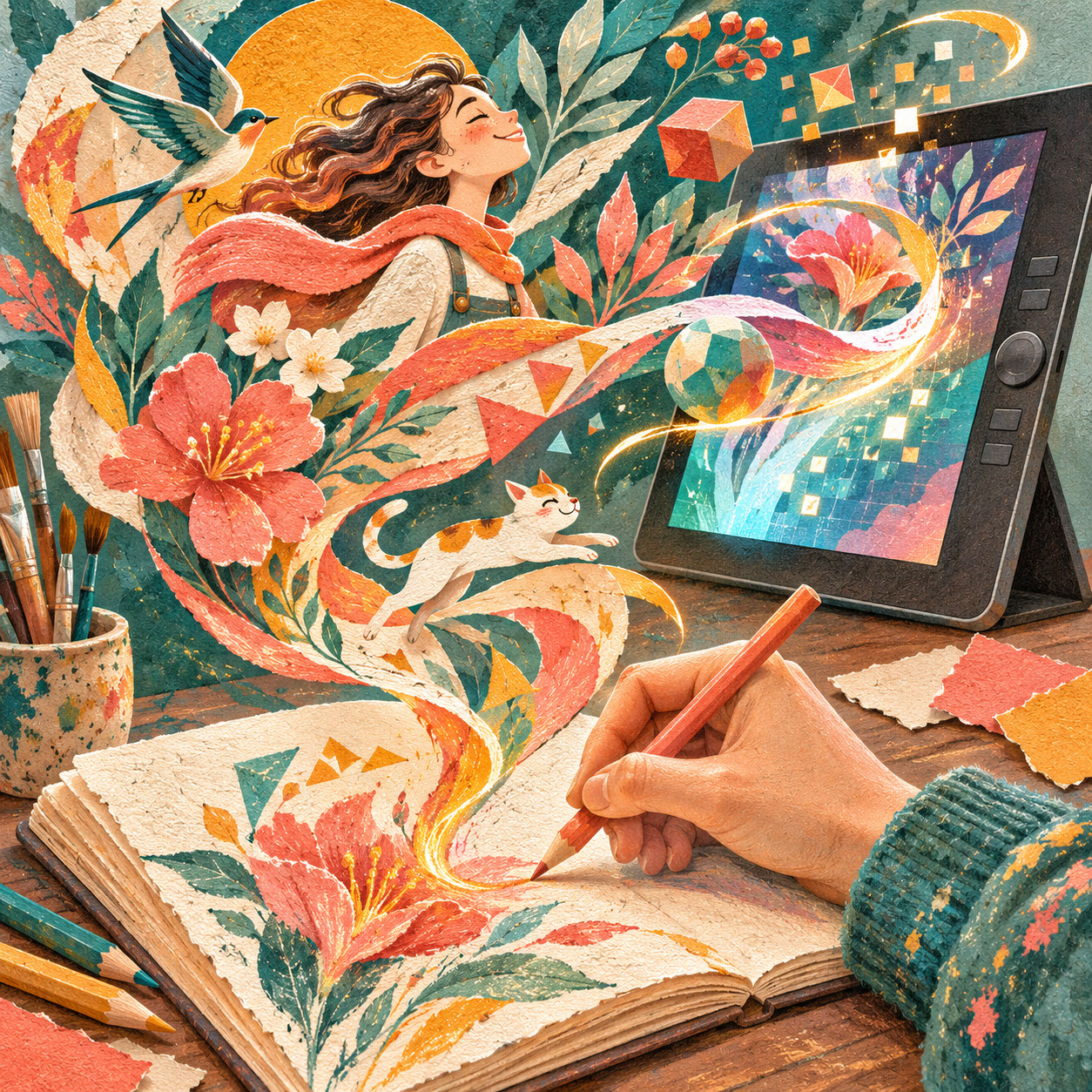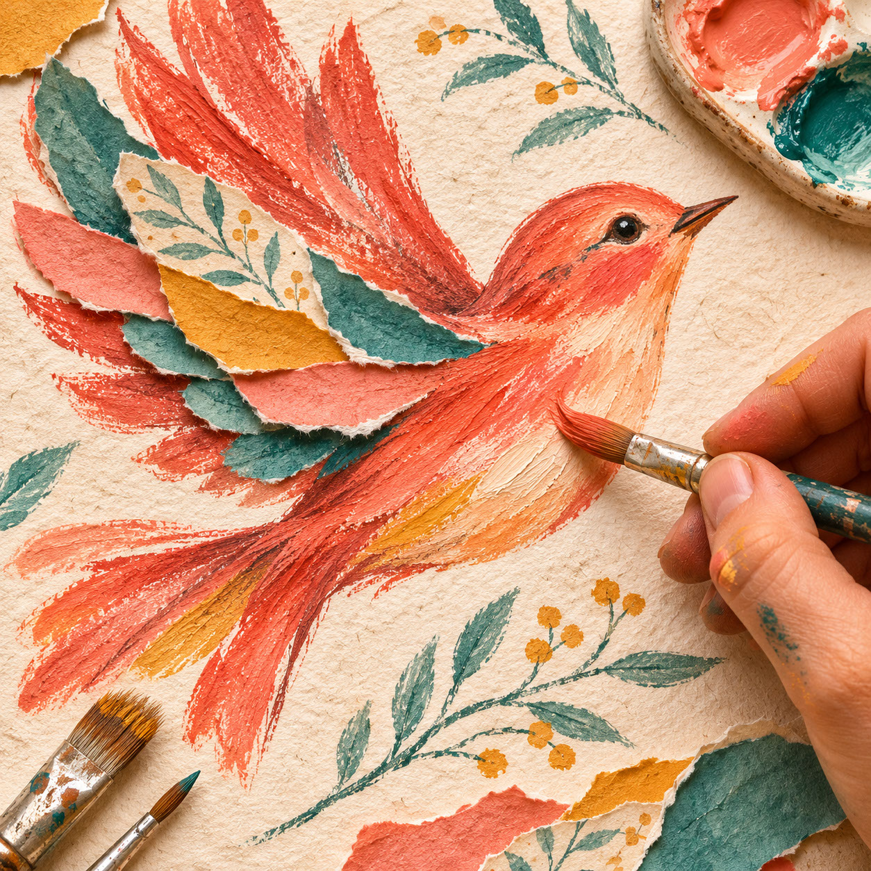
EPISODE 3-Expressive Colour in 2027 Illustration: How Bold Palettes and Emotional Contrasts Are Transforming Visual Design
Discover how 2027 illustration embraces bold colour contrasts and emotional palettes. Learn practical techniques for creating memorable colour systems.
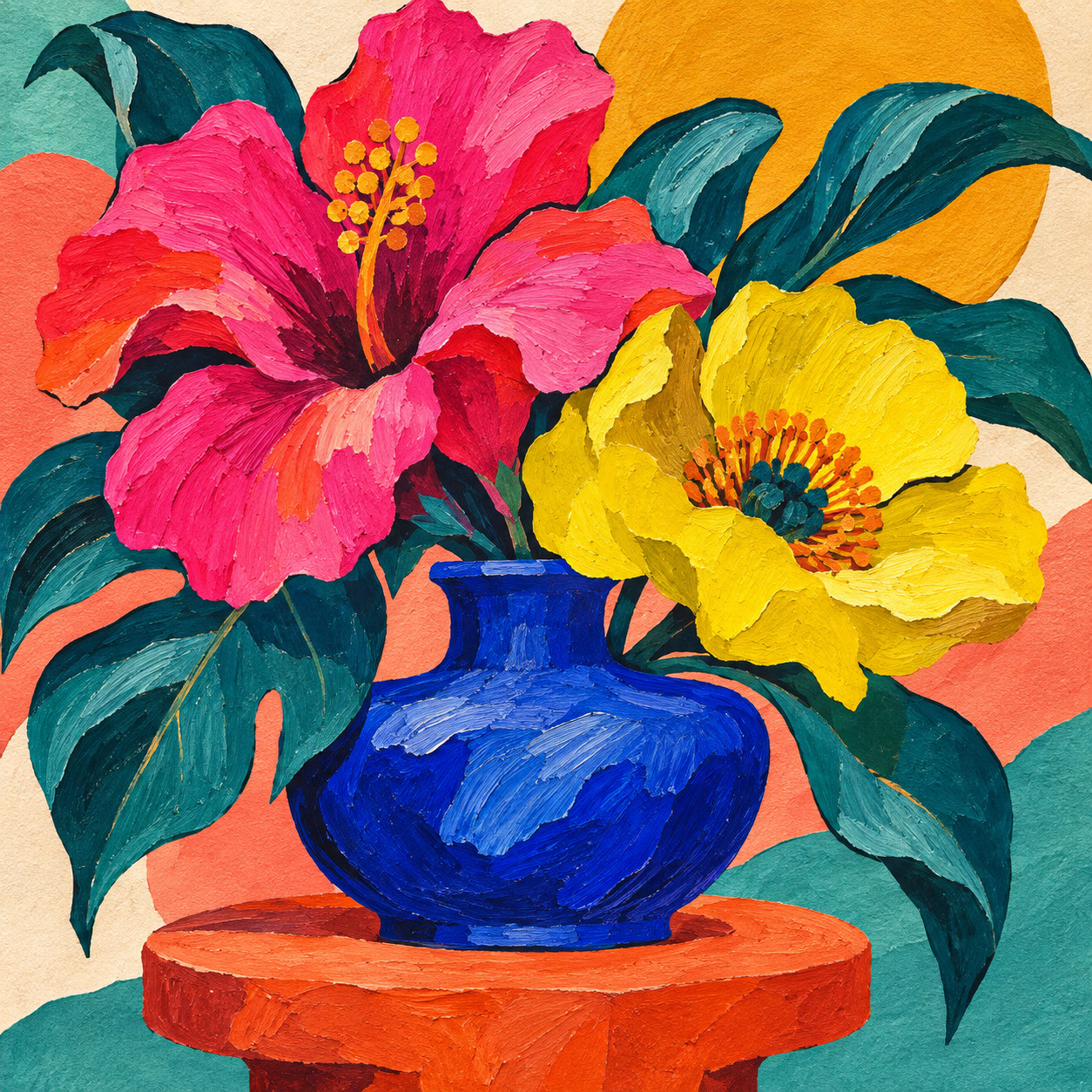 🔍 COVER PLATE — CLICK TO EXPAND
Square hero cover for Episode 3 ('Expressive Colour in 2027 Illustration: How Bold Palettes and Emotional Contrasts Are Transforming Visual Design'): a sculptural botanical still-life pairing an electric-pink flower and acid-yellow bloom with deep teal leaves, a cobalt-blue vessel, and a terracotta pedestal.
Have you noticed how colour has evolved from a simple decorative choice to something far more powerful in contemporary illustration? In 2027, we're witnessing a fascinating shift where illustrators are abandoning safe, predictable palettes in favour of bolder, more emotionally intentional colour choices. It's a thrilling development, and one that's reshaping how visual communication connects with audiences.
This isn't merely about following the latest colour trends or picking shades that look pretty together. Instead, it's about understanding colour as a strategic creative tool—one that communicates specific emotions, creates instant memorability, and drives commercial success. Whether you're creating greetings cards, editorial illustrations, packaging designs, or digital content, mastering expressive colour could be the difference between work that fades into the background and work that genuinely resonates.
Let's explore why 2027's boldest illustrators are embracing expressive colour systems, and discover practical techniques you can apply to your own creative practice.
 🔍 PLATE 01 — CLICK TO EXPAND
Bold Palettes and Emotional Contrasts — Lead editorial plate for Episode 3: an imaginative botanical landscape flows out of an open sketchbook, combining grounded moss and deep-teal leaves with electric-pink blooms, acidic-yellow accents, synthetic-blue shapes, and confident dark contours. Colour Palette: Deep Teal (#124E4A), Moss Green (#3F6A4E), Electric Pink (#FF3385), Acid Yellow (#E5FF00), Terracotta (#D46246)
Why Neutral Has Lost Its Edge
For years, we've seen an oversaturation of what might charitably be called 'safe' colour choices. Endless dusty pinks, muted greys, predictable earth tones—these palettes dominated everything from Instagram feeds to high street packaging. And whilst there's nothing inherently wrong with these choices, they've created a kind of visual fatigue. Audiences have become so accustomed to these comfortable combinations that they've stopped really seeing them.
Here's the paradox: in a world of infinite colour options, many illustrators had retreated to the same narrow range of predictable palettes. But something interesting has happened. As digital platforms become increasingly crowded and AI-generated imagery raises the stakes for distinctive visual work, audiences are craving colour combinations that surprise, energise, and communicate specific emotional messages.
The result? A deliberate move towards expressive colour—palettes that balance ecological authenticity with digital boldness, creating work that feels both grounded and contemporary.
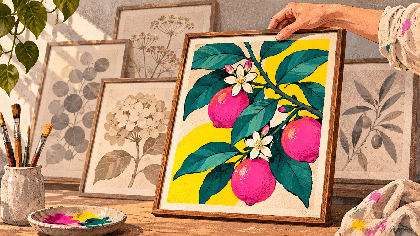 🔍 PLATE 02 — CLICK TO EXPAND
Why Neutral Has Lost Its Edge — Breaking Away from Predictable Beige Palettes — Visual contrast study for 'Why Neutral Has Lost Its Edge': an illustrator places a bold botanical print featuring deep teal leaves, electric-pink fruit, and acid-yellow accents in the foreground, standing out instantly against muted beige and grey prints behind. Colour Palette: Electric Pink (#FF2E88), Deep Teal (#134E4A), Acid Yellow (#D8F800), Muted Stone (#C8C2B8)
The Two Colour Families Defining 2027
Nature-Grounded Tones
The first colour family drawing significant attention in 2027 illustration consists of deep, nature-grounded tones. These colours create emotional resonance by connecting viewers to natural materials and sustainable values—particularly relevant for brands positioning themselves around environmental consciousness.
Deep Teal suggests depth, contemplation, and environmental awareness. It's a colour that feels both sophisticated and connected to the natural world, evoking deep ocean waters and ancient forests.
Moss Green communicates growth, renewal, and connection to natural cycles. There's something inherently hopeful about moss—it speaks to resilience and the quiet persistence of nature.
Clay and Terracotta bring warmth, heritage, and earthbound authenticity. These mineral-rich tones feel handcrafted and human, suggesting traditional making processes and cultural depth.
Mineral Shades—stone greys, slate blues, and ochres—suggest permanence and geological time. They ground compositions and provide a sense of stability that complements more vibrant choices.
Digitally-Influenced Brights
The second colour family couldn't be more different, yet works beautifully in tension with those ecological tones. These digitally-influenced brights cut through visual noise and create instant memorability.
Electric Pink introduces playfulness, confidence, and contemporary energy. It's unapologetically bold and refuses to be ignored—perfect for work that needs to stand out in crowded social media feeds.
Acidic Yellow creates urgency, optimism, and visual disruption. This isn't the soft, buttery yellow of traditional illustration; it's sharp, attention-grabbing, and decidedly modern.
Synthetic Blue suggests technology, innovation, and forward-thinking perspectives. It's a colour that feels distinctly of our digital moment whilst remaining versatile enough for various applications.
The Magic of Combination
Here's where it gets really interesting: the most compelling 2027 palettes don't choose one family over another. Instead, they create deliberate tension between ecological groundedness and digital vibrancy. Imagine deep teal paired with electric pink, or clay tones offset by acidic yellow accents. These combinations allow work to feel both authentic and contemporary—rooted in natural values whilst embracing modern visual culture.
 🔍 PLATE 03 — CLICK TO EXPAND
The Two Colour Families Defining 2027 — Ecological Earth Tones Meet Digital Brights — Dual-palette study for 'The Two Colour Families Defining 2027': grounding ecological tones (moss green, deep teal, terracotta clay, and slate mineral) woven with synthetic digital brights (electric pink, acidic yellow, and cobalt blue) in a single balanced still-life. Colour Palette: Moss Green (#3A6348), Clay Terracotta (#C95B40), Electric Pink (#FF3385), Synthetic Blue (#2563EB)
Practical Palette Construction Techniques
The Role of Dark Outlines
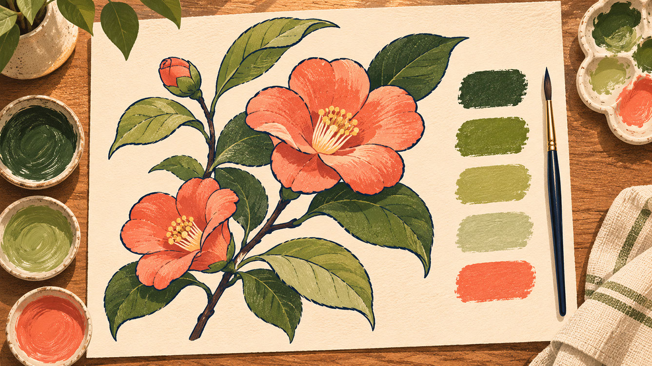
One technique that's proving particularly effective in 2027 illustration is the strategic use of dark outlines. Strong, dark outlines (not necessarily black—deep navy, dark brown, or even deep purple can work beautifully) make bright colours appear more graphic and defined.
This creates what we might call a 'containment effect'—the outlines prevent colours from bleeding into visual chaos, making the overall composition feel more intentional and controlled. The result is more memorable, reproducible imagery that works effectively across both print and digital formats.
When choosing outline colours, select tones that complement rather than compete with your palette selections. A warm brown outline, for instance, can soften the impact of cool brights, whilst a dark teal outline might enhance ecological colour families.
Tonal Palettes for Editorial Calm
Not every illustration calls for maximum colour impact. For sophisticated, restrained work—think book covers, magazine illustration, premium packaging, or editorial contexts—tonal palettes offer tremendous power.
These palettes use variations of a single colour family, creating subtle shifts in value rather than dramatic colour contrasts. The effect communicates professionalism, contemplation, and editorial authority. A composition using five values of moss green, for instance, can feel both cohesive and visually interesting.
The technique involves selecting three to five values within one colour family, plus one carefully chosen accent. This accent—perhaps a warm coral against those moss greens—provides visual interest without disrupting the overall calm.
Breathing Space and Visual Rest
Even the boldest palettes need breathing space. Soft tinted neutrals—cream, warm grey, muted stone tones—play an essential role in preventing visual exhaustion. These colours allow your hero tones to dominate whilst supporting colours recede appropriately.
Think of it as creating visual hierarchy: bold colours attract attention, whilst neutral areas provide rest for the eye. A practical ratio might be 60% dominant colours, 25% supporting tones, and 15% neutral breathing space—though this naturally varies depending on the specific application and intended mood.
 🔍 PLATE 04 — CLICK TO EXPAND
Practical Palette Construction Techniques — Tonal Variation, Dark Outlines & Breathing Space — Technical colour blueprint for 'Practical Palette Construction Techniques': an overhead worktable displaying a finished botanical artwork built from tonal moss greens, crisp dark-navy outlines, a single controlled coral focal accent, and generous cream paper breathing space. Colour Palette: Tonal Moss (#2E5A44), Sage Green (#6B947A), Dark Navy Outline (#162032), Focal Coral (#F06048)
Designing for Emotional Clarity
The most effective colour systems in 2027 are those designed for emotional clarity rather than mere aesthetic novelty. This means choosing colours because they communicate specific emotions, not because they're currently trending.
Developing Your Colour System
Start with the emotional message: what should viewers feel when they encounter your work? Calm and contemplative? Energised and playful? Sophisticated and premium? Your answer guides everything that follows.
Select a dominant colour family that anchors that emotion. If you want viewers to feel grounded and environmentally conscious, ecological tones might lead. If energy and contemporary relevance matter more, digitally-influenced brights could dominate.
Add contrasting accents that create energy or tension. Even a predominantly calm palette benefits from moments of visual surprise. Include neutral breathing space for visual hierarchy, then test across your intended applications before finalising.
The Emotional Clarity Test
Here's a useful benchmark: can someone unfamiliar with your work describe the mood your palette creates in three words? If friends or colleagues struggle to articulate the emotional impact, your colour system may lack sufficient focus. This doesn't mean simplifying to the point of boredom—it means ensuring your colour choices work together towards a clear emotional purpose.
 🔍 PLATE 05 — CLICK TO EXPAND
Designing for Emotional Clarity — Aligning Colour Psychology with Narrative Mood — Mood-driven editorial illustration for 'Designing for Emotional Clarity': a calm figure seated amidst broad deep-teal and moss-green foliage on warm clay ground holds a single luminous coral bloom, demonstrating how restrained colour choices evoke grounded optimism. Colour Palette: Calm Teal (#14524E), Grounded Clay (#C86D52), Luminous Coral (#F46B52), Soft Cream (#F6EFE2)
Colour's Commercial Impact
Colour is often the first element audiences respond to—before style, subject matter, or composition register consciously. This makes palette choices incredibly important for commercial success.
Distinctive colour palettes create instant brand recognition and memorability. Think about how quickly you can identify certain illustrators purely from their characteristic colour approaches. This recognition compounds over time, building audience connection and commercial value.
Applications Across Markets
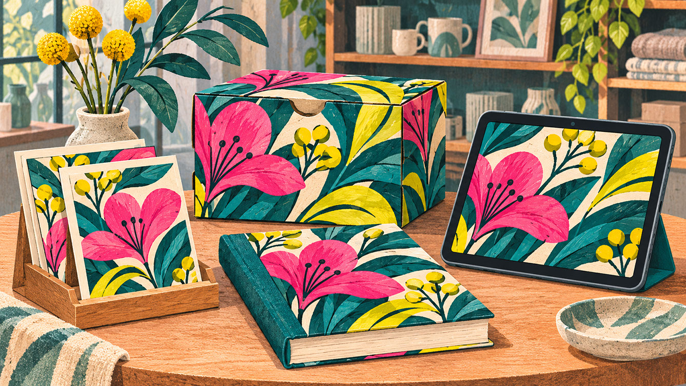
Greetings Cards and Stationery: Colour drives impulse purchasing decisions in this sector. Bold, unexpected combinations catch the eye on crowded shop displays, whilst emotional resonance encourages customers to pick up and purchase.
Packaging Design: Creating shelf standout through unexpected colour combinations has become increasingly important as markets become more competitive. Colours that surprise within appropriate category expectations tend to perform well.
Editorial and Publishing: Colour communicates genre, tone, and target readership before a single word is read. A children's book cover uses colour differently than literary fiction, and getting this right influences purchasing decisions significantly.
Digital Content: Bold palettes perform strongly in social media feeds where attention is fleeting and competition is intense. Colours that photograph well and translate effectively across different screen types have practical advantages.
 🔍 PLATE 06 — CLICK TO EXPAND
Colour's Commercial Impact — Shelf Standout & Brand Recognition Across Print and Digital — Commercial merchandising plate for 'Colour's Commercial Impact': a coordinated collection of greeting cards, packaging, publishing, and digital display in deep teal, electric pink, and acid yellow commands immediate attention against muted background merchandise. Colour Palette: Deep Teal (#134E4A), Electric Pink (#FF2E88), Acid Yellow (#D9F800), Studio Cream (#F5EFE2)
Bringing It All Together
Expressive colour in 2027 illustration represents a deliberate move away from safe, predictable choices towards palettes that communicate with emotional intention and creative boldness. The productive tension between ecological, grounded tones and digitally-influenced brights creates work that feels both authentic and contemporary.
Consider auditing your current colour approaches. Are your palettes serving emotional and commercial purposes, or simply defaulting to comfortable choices? There's nothing wrong with comfort, but there's tremendous opportunity in strategic boldness.
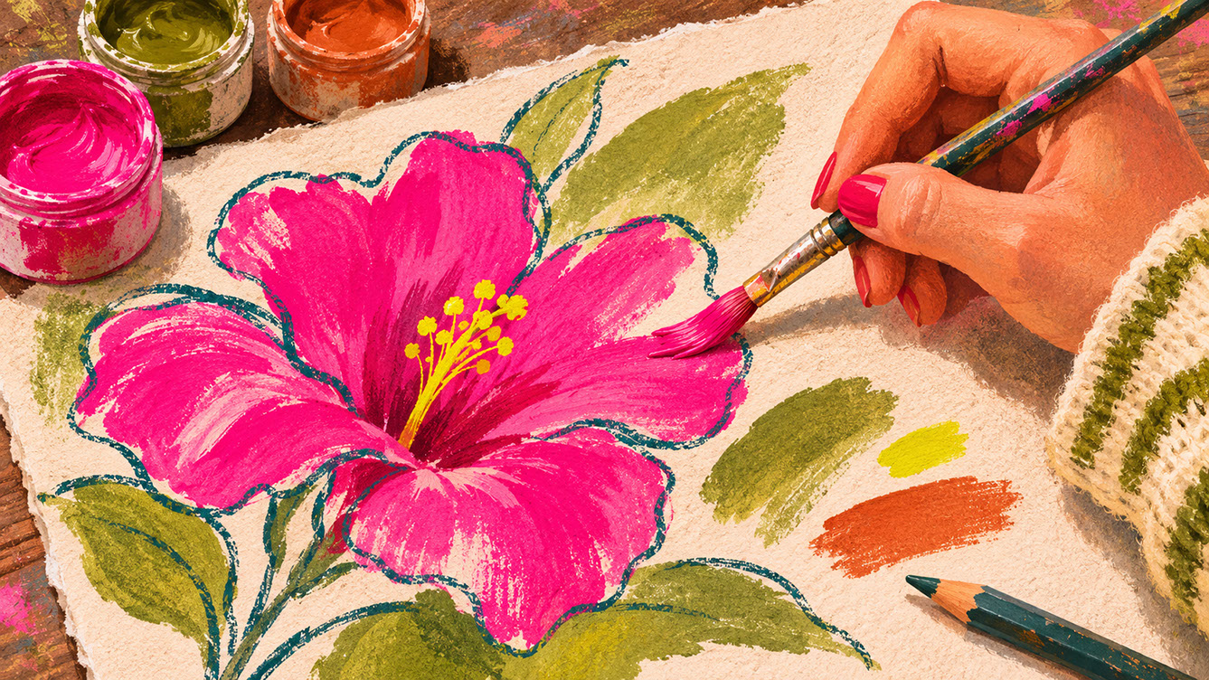
The tactile qualities we explored in Episode 2—those beautiful handmade textures and visible brushstrokes—come alive even more powerfully when combined with expressive colour approaches. Rough pencil marks in deep teal, uneven outlines containing electric pink, paper grain visible beneath moss green washes: these combinations create work with both physical presence and emotional impact.
Colour isn't decoration—it's communication. In 2027, the illustrators creating the most memorable, commercially effective work are those approaching colour as a strategic creative tool with genuine emotional power. The question isn't whether to embrace bolder colour choices, but how to do so in ways that serve your unique creative voice and commercial goals.
 🔍 PLATE 07 — CLICK TO EXPAND
Bringing It All Together — Empowering Personal Voice Through Strategic Bold Colour — Closing studio study for 'Bringing It All Together': an illustrator's hand paints a vivid electric-pink bloom within uneven deep-teal pencil contours surrounded by moss-green washes, a small acid-yellow highlight, and terracotta swatches. Colour Palette: Electric Pink (#FF2E88), Deep Teal (#134E4A), Moss Wash (#3E6B4E), Acid Yellow (#DAF800)
⚡ 5 Strategies to Consider
STUDIO PLAYBOOK // 5 DIRECTIVES❓ Frequently Asked Questions — 5 Q&As (5 Q&As)
SCHEMA.ORG/FAQPAGE // 5 Q&As (5 Q&As)Q1. How do I develop a distinctive colour palette without it feeling forced or trendy?
Ground your colour choices in emotional intention rather than current fashions. Start by asking what you want viewers to feel, then select colours that authentically communicate those emotions. Palettes rooted in genuine creative purpose remain relevant far longer than those chasing temporary trends. Focus on building a colour signature that reflects your artistic voice rather than copying what's popular.
Q2. Should I stick to one colour palette across all my illustration work?
Consistency creates recognition, but rigidity limits creative growth. Consider developing a colour signature—a core approach or recurring colour relationship—whilst allowing variation for different projects and contexts. This balance gives you brand recognition whilst maintaining the flexibility to respond appropriately to different briefs and creative challenges.
Q3. How many colours should a working illustration palette include?
Most effective illustration palettes contain five to seven colours: two to three dominant tones that carry the main emotional message, one to two accents that create energy or surprise, and two to three neutrals for breathing space and visual hierarchy. This provides sufficient variety for interesting compositions whilst maintaining cohesion across a body of work.
Q4. How do I ensure my bold colours reproduce accurately across print and digital formats?
Test your palettes across all intended applications early in the development process. Build relationships with printers and request proofs before committing to final artwork. Learn which specific colours shift between screen and physical reproduction—certain bright pinks and electric blues are particularly notorious for printing differently than expected. Digital proofing can help, but physical tests remain essential for print work.
Q5. What is the role of dark outlines in making bold colours more effective?
Strong dark outlines create a containment effect that makes bright colours appear more graphic and defined. They prevent colours from bleeding into visual chaos and create more memorable, reproducible imagery across print and digital formats. Choose outline colours that complement your palette—deep navy, dark brown, or even deep purple can work beautifully depending on your other colour choices.