EPISODE 5-Collage, Layering and Visual Maximalism: 7 Essential Techniques for Creating Richly Textured Illustrations in 2027
Discover how collage and visual maximalism are transforming illustration in 2027. Learn layering techniques, hierarchy strategies and commercial applications.
 🔍 COVER PLATE — CLICK TO EXPAND
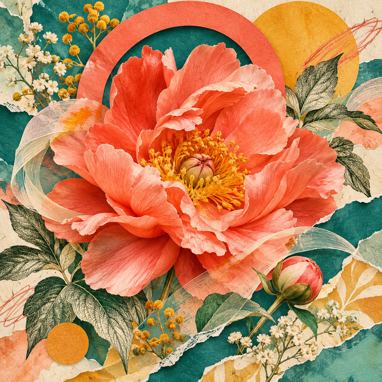
Square hero cover for Episode 5 ('Collage, Layering and Visual Maximalism: 7 Essential Techniques for Creating Richly Textured Illustrations in 2027'): an oversized photographic coral flower layered with vintage-style engraved leaves, torn teal paper, ochre circles, and a bold cut-paper arch.
There's something utterly captivating about encountering an illustration so richly layered that you discover new details with every viewing. Perhaps it's a fragment of vintage typography peeking through painted brushstrokes, or a photographic element seamlessly woven between hand-drawn shapes. These compositions reward closer inspection, inviting viewers to linger and explore rather than simply glance and scroll past.
After years dominated by minimalist aesthetics and clean digital imagery, 2027 is witnessing a delightful rebellion. Visual maximalism is having its moment, and collage techniques are at the heart of this creative renaissance. Audiences are increasingly drawn to compositions that tell multiple stories simultaneously, combining unexpected elements into cohesive wholes that feel both fresh and nostalgically familiar.
This approach beautifully complements the tactile qualities we explored earlier in this series, as well as the bold colour approaches that are defining the year. Yet collage and layering introduce an entirely different structural philosophy—one where contrast, complexity, and careful chaos become your greatest creative allies.
Let's dive into the techniques that will help you master this richly rewarding approach to illustration.
 🔍 PLATE 01 — CLICK TO EXPAND
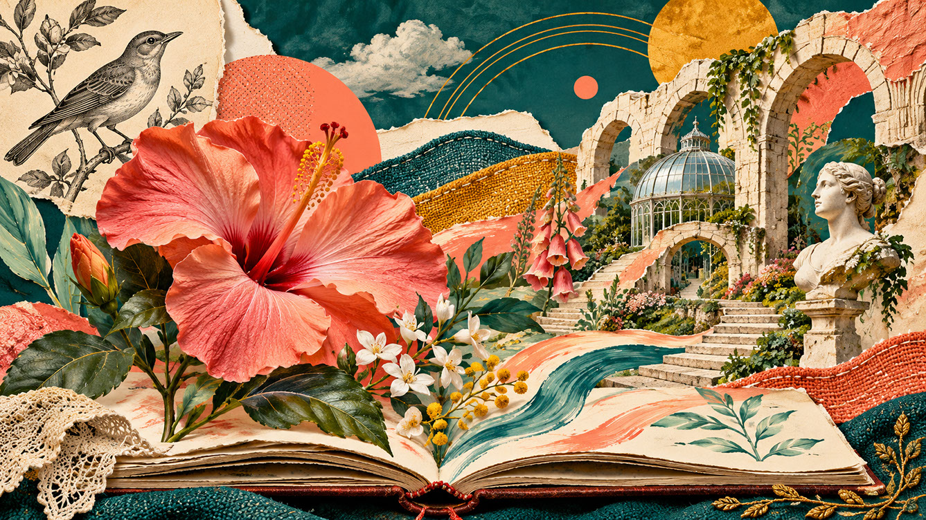
7 Essential Techniques for 2027 — Lead editorial plate for Episode 5: a richly layered garden growing from an open artist's sketchbook unites an oversized photographic flower cutout, torn-paper architecture, gouache botanical leaves, an archival-style bird engraving, and fabric-textured hills. Colour Palette: Deep Teal (#134E4A), Warm Coral (#F26A4B), Golden Ochre (#D99B26), Soft Studio Cream (#F6EFE2)
Why Disparate Elements Create Powerful Visual Stories
Our brains are naturally wired to find unexpected combinations compelling. There's a creative tension that emerges when elements that seemingly shouldn't work together are placed in conversation—it creates visual energy that maintains viewer engagement far longer than predictable compositions.
Think about the types of elements you might bring together in a single piece. Scanned materials offer wonderful starting points: vintage papers with their yellowed edges, fabric swatches with woven textures, found ephemera from charity shops and flea markets. Photography adds another dimension entirely—documentary images, personal snapshots, or stock imagery transformed through new contexts.
Typography provides yet another layer of possibility. Hand-lettered elements carry personal warmth, archival type specimens bring historical weight, and contemporary fonts offer crisp modernity. Add painted shapes—gestural brushwork, geometric forms, textural marks—alongside digital fragments like gradients, vector elements, or even interface components, and suddenly you've got an extraordinary visual vocabulary at your fingertips.
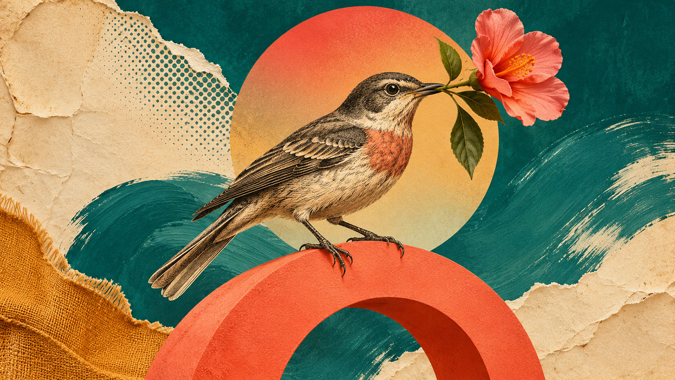
The dialogue between old and new proves particularly powerful. Archival references bring historical depth and nostalgic resonance that audiences find emotionally compelling. Vintage print textures—letterpress effects, aged paper, faded inks—create instant atmosphere whilst contemporary elements keep the work feeling relevant and fresh.
 🔍 PLATE 02 — CLICK TO EXPAND
Why Disparate Elements Create Powerful Visual Stories — Old and New Media in Dialogue — Juxtaposition study for 'Why Disparate Elements Create Powerful Visual Stories': an archival-style engraved bird perches on a contemporary bright-coral geometric arch carrying a photographic flower against torn aged paper and gestural teal gouache. Colour Palette: Deep Teal (#134E4A), Warm Coral (#F26A4B), Golden Ochre (#D99B26), Soft Studio Cream (#F6EFE2)
Building Your Visual Library
Successful collage illustration begins long before you start composing. Building a robust visual library becomes essential to developing a distinctive practice.
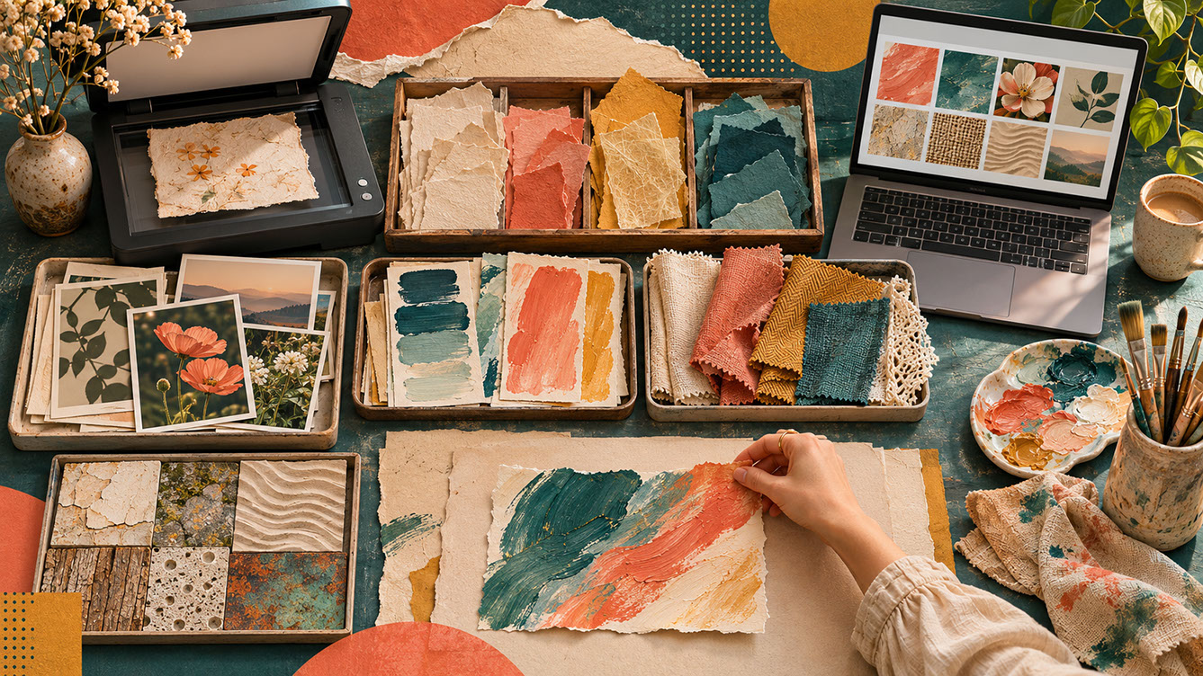
Start collecting physical materials with intention. Scan found papers, vintage magazines, and packaging ephemera at high resolution—you'll need that flexibility when it comes to production. Create original painted textures specifically for digital collage; these become uniquely yours and impossible to replicate. Photograph interesting surfaces wherever you encounter them: weathered walls, wooden floors, interesting fabrics, natural materials with compelling textures.
Organise your digital assets thoughtfully. Build categorised libraries of reusable elements—paper textures in one folder, painted marks in another, photographic elements sorted by type. Over time, these personal archives become distinctive to your practice, giving your collage work a recognisable character that's entirely your own.
A word on ethics: be mindful of copyright when using found imagery. Creating original elements inspired by archival references sidesteps legal concerns whilst developing your unique visual voice. Where you do use recognisable found materials, credit sources appropriately.
 🔍 PLATE 03 — CLICK TO EXPAND
Building Your Visual Library — Organising Torn Papers, Painted Swatches & Scanned Textures — Archive workflow plate for 'Building Your Visual Library': an overhead studio table organised with shallow trays of torn papers, painted colour swatches, woven fabric scraps, original botanical photographs, and a flatbed scanner. Colour Palette: Deep Teal (#134E4A), Warm Coral (#F26A4B), Golden Ochre (#D99B26), Soft Studio Cream (#F6EFE2)
Establishing Clear Hierarchy in Maximalist Compositions
Here's the fundamental challenge of visual maximalism: richly layered work risks becoming overwhelming rather than engaging. The difference between satisfying complexity and confusing chaos lies in structural discipline—and ironically, more elements require more careful organisation, not less.
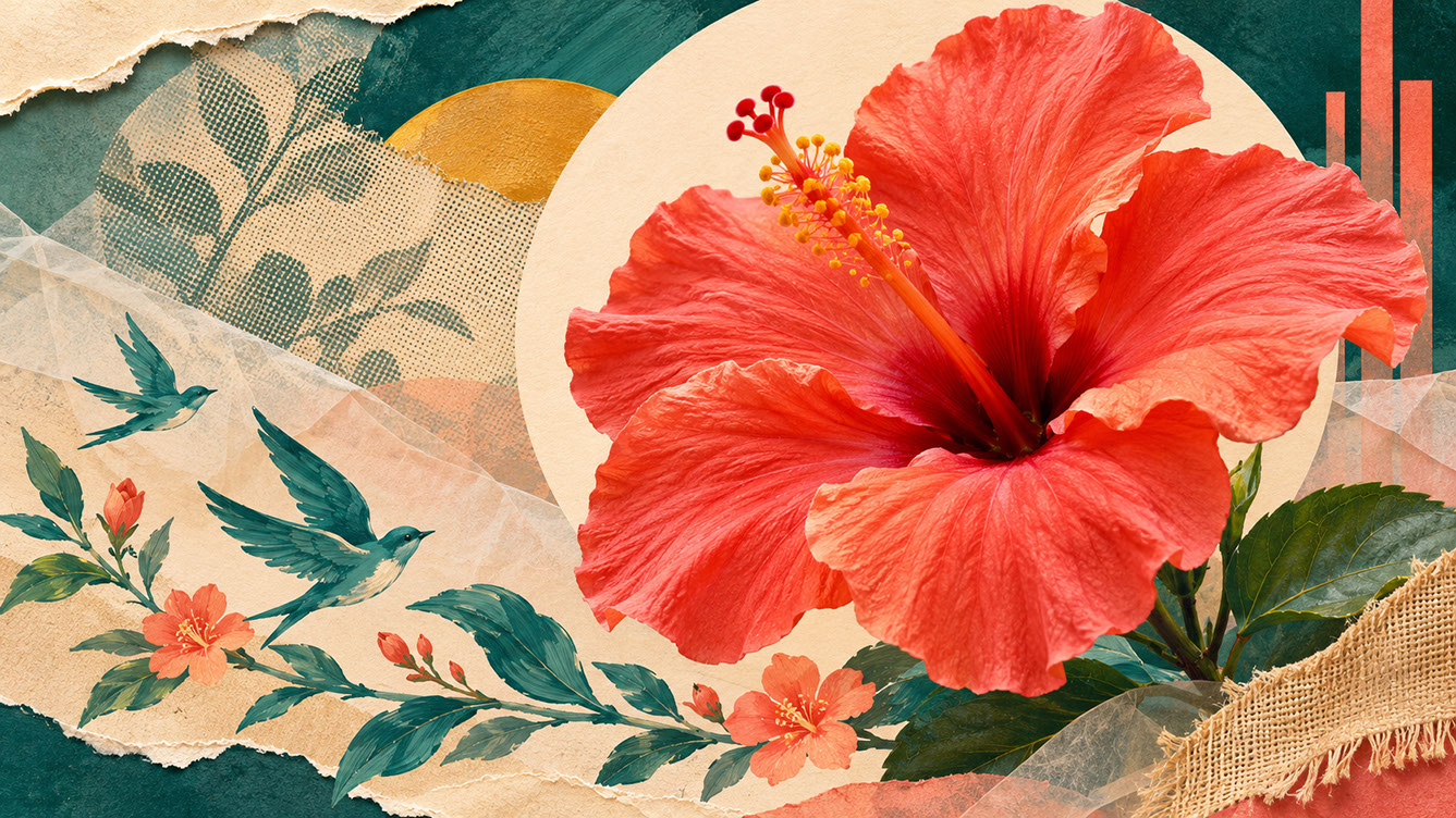
Think in terms of primary, secondary, and tertiary elements. Your focal point anchors the entire composition; it's what viewers should see first and remember longest. Supporting elements add context and interest without competing for attention. Background layers provide depth and texture, creating atmosphere rather than demanding focus.
Several techniques help establish clear hierarchy. Scale variation proves immediately effective—make key elements significantly larger than supporting ones. Position your focus against calmer areas for maximum contrast. Use colour intensity strategically, with higher saturation drawing the eye where you want it. Play with sharpness and blur; crisp focus advances whilst soft atmospheric layers recede. Adjust opacity to allow elements to sit forward or drift backward in the visual space.
Test your hierarchy ruthlessly. Try the squint test: when you view the composition unfocused, does the main element still dominate? What does your eye land on in the first half-second of viewing? If the answer isn't your intended focal point, adjustments are needed.
 🔍 PLATE 04 — CLICK TO EXPAND
Establishing Clear Hierarchy in Maximalist Compositions — Primary Focal Anchor vs Supporting Layers — Compositional hierarchy plate for 'Establishing Clear Hierarchy in Maximalist Compositions': one dominant coral photographic flower cutout framed against a quiet cream circular opening, supported by smaller teal painted birds and receding halftone textures. Colour Palette: Deep Teal (#134E4A), Warm Coral (#F26A4B), Golden Ochre (#D99B26), Soft Studio Cream (#F6EFE2)
The Art of Restraint Within Abundance
Too many competing textures create visual noise rather than visual richness. Learning to recognise when variety tips into incoherence separates amateur maximalism from professional work.
Consider adopting a 'rule of three' for texture types in any single composition. Perhaps you're working with paper textures, painted marks, and photographic elements—three categories that can contain multiple individual pieces whilst maintaining coherent surface quality. Using similar texture families (all paper-based, or all painted, for instance) helps disparate elements feel related.
Reduce texture intensity in supporting areas. Your background layers needn't be as visually demanding as your focal point—in fact, they shouldn't be. Layer similar textures for depth without competition, use transparency to soften textural contrasts, and allow some areas to breathe with minimal surface activity.
Maintaining richness through subtlety sounds contradictory, but it's the secret to successful maximalist work. You can have abundance and restraint simultaneously; they're not opposites but partners.
 🔍 PLATE 05 — CLICK TO EXPAND
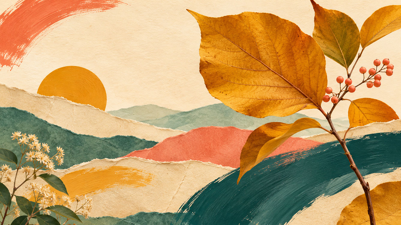
The Art of Restraint Within Abundance — Limiting Competing Texture Families — Controlled texture study for 'The Art of Restraint Within Abundance': a balanced collage landscape using just three media families—torn paper hills, broad gouache brushstrokes, and a dominant ochre botanical cutout below a calm cream sky. Colour Palette: Deep Teal (#134E4A), Warm Coral (#F26A4B), Golden Ochre (#D99B26), Soft Studio Cream (#F6EFE2)
Creating Unity Across Diverse Elements
When you're combining materials from different sources, eras, and media, cohesion doesn't happen automatically. Viewers unconsciously search for visual relationships—give them satisfying connections to discover.
Colour becomes your most powerful unifying thread. Establish a limited palette that appears throughout the composition, regardless of how many different elements you're combining. Use colour overlays to harmonise disparate photographic elements that might otherwise clash. Repeat accent colours to create visual rhythm, drawing the eye through the composition in an intentional dance.
Shape repetition offers another cohesion strategy. Echo geometric forms across different elements—if you've used a circular cut-out in one area, repeat circular motifs elsewhere. Consistent organic shapes (flowing curves, angular cuts, soft corners) create visual logic even when individual elements are wildly different in origin.
These visual rhythms—spacing similar elements to create pattern-like flow—need variation to remain interesting. Repetition without variation becomes boring; variation without repetition becomes chaotic. Find the balance.
 🔍 PLATE 06 — CLICK TO EXPAND
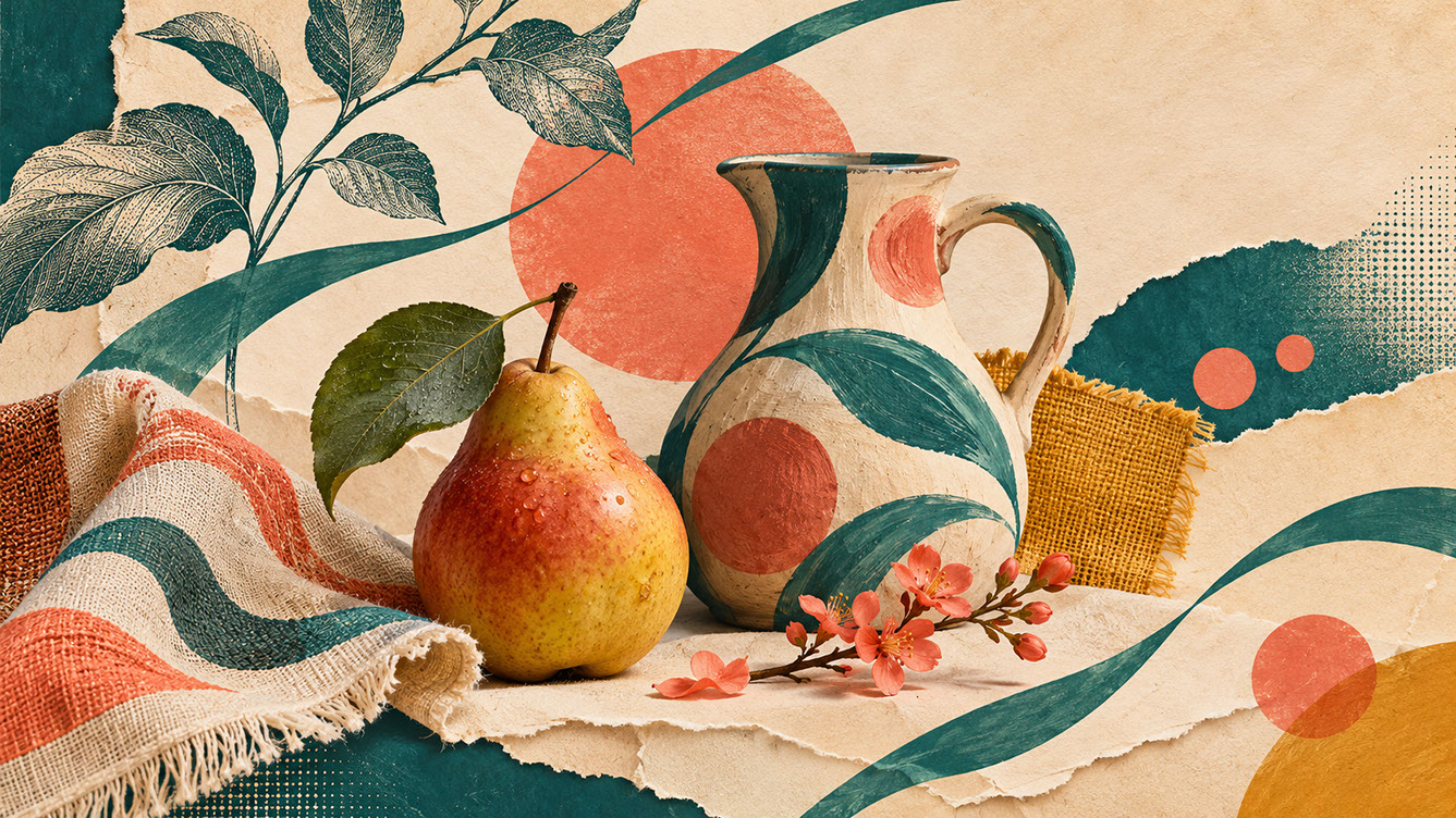
Creating Unity Across Diverse Elements — Repeating Colour Threads & Geometric Motifs — Visual cohesion study for 'Creating Unity Across Diverse Elements': a photographic pear, hand-painted vessel, engraved leaves, and fabric scraps unified by repeating coral circular motifs and flowing teal curves. Colour Palette: Deep Teal (#134E4A), Warm Coral (#F26A4B), Golden Ochre (#D99B26), Soft Studio Cream (#F6EFE2)
The Power of Strategic Breathing Space
Perhaps surprisingly, the most important technique for successful maximalist illustration is knowing where to leave space.
Rest areas allow the eye to process complexity. The contrast principle works powerfully here: busy areas feel even busier when positioned adjacent to quiet zones. Without breathing space, viewer fatigue sets in and engagement drops.
Visual calm takes many forms. Empty or near-empty space obviously qualifies, but so do solid colour fields without texture, soft blurred areas within otherwise sharp compositions, and simple geometric shapes nestled amongst organic complexity.
Position calm areas strategically. Place them near focal points to enhance emphasis, at edges to provide visual entry and exit points, or between dense sections to break up intensity. Ensure quiet areas feel intentional rather than forgotten—use colour to keep them connected to the whole composition.
Balance matters: too much calm dilutes maximalist impact, whilst too little exhausts viewers. Trust your instincts, and test with fresh eyes after stepping away.
 🔍 PLATE 07 — CLICK TO EXPAND
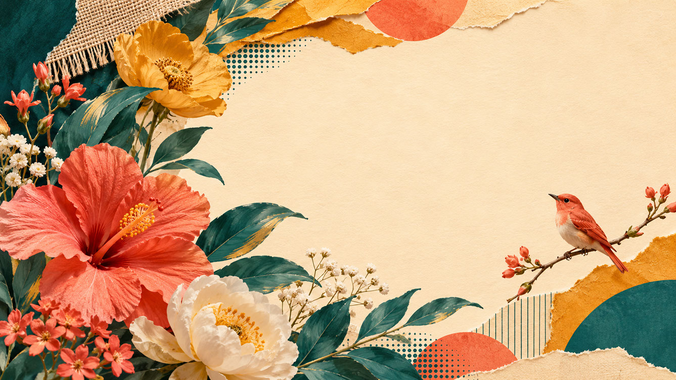
The Power of Strategic Breathing Space — Balancing Textural Density with Calm Negative Space — Negative space study for 'The Power of Strategic Breathing Space': a lush asymmetric crescent of layered photographic blooms, painted teal leaves, and ochre torn paper frames an open warm-cream expanse where a single small coral bird rests. Colour Palette: Deep Teal (#134E4A), Warm Coral (#F26A4B), Golden Ochre (#D99B26), Soft Studio Cream (#F6EFE2)
Commercial Applications for Collage and Layered Illustration
Visual maximalism thrives across numerous commercial contexts in 2027.
Editorial illustration embraces layered visual storytelling enthusiastically. Magazine features benefit from compositions that reward extended viewing; cover imagery stands out on crowded newsstands precisely because it offers more to explore. Cultural and lifestyle publications are particularly drawn to maximalist approaches that communicate complexity and sophistication.
Book cover design finds natural alignment with collage techniques. Literary fiction covers benefit from intrigue and depth; non-fiction covers can communicate subject complexity through layered visual metaphors. Young adult publishing and illustrated books offer wonderful opportunities for rich, detailed artwork.
Campaign work increasingly seeks distinctive visual identities, and collage provides immediate differentiation. Cultural institutions—museums, theatres, festivals—embrace maximalist approaches that feel appropriately artistic. Social awareness campaigns use layered messaging to communicate complexity, whilst brand launches leverage visual richness for products with heritage stories.
Packaging applications continue growing. Premium product lines benefit from visual depth; gift packaging and special editions warrant elaborate illustration; craft-positioned food and beverage brands find natural alignment with textured, handmade aesthetics.
 🔍 PLATE 08 — CLICK TO EXPAND
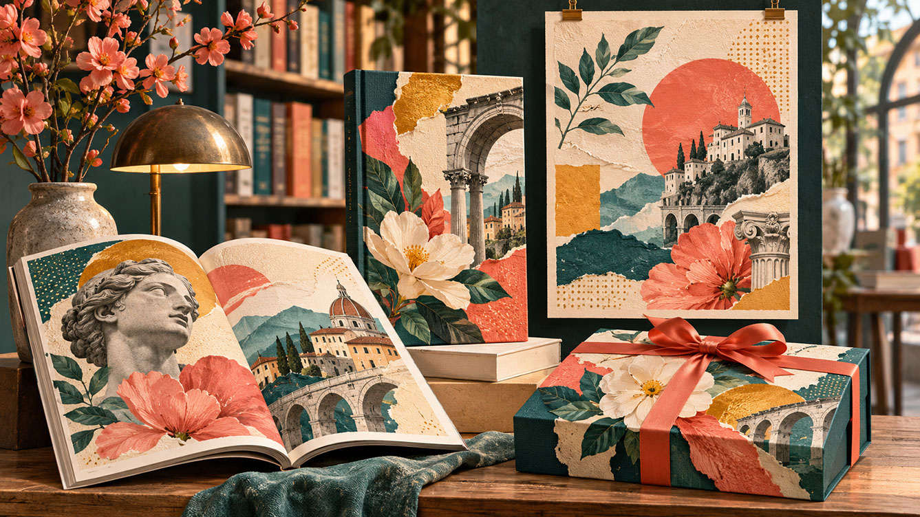
Commercial Applications for Collage and Layered Illustration — Editorial, Book Covers & Packaging — Commercial application showcase for 'Commercial Applications for Collage and Layered Illustration': a cultural bookshop display featuring an editorial magazine, hardback book cover, exhibition poster, and gift box carrying coordinated botanical-and-architectural collage artwork. Colour Palette: Deep Teal (#134E4A), Warm Coral (#F26A4B), Golden Ochre (#D99B26), Soft Studio Cream (#F6EFE2)
Making Maximalism Scale
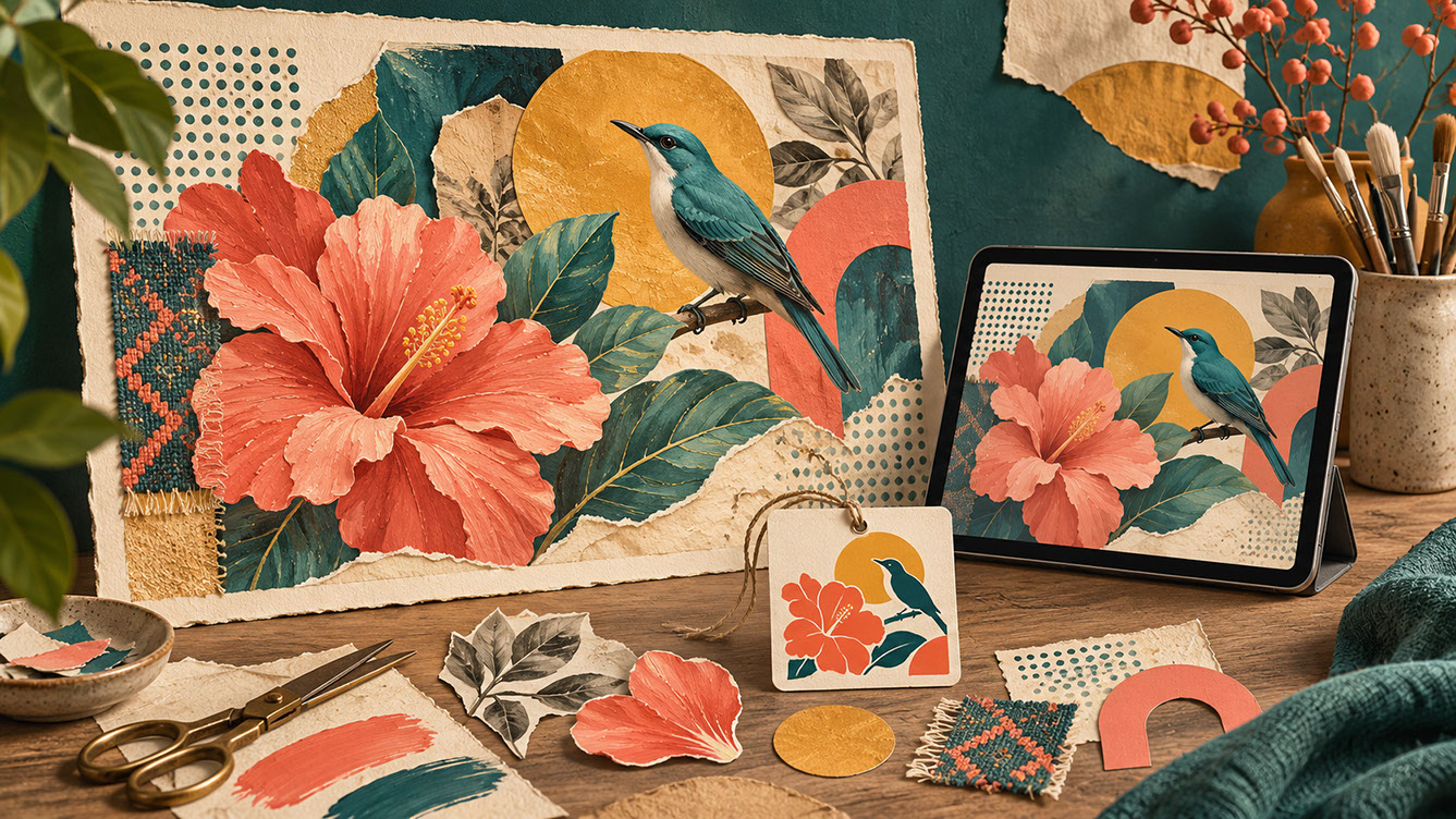
Here's a practical challenge many maximalist illustrators overlook: detailed collage work often fails at small sizes. Social media thumbnails, product labels, and app icons test your composition ruthlessly.
Design with clear focal points that survive reduction. Test compositions at multiple scales throughout your process, not just at the end. Consider creating simplified versions specifically for smallest applications—a hero illustration needn't work identically everywhere.
Technical considerations matter for production. Maintain resolution requirements appropriate for print; choose file formats that preserve texture quality; ensure colour consistency across reproduction methods.
Think modularly where possible. Create collage elements that work independently as well as together. Develop compositions that can be cropped for various formats without losing their essential character. This flexibility extends your work's commercial viability significantly.
 🔍 PLATE 09 — CLICK TO EXPAND
Making Maximalism Scale — Adapting Layered Collage from Large Format Prints to Small Labels — Scale adaptability study for 'Making Maximalism Scale': a designer's workbench showing the same coral flower and teal bird collage across a richly detailed large print, a medium digital layout, and a simplified small product label. Colour Palette: Deep Teal (#134E4A), Warm Coral (#F26A4B), Golden Ochre (#D99B26), Soft Studio Cream (#F6EFE2)
Conclusion
Successful collage and visual maximalism require disciplined approaches to hierarchy, cohesion, and strategic restraint within abundance. The apparent chaos of layered illustration actually demands more structural thinking than minimal approaches—but the rewards justify the effort.
Layered work offers something wonderful to both creators and audiences: the joy of discovery. The process of finding unexpected combinations mirrors the viewer's experience of noticing new details with each encounter. That mutual delight creates lasting engagement that simpler approaches struggle to match.
Start building your personal texture library today. Experiment with combining just two or three disparate elements before attempting full maximalist compositions. Trust that the skills you're developing will serve you throughout 2027 and beyond—visual richness isn't going anywhere.
 🔍 PLATE 10 — CLICK TO EXPAND
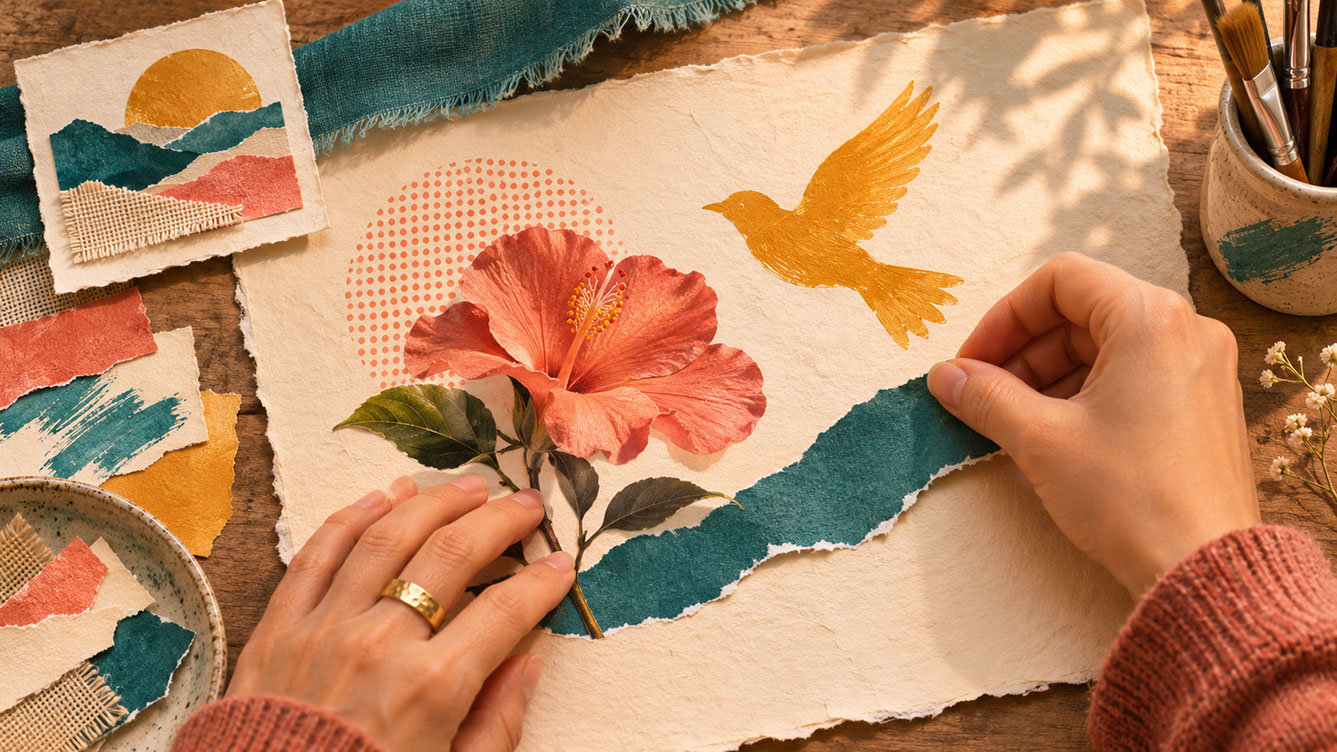
Conclusion — The Joy of Discovery & Deliberate Craftsmanship in Layered Illustration — Closing studio plate for 'Conclusion': an artist's hands thoughtfully assemble a photographic coral bloom, a torn teal paper curve, and an ochre painted bird silhouette on textured cream paper. Colour Palette: Deep Teal (#134E4A), Warm Coral (#F26A4B), Golden Ochre (#D99B26), Soft Studio Cream (#F6EFE2)
⚡ 5 Strategies to Consider
STUDIO PLAYBOOK // 5 DIRECTIVES❓ Frequently Asked Questions — 5 Q&As (5 Q&As)
SCHEMA.ORG/FAQPAGE // 5 Q&As (5 Q&As)Q1. How do I start creating collage illustration if I've always worked with clean, minimal styles?
Begin by introducing single textured elements into existing work—a scanned paper background, a painted mark, or a photographic fragment. Build complexity gradually rather than attempting full maximalism immediately. This incremental approach helps you understand how layered elements interact without overwhelming your established workflow.
Q2. What software works best for digital collage and layering?
Adobe Photoshop remains the industry standard for texture-rich collage work due to its sophisticated layer management and blending mode capabilities. Procreate offers excellent options for iPad-based workflows with intuitive layering tools, whilst Affinity Photo provides a cost-effective alternative with comparable functionality for desktop users.
Q3. How do I know when a composition has enough elements versus too many?
Test by removing elements one by one. If the composition improves with subtraction, you've likely exceeded optimal complexity. Additionally, use the squint test—if your focal point doesn't dominate when viewing the work unfocused, supporting elements may be competing too strongly for attention.
Q4. What resolution should I scan materials at for collage illustration?
Scan physical materials at minimum 300 DPI, though 600 DPI provides greater flexibility for large-scale print applications. Higher resolution files allow you to scale elements up significantly without quality loss, giving you production flexibility when artwork needs to work across multiple formats and sizes.
Q5. How can I make disparate collage elements feel cohesive?
Use colour as your primary unifying thread by establishing a limited palette that appears throughout the composition. Apply colour overlays to harmonise photographic elements, repeat accent colours to create visual rhythm, and echo geometric forms or organic shapes across different elements to build satisfying visual relationships.