2027's Joy Colours: How Energy Orange and Pop Pink Make Design Feel Alive Again
Master Energy Orange and Pop Pink for 2027. Learn strategic joy colour deployment for branding, UI, photography, and packaging that sparks delight.
 🔍 COVER PLATE — CLICK TO EXPAND
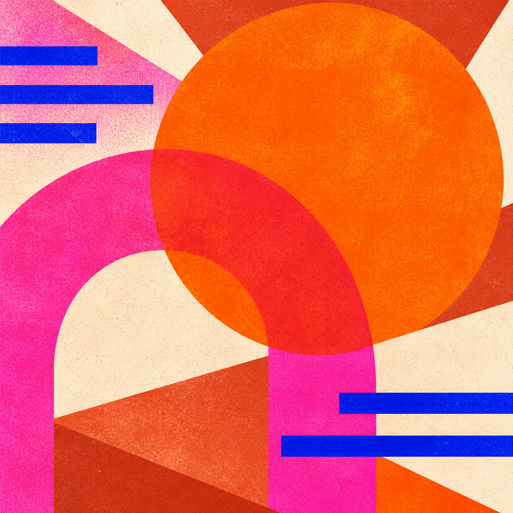
Episode 5 Hero Cover: High-chroma Energy Orange and Pop Pink deployed as precision focal interventions to spark optimism and kinetic vitality in 2027 design.
Introduction: Why Design Needs Strategic Joy Right Now
Let me ask you something that might feel a bit provocative: when did we collectively decide that sophisticated design must always be muted, restrained, and—let's be honest—a little bit dull?
Don't get me wrong. In Episode 4, we explored the restorative power of Meadowland Green and its layered botanical companions, discovering how those herbal tones create genuine biophilic connection and visual calm. That episode demonstrated precisely why green serves as 2027's primary vehicle for communicating wellness and rest. But here's the thing: human beings aren't built for perpetual calm. We need punctuation. We need moments that make our hearts beat faster.
Enter Energy Orange (Coloro 018-57-34) and Pop Pink (Coloro 151-73-22)—2027's official vitality colours. These aren't decorative afterthoughts or childish interruptions to serious design work. According to WGSN's extensive cultural research, these high-chroma warmth tones function as strategic tools for emotional resilience, creating intentional moments of delight, energy, and release within otherwise restrained systems.
Today, we're diving deep into precisely when, where, and how to deploy these joy colours without overwhelming your carefully considered design systems. Whether you're designing calls to action, youth-facing campaigns, UI interaction moments, photography with coloured gels, or packaging that demands attention, this episode delivers your complete practical guide.
 🔍 PLATE 01 — CLICK TO EXPAND
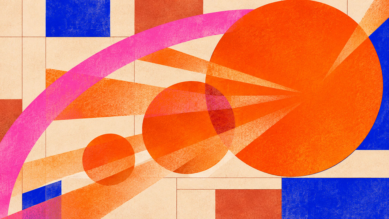
Plate 01 — Introduction — Why Contemporary Visual Culture Needs Disciplined Bursts of Strategic Joy: Plate 01 (Introduction): Strategic joy uses calibrated doses of high-chroma warmth to cut through sombre visual fatigue and create memorable emotional peaks.
The Psychology of Strategic Joy: Why Bright Colour Counterweights Anxiety
Understanding WGSN's Resilience Connection
WGSN's positioning of Energy Orange isn't arbitrary trend forecasting—it's a documented response to cultural and psychological needs. This particular orange carries intrinsic associations with resilience, adaptability, and forward momentum. Pop Pink, meanwhile, supports what researchers term 'strategic joy': playful, analogue experiences that provide emotional release from ambient uncertainty.
The distinction here matters enormously. We're not talking about random brightness splashed across designs because someone fancied a change from beige. We're discussing carefully deployed vitality accents that serve specific emotional functions within design systems.
The Difference Between Chaos and Intentional Joy
Picture two scenarios. In the first, bright orange and pink appear everywhere—backgrounds, buttons, typography, icons—creating visual chaos that exhausts rather than energises. In the second, these same colours appear sparingly: a single orange button on an otherwise neutral interface, a pink accent label on craft-brown packaging, a flash of colour in an editorial photograph's corner.
The second scenario creates what I'd call 'colour reward moments'. Your eye encounters restraint, restraint, restraint—then bang: a moment of pure, confident colour that feels earned rather than overwhelming. This is strategic joy in action.
The Emotional Release Function
Purely muted environments, over time, can feel oppressive. We need both calm and stimulation, rest and energy. High-chroma colour creates emotional punctuation—those design moments that make viewers feel something immediate and positive. Think of it as the colour equivalent of a perfectly timed joke in an otherwise serious conversation.
 🔍 PLATE 02 — CLICK TO EXPAND
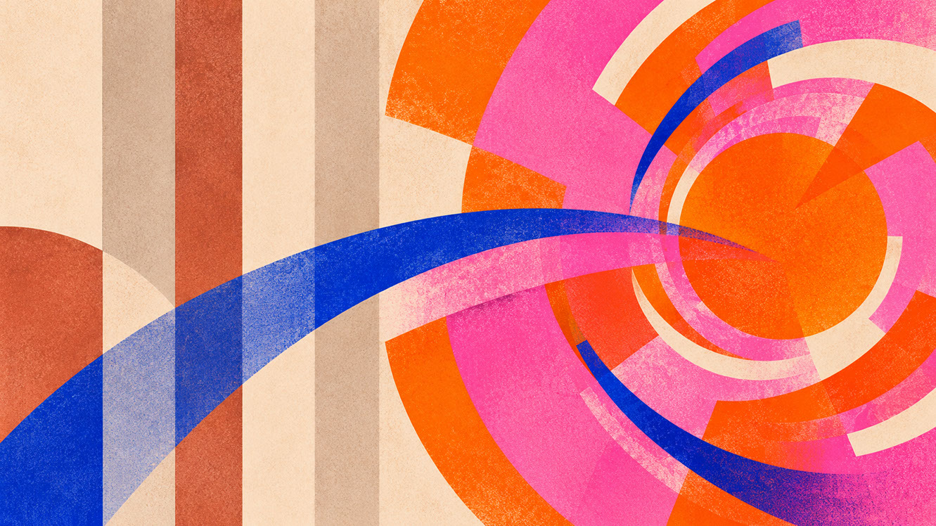
Plate 02 — The Psychology of Strategic Joy — Intentional Dopamine vs. Unstructured Visual Chaos: Plate 02 (Psychology of Strategic Joy): Why human perception responds to restrained, well-anchored bright accents as signals of resilience, play, and confidence.
Understanding Energy Orange and Pop Pink: Character and Context
Energy Orange (Coloro 018-57-34) Deep Dive
This isn't your standard tangerine or construction-site orange. Coloro 018-57-34 sits in warm, saturated territory that reads as optimistic without tipping into aggressive. It's a colour of action, movement, and encouragement.
Psychologically, orange encourages decision-making. It's associated with warmth, enthusiasm, and approachability—making it extraordinarily effective for conversion moments where you need viewers to take action rather than simply observe.
Pop Pink (Coloro 151-73-22) Deep Dive
Forget bubblegum associations or dusty rose retreats. This pink is confident, contemporary, and culturally current. It signals awareness of the present moment without feeling desperate or try-hard.
Pop Pink works particularly well for beauty, cultural, and youth-facing campaigns where you need to communicate relevance and playfulness simultaneously. It can feel both sophisticated and energetic when handled with intention—a combination that makes it invaluable for brands targeting younger demographics.
Choosing Between Them
Generally speaking: orange for action, pink for connection. Orange says 'do something now'; pink says 'join something exciting'. Use orange when you need conversion, engagement, or immediate response. Use pink when you're building cultural relevance, community feeling, or contemporary aesthetic appeal.
Can you use both together? Absolutely—but exercise restraint. These colours amplify each other, so combining them requires even more surrounding neutrality.
 🔍 PLATE 03 — CLICK TO EXPAND
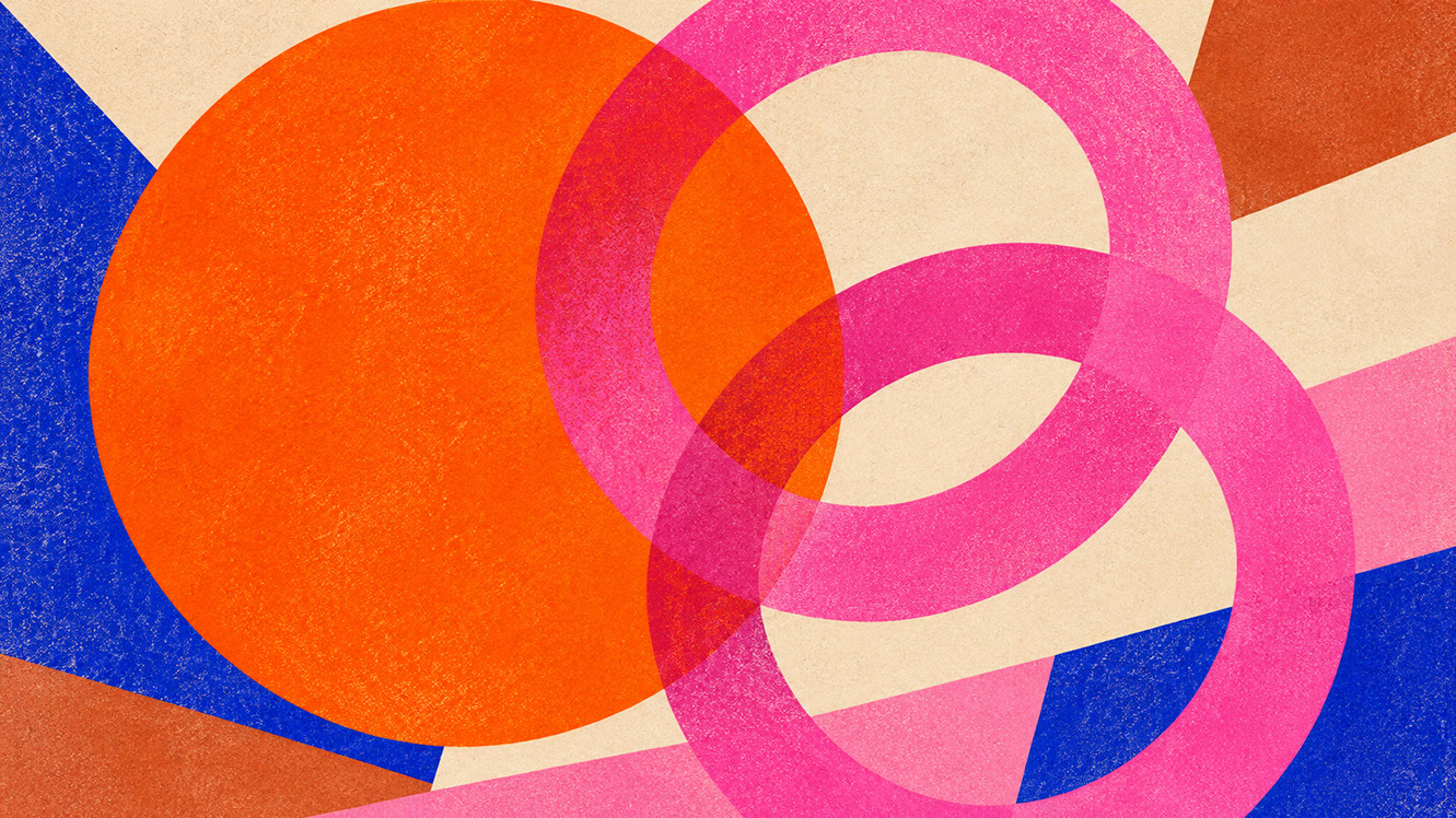
Plate 03 — Understanding Energy Orange (018-57-34) & Pop Pink (151-73-22) — Character & Undertones: Plate 03 (Energy Orange & Pop Pink Deep Dive): Comparing the kinetic, action-oriented warmth of Energy Orange with the playful, subcultural vibrancy of Pop Pink.
Building the Curated Joy Palette
Proportion Principles
The 60-30-10 rule becomes essential here. Vitality colours typically occupy no more than 10% of a design system—often less. This isn't limitation; it's amplification. Joy colours become more powerful when surrounded by restraint.
Consider this working palette for 2027's strategic joy approach:
Primary Vitality Anchor: Energy Orange (Coloro 018-57-34)
Strategic Joy Element: Pop Pink (Coloro 151-73-22)
Additional Energy (when needed): Citrus Yellow
Complementary Anchor: Luminous Blue (Coloro 125-28-38)
Palette Harmony: Soft Lilac
Supporting Cast Importance
Energy Orange and Pop Pink need neutral or cool partners to function properly. Luminous Blue provides complementary contrast that prevents palettes feeling unbalanced. Soft Lilac creates smooth transitions between high-chroma moments and quieter zones.
Without this supporting cast, vitality colours risk feeling chaotic rather than joyful.
 🔍 PLATE 04 — CLICK TO EXPAND
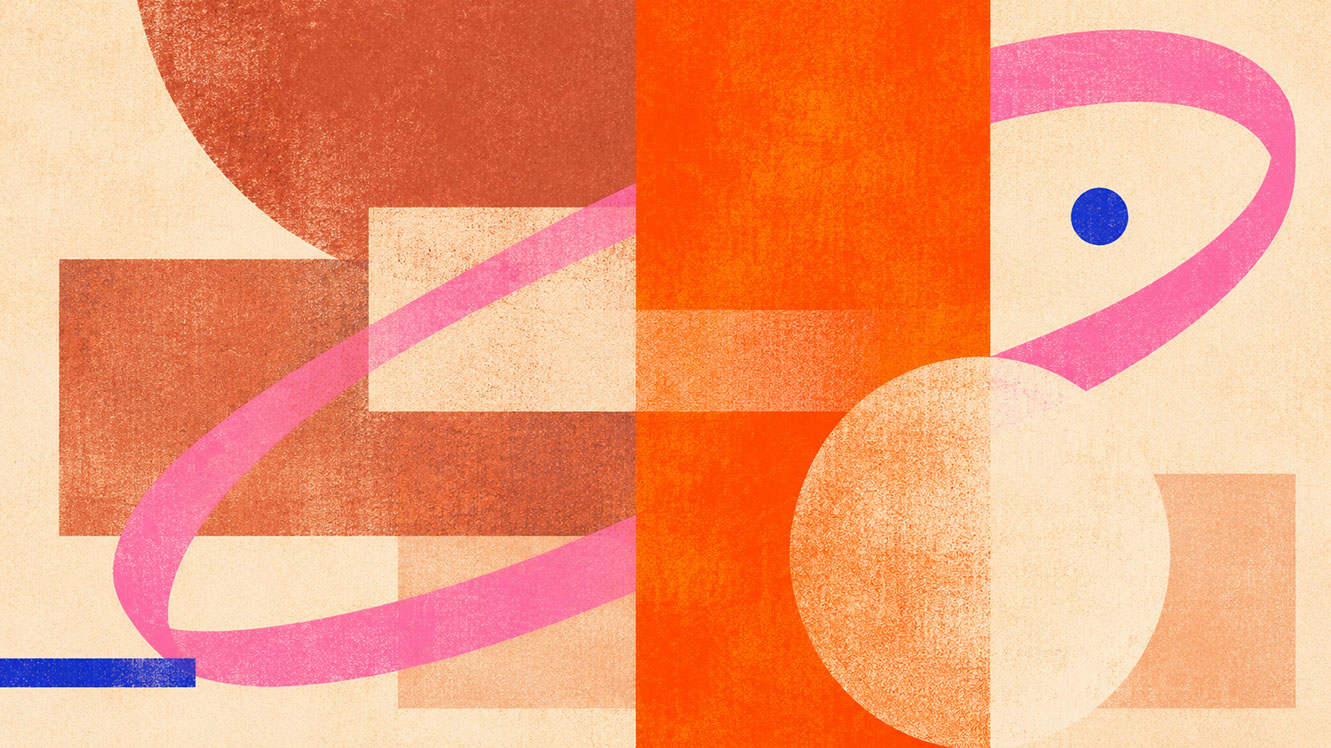
Plate 04 — Building the Curated Joy Palette — Grounding 10% Brights With 90% Mineral & Ink Neutrals: Plate 04 (Building the Curated Joy Palette): High-chroma joy colours achieve maximum punch when restricted to 5–10% of the visual field against calm mineral grounds.
Branding and Graphic Design Applications
Orange for Calls to Action
Orange buttons convert. This isn't opinion—it's well-documented user behaviour. Orange psychologically encourages action and decision-making, making it ideal for 'Buy Now', 'Subscribe', 'Get Started' moments.
The key is proportion. An orange button appearing infrequently and meaningfully carries far more weight than orange scattered throughout an interface. Test orange against your specific brand neutrals; it needs sufficient contrast to pop without clashing.
Pink for Cultural and Youth-Facing Campaigns
Pop Pink signals cultural awareness and contemporary relevance immediately. It works exceptionally well in beauty, fashion, music, and entertainment contexts where you need to communicate that your brand understands the current moment.
Importantly, we're moving beyond stereotypical pink-equals-feminine associations. Pop Pink in 2027 reads as confident, not gendered—making it appropriate for broader applications than traditional 'women's' marketing.
Balancing High-Chroma with Premium Positioning
Here's something that might surprise you: premium brands can absolutely use vitality colours. The secret is treating them as strategic interventions rather than dominant palette members. A luxury packaging line with a single orange interior reveal. An upmarket restaurant brand with pink accent typography. Restraint plus impact equals sophistication.
 🔍 PLATE 05 — CLICK TO EXPAND
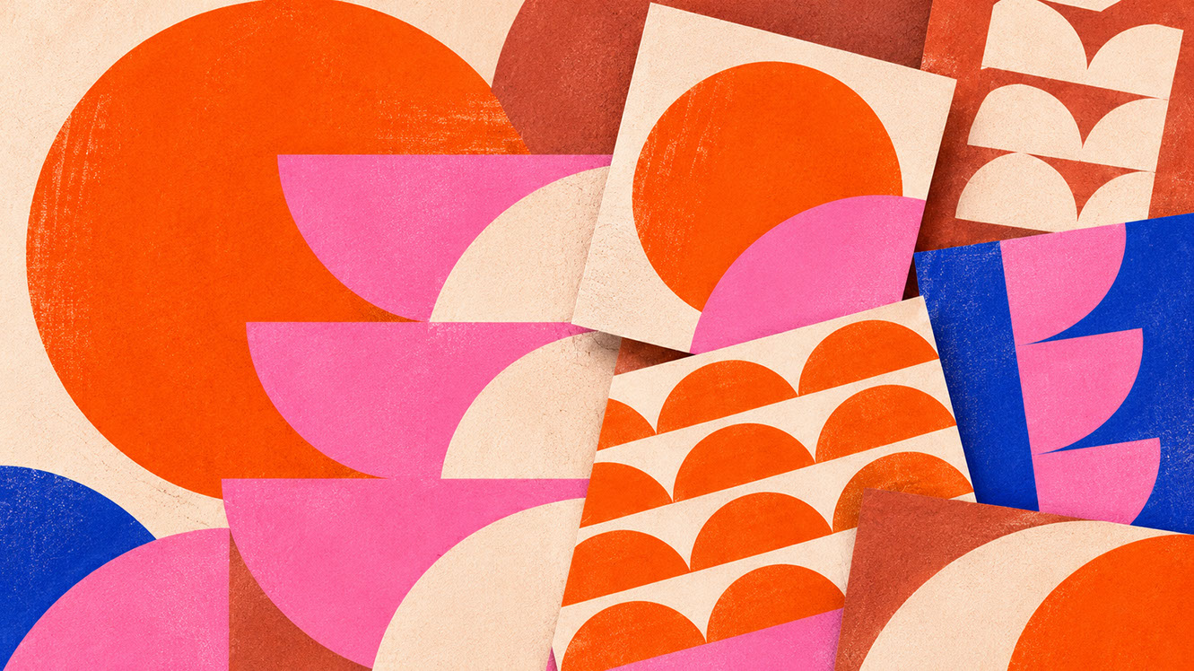
Plate 05 — Branding & Graphic Design — Expressive Typography, Editorial Posters & Campaign Highlights: Plate 05 (Branding & Graphic Design): Using Energy Orange for kinetic wayfinding and calls to action, and Pop Pink for cultural, youth, and limited-edition campaign expressions.
UI and Digital Interface Applications
The Functional Hierarchy of Bright Colour
In digital interfaces, high-chroma colour should be reserved for moments requiring genuine attention: primary action buttons, success notifications, achievement badges, reward confirmations. If everything is bright, nothing is.
This creates functional hierarchy. Users learn quickly that orange or pink means 'this matters' or 'this is a reward'. That learning becomes design language.
Gamification and Reward Systems
Energy Orange and Pop Pink create satisfying feedback loops in gamified interfaces. Achievement badges, progress indicators, and celebration moments all benefit from high-chroma treatment. The bright colour becomes the reward itself—a visual pat on the back.
Preventing Visual Fatigue
Large areas of bright colour cause eye strain and distraction. Generous white space (or neutral space) around vitality colours is essential. For dark mode interfaces, remember that bright colours behave differently on dark backgrounds—they may need desaturation to prevent glowing effects.
Accessibility matters here too. Test colour combinations for users with colour sensitivity and ensure sufficient contrast ratios for text.
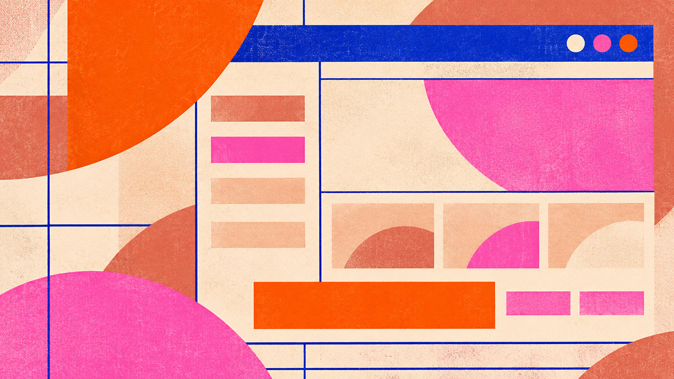 🔍 PLATE 06 — CLICK TO EXPAND
Plate 06 — UI & Digital Interfaces — Micro-Interactions, Progress Badges & Conversion CTAs: Plate 06 (UI & Digital Interfaces): Deploying high-chroma joy tokens for conversion buttons, gamified milestones, and interactive hover states without inducing screen fatigue.
Photography and Art Direction Applications
The Direct Flash Aesthetic
Direct flash creates bold, punchy imagery that suits vitality colours perfectly. This deliberately artificial lighting rejects soft, natural aesthetics in favour of confident visual statements.
This approach works brilliantly for editorial content, youth campaigns, and event documentation where energy matters more than ethereal atmosphere.
Coloured Gels and Dramatic Shadows
Using orange and pink gels creates coloured light effects that add visual interest and brand recognition. Coloured shadows become design elements themselves—unexpected, memorable, and highly shareable on social platforms.
Styling for Energy
Incorporate bright objects, textiles, and props into shoots strategically. Not every element needs to be bright—restraint in styling mirrors restraint in graphic design. A single orange object against neutral surroundings creates more impact than comprehensive colour saturation.
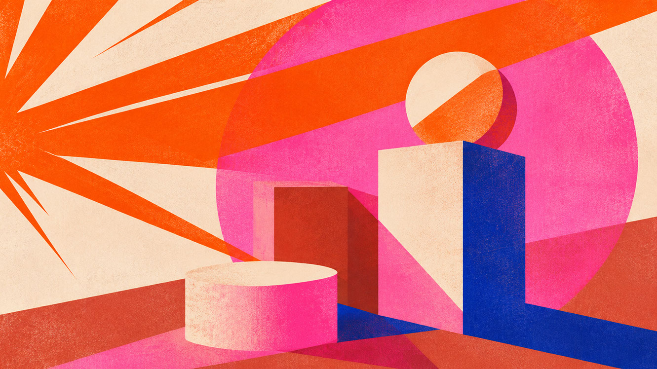 🔍 PLATE 07 — CLICK TO EXPAND
Plate 07 — Photography & Art Direction — Direct Flash, Coloured Gels & Graphic Prop Styling: Plate 07 (Photography & Art Direction): High-energy direct flash, crisp cast shadows, and single high-chroma props bring editorial immediacy to commercial campaigns.
Packaging and Experiential Design Applications
The Small Intervention Strategy
A single bright element on otherwise neutral packaging creates remarkable memorability. Consider coloured closures, accent labels, bright inner reveals, or coloured tissue paper inside boxes. These surprise-and-delight moments work precisely because they're unexpected.
Limited Edition Applications
Vitality colours signal 'new' and 'limited' without requiring additional text. Seasonal packaging variants using Energy Orange or Pop Pink communicate special-edition status immediately, driving urgency and collectibility.
Event and Experiential Contexts
Temporary installations benefit enormously from bright colour. Energy Orange and Pop Pink create Instagram-worthy moments that attendees want to photograph and share. Wayfinding becomes intuitive when bright colour directs attention.
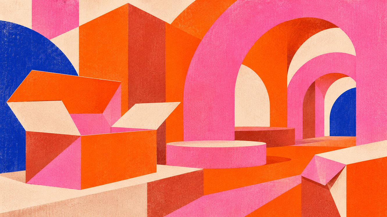 🔍 PLATE 08 — CLICK TO EXPAND
Plate 08 — Packaging & Experiential Design — The Small Intervention Strategy & Interior Flood Reveals: Plate 08 (Packaging & Experiential Design): A 5% bright seal, tear-strip, or interior box flood against 95% raw unbleached board turns unboxing into theatrical delight.
Material Partnerships: Bringing Joy Colours to Life
Risograph and Screen Printing
Risograph ink creates characteristic bright, slightly imperfect results that prevent vitality colours feeling too corporate. The handmade quality adds authenticity—particularly valuable for cultural and independent brands. Small runs and colour variation between prints become features, not bugs.
Translucent Plastic and Layered Effects
Translucent coloured materials create depth and visual interest through layering. Packaging windows, event materials, and product components all benefit from this approach. Consider sustainability carefully—recycled and recyclable options exist.
Glossy Stickers and Contrast Applications
Glossy surfaces intensify bright colour perception significantly. The tactile contrast between matte backgrounds and glossy bright accents creates premium-feeling moments at accessible price points.
Sport Mesh and Technical Fabrics
Mesh and technical fabrics suit bright, sporty applications perfectly. The association with energy, movement, and youth culture makes these materials natural partners for vitality colours in fashion, accessories, and product design.
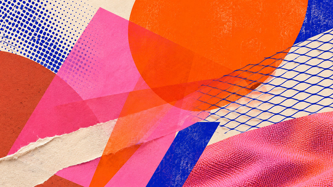 🔍 PLATE 09 — CLICK TO EXPAND
Plate 09 — Material Partnerships — Fluorescent Risograph Ink, Translucent Acrylic & Technical Mesh: Plate 09 (Material Partnerships): Pairing joy colours with matte risograph soy inks, frosted translucent polymers, high-gloss stickers on raw board, and technical textiles.
Conclusion: Strategic Joy as Design Intelligence
Energy Orange and Pop Pink aren't about making things louder. They're about making things feel more alive—creating emotional resilience through carefully considered moments of delight within otherwise restrained systems.
Remember the core principles: proportion matters (aim for 10% or less), different colours serve different functions (orange for action, pink for connection), and material partnerships amplify authenticity.
Your action step: identify one specific application in your current work where strategic joy could improve outcomes. Perhaps a call-to-action button, a packaging accent, or a campaign highlight moment. Test Energy Orange or Pop Pink in that context and measure the response.
In Episode 6, we shift from contemporary brightness to heritage depth. We'll explore oxblood, russet, and antique plum—colours of craft heritage, accumulated knowledge, and the post-luxury shift where visible craftsmanship trumps high-shine perfection. If you're ready to understand why younger audiences increasingly gravitate toward archival depth, that episode delivers your complete guide.
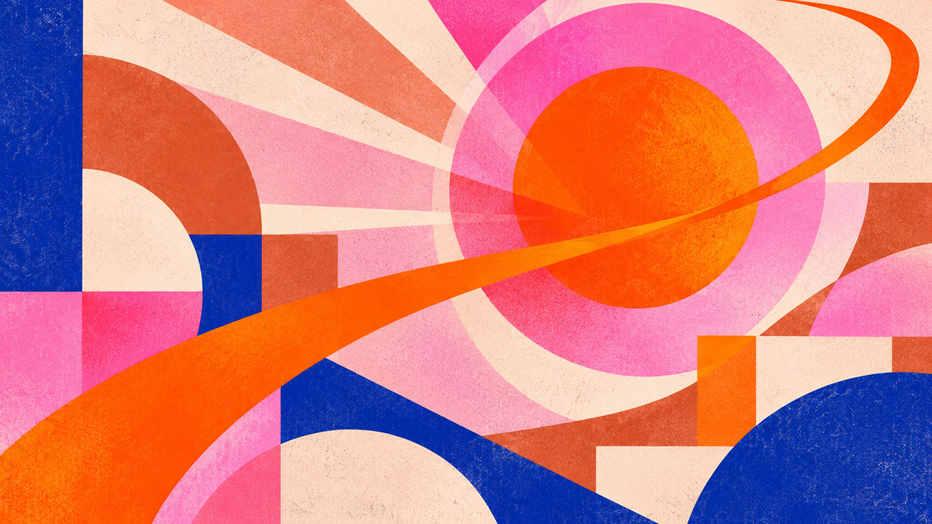 🔍 PLATE 10 — CLICK TO EXPAND
Plate 10 — Conclusion — Strategic Joy as Disciplined Emotional Intelligence in 2027 Design: Plate 10 (Conclusion): Used with architectural restraint, Energy Orange and Pop Pink infuse serious design systems with unforgettable human warmth and vitality.
⚡ 5 Strategies to Consider
STUDIO PLAYBOOK // 5 DIRECTIVES❓ Frequently Asked Questions — 5 Q&As (5 Q&As)
SCHEMA.ORG/FAQPAGE // 5 Q&As (5 Q&As)Q1. Isn't using bright colour in design unprofessional or childish?
When deployed with intentional proportion and placement, high-chroma colour signals confidence and emotional intelligence rather than immaturity. Strategic restraint—using bright colours at around 10% of your design system—creates sophisticated impact rather than chaotic overwhelm. Premium brands successfully use vitality colours as strategic interventions within otherwise restrained systems.
Q2. Won't Energy Orange and Pop Pink date quickly compared to neutral palettes?
High-chroma accents actually date less rapidly than trendy mid-tones because they serve a functional emotional purpose rather than following surface fashion. When used as accent colours within considered systems, orange and pink maintain their effectiveness because they fulfil psychological needs for joy and action that remain constant regardless of seasonal trends.
Q3. How do I convince a conservative client to accept bright colour in their design system?
Start with a single, functional application such as a call-to-action button and demonstrate improved engagement metrics. Let measurable results build confidence for broader applications. Presenting bright colour as a strategic conversion tool rather than a purely aesthetic choice helps conservative clients understand the commercial rationale behind the recommendation.
Q4. Can I use bright colours as my primary brand colour in an app interface?
Generally, bright colours work best as accent rather than dominant colours in interfaces. Large areas of high-chroma colour cause visual fatigue and create accessibility challenges at scale. Reserve Energy Orange and Pop Pink for moments requiring genuine attention—primary action buttons, success notifications, and reward confirmations—whilst maintaining neutral foundations throughout.
Q5. What proportion of bright colour should I use in a design system?
Apply the 60-30-10 rule with vitality colours occupying the 10% accent layer—sometimes even less. This proportional restraint amplifies impact: bright moments feel more powerful when surrounded by neutral foundation and secondary colours. Joy colours become rewards rather than visual noise when they appear infrequently and meaningfully.
EXPLORE RELATED STUDIO TAGS (8):
Glad this piece sparked something — want the matching 4096×4096px .ZIP pack?
Enter your email below for an instant direct download of Studio Seamless Pattern Pack — Drop 01 (WPAY_DROP01.zip) plus new Studio Journal essays & free drops.