Why 2027 Colour Trends Are Splitting in Two: The Bold Shift from Digital Blanding to Chromatic Confidence
Discover why 2027 colour trends embrace warm earth tones paired with electric accents. Meet Luminous Blue, Energy Orange, Meadowland Green, Clay and more.
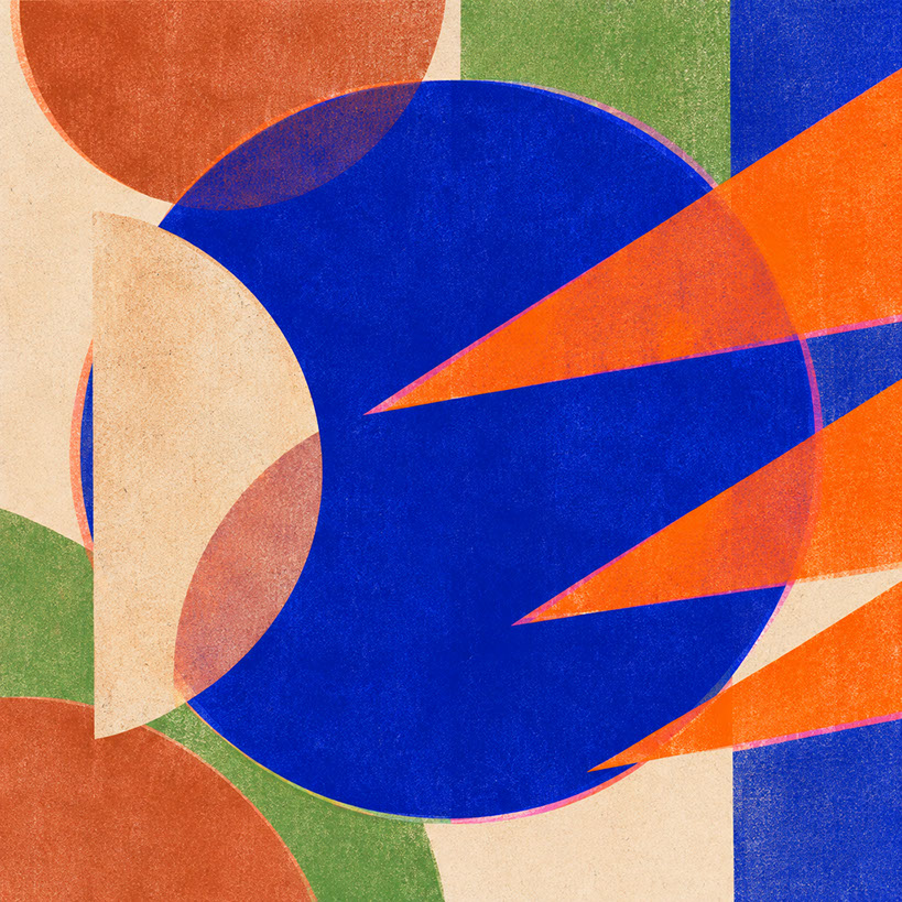 🔍 COVER PLATE — CLICK TO EXPAND
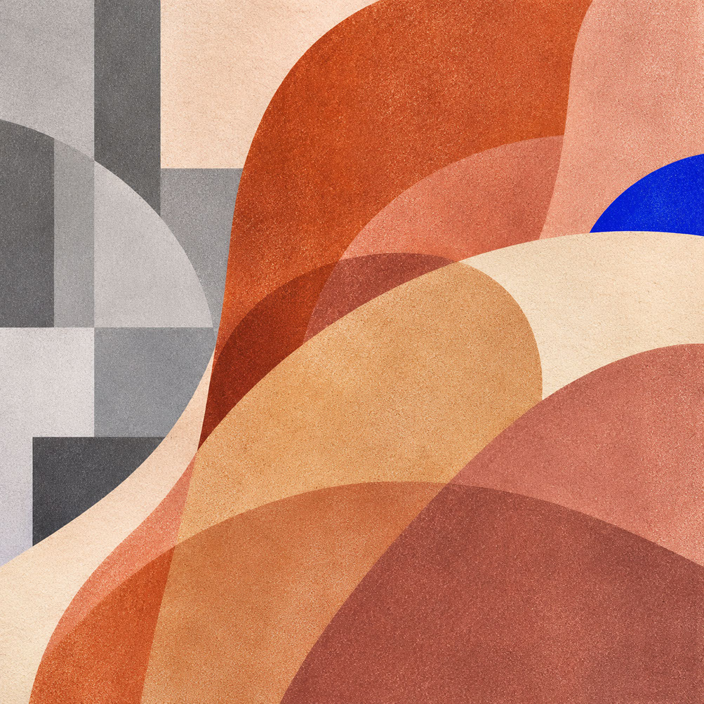
Episode 1 Hero Cover: Visualising the 2027 split between tactile mineral grounding and hyper-saturated electric optimism as designers reject sterile digital blanding.
If you have spent any time scrolling through brand websites, flicking through design portfolios, or simply walking through a contemporary retail space recently, you have probably noticed something peculiar. Everything looks remarkably... similar. Cool greys dominate interfaces, muted pastels blur together across packaging, and sterile white spaces have become so ubiquitous that brands are practically indistinguishable from one another. Welcome to the era of digital blanding—and frankly, we are all exhausted by it.
But here is the genuinely exciting news: 2027 marks a decisive turning point. The colour landscape is splitting in two, embracing a fascinating duality that promises to reinvigorate design culture across every discipline. We are witnessing the emergence of chromatic confidence—a bold movement that pairs warm, mineral-based earth tones with hyper-saturated electric accents. This is not simply swapping one trend for another; it is a fundamental rethinking of how colour functions emotionally, psychologically, and practically in our lives.
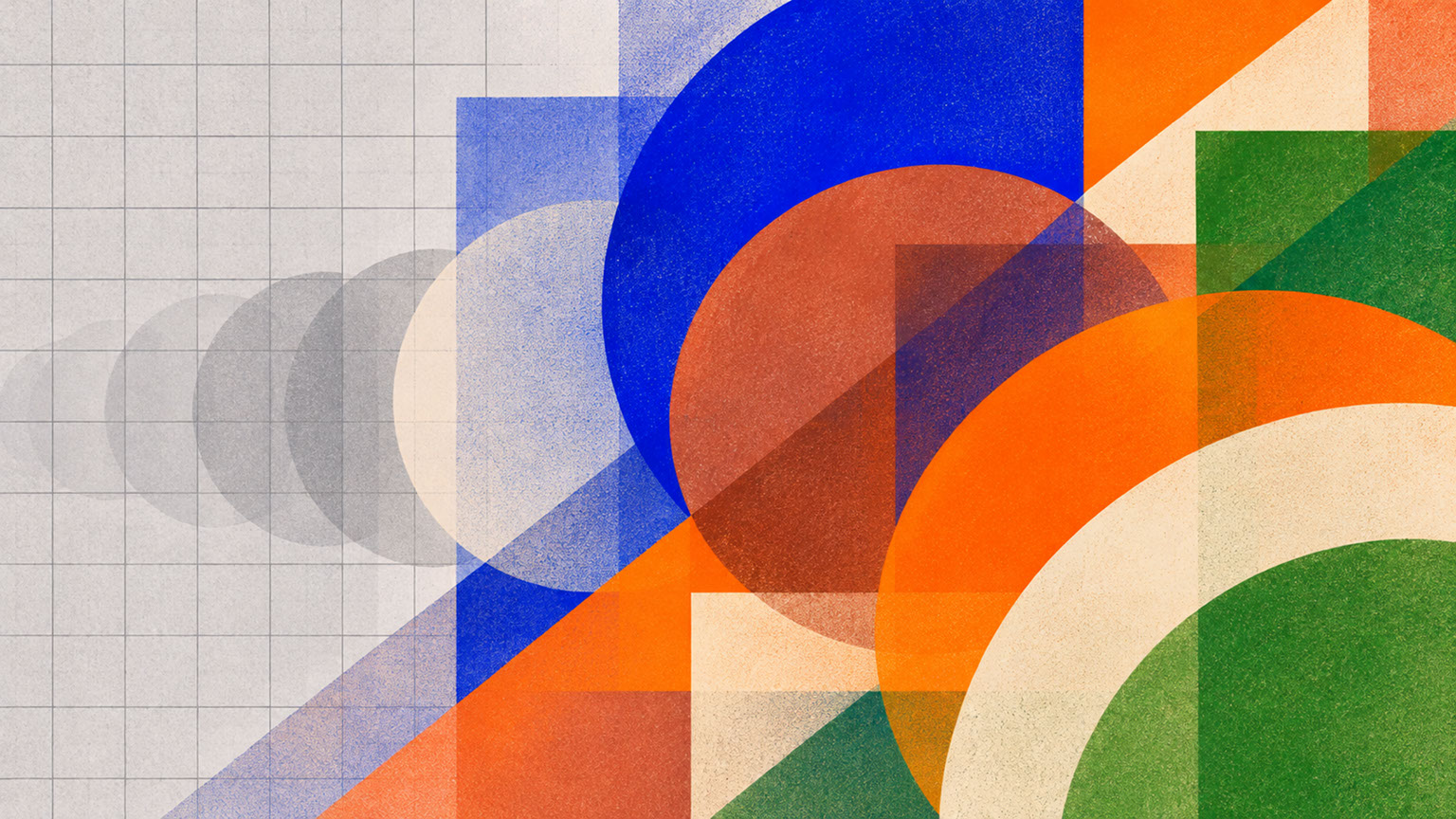 🔍 PLATE 01 — CLICK TO EXPAND
Plate 01 — Introduction — Moving Beyond Homogeneous Grey Interfaces Toward Expressive 2027 Colour: Plate 01 (Introduction): Breaking free from interchangeable cool greys and muted corporate pastels toward emotionally resonant 2027 chromatic confidence.
The Anti-Blanding Movement: Why Sterile Aesthetics No Longer Resonate
Let us be honest about how we got here. The minimalist aesthetic served genuine purposes. Clean interfaces improved usability, neutral palettes ensured accessibility, and simplified colour systems scaled beautifully across digital platforms. The problem is that everyone adopted the same solution simultaneously.
Geometric sans-serif logos multiplied like rabbits. Gradient-free interfaces became the default. Corporate colour palettes converged on identical spectrums of inoffensive greys and diluted blues. The result? A visual landscape where removing a logo renders most brands utterly unrecognisable.
What is driving the pushback? It comes down to psychology. We are living through genuinely uncertain times, and that uncertainty creates a fascinating dual demand. People simultaneously crave reassurance AND stimulation. They want to feel grounded and comforted whilst also experiencing optimism and energy. This emotional complexity cannot be addressed by a single-note palette of clinical neutrals.
WSGN, the global authority on consumer and design trends, has positioned 2027 as a pivotal year for meaningful connection and emotional colour. Their forecast, developed in collaboration with Coloro, emphasises interconnectedness—nature meeting technology, ancient meeting contemporary, heritage craft colliding with synthetic innovation. The message is clear: functional neutrality is out, and emotional intentionality is in.
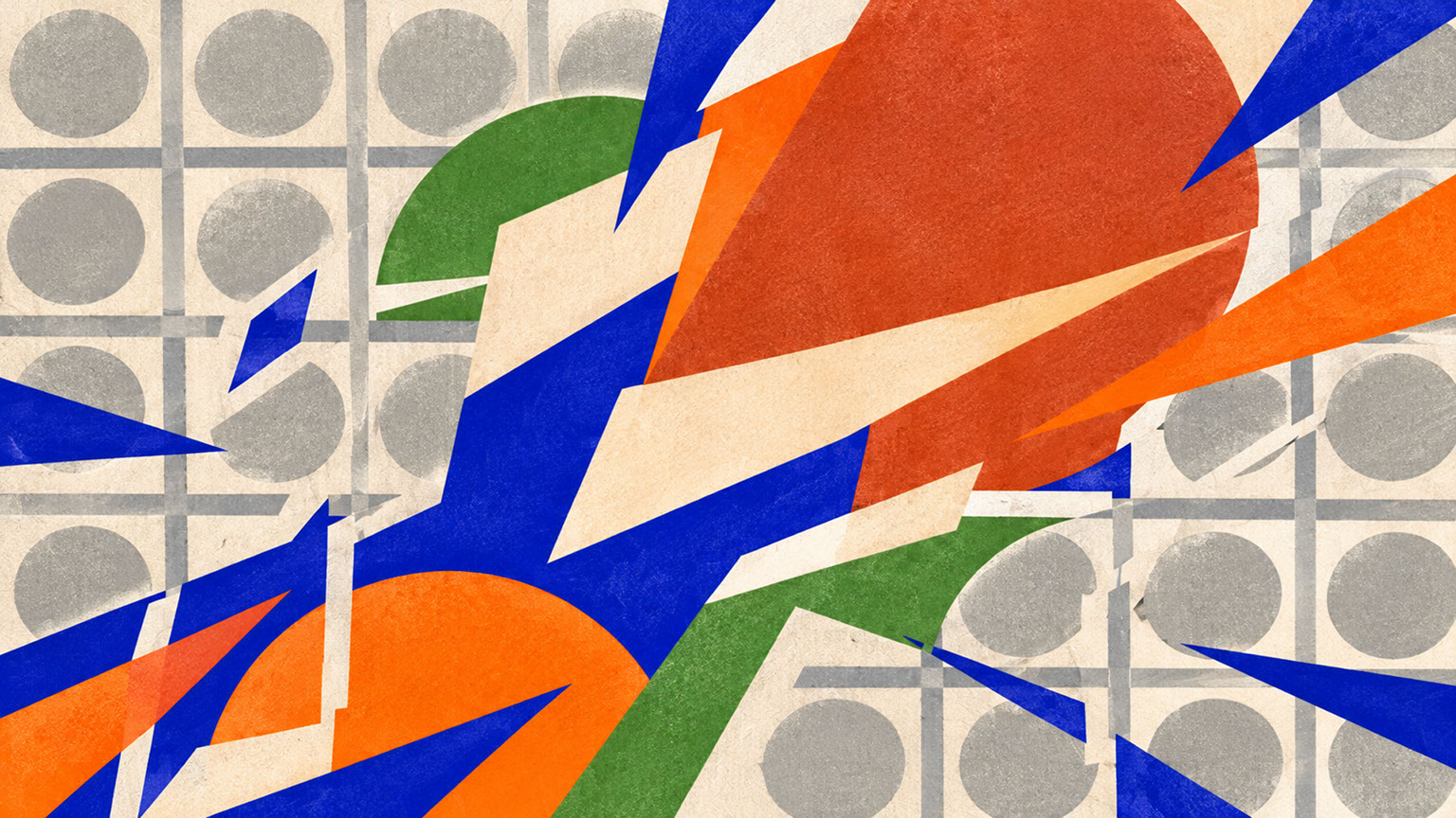 🔍 PLATE 02 — CLICK TO EXPAND
Plate 02 — The Anti-Blanding Movement — Why Sterile Aesthetics No Longer Resonate With Audiences: Plate 02 (The Anti-Blanding Movement): Why audiences fatigued by algorithmic sameness now reward brands that take decisive, characterful chromatic positions.
Why Opposites Attract: The New Philosophy of Colour Pairing
So what exactly are chromatic dualities, and why do they work? At its core, this philosophy involves the intentional pairing of warm, earthy neutrals with confident, saturated accents. Think terracotta sitting alongside electric blue. Raw clay foundations supporting pops of citrus orange. Soft mineral backgrounds punctuated by vibrant green.
Psychologically, this combination creates emotional completeness. The warm neutrals provide grounding—they feel familiar, tactile, and safe. The electric accents deliver energy—they communicate confidence, optimism, and forward momentum. Neither element works as effectively alone. Earth tones without vibrancy feel withdrawn and melancholic. Electric accents without grounding feel aggressive and unsettling.
This pairing resonates now because it sits at the meeting point of inherited craft traditions and synthetic technology. We are drawn to authenticity and heritage, but we also want to feel contemporary and progressive. The 2027 palette achieves both simultaneously.
Critically, this represents a shift from asking which colours are trending to understanding how colours interact. The story is about relationships and ratios, not simply selecting individual hues. Colour hierarchy matters more than colour proliferation. It is emotionally intelligent design rather than trend-chasing.
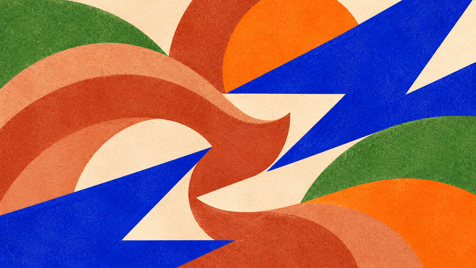 🔍 PLATE 03 — CLICK TO EXPAND
Plate 03 — Why Opposites Attract — Pairing Mineral Earth Tones With Hyper-Saturated Accents: Plate 03 (Why Opposites Attract): How pairing restorative mineral neutrals with high-energy electric accents satisfies the simultaneous human craving for calm and vitality.
Meet the 2027 Palette: Five Colours That Define the Year
Let us introduce the specific colours that embody this chromatic duality. WGSN and Coloro have identified five key players that work together as a cohesive system.
Luminous Blue (Coloro 125-28-38)
This is the authoritative anchor of the entire palette and WGSN and Coloro's official Colour of the Year 2027. Luminous Blue connects to historical pigment traditions—think lapis lazuli, the precious mineral that Renaissance artists ground into ultramarine. Yet it simultaneously resonates with contemporary technology, evoking lithium-ion batteries and the energy transition. This blue communicates confidence, innovation, and trustworthiness without aggression.
Energy Orange (Coloro 018-57-34)
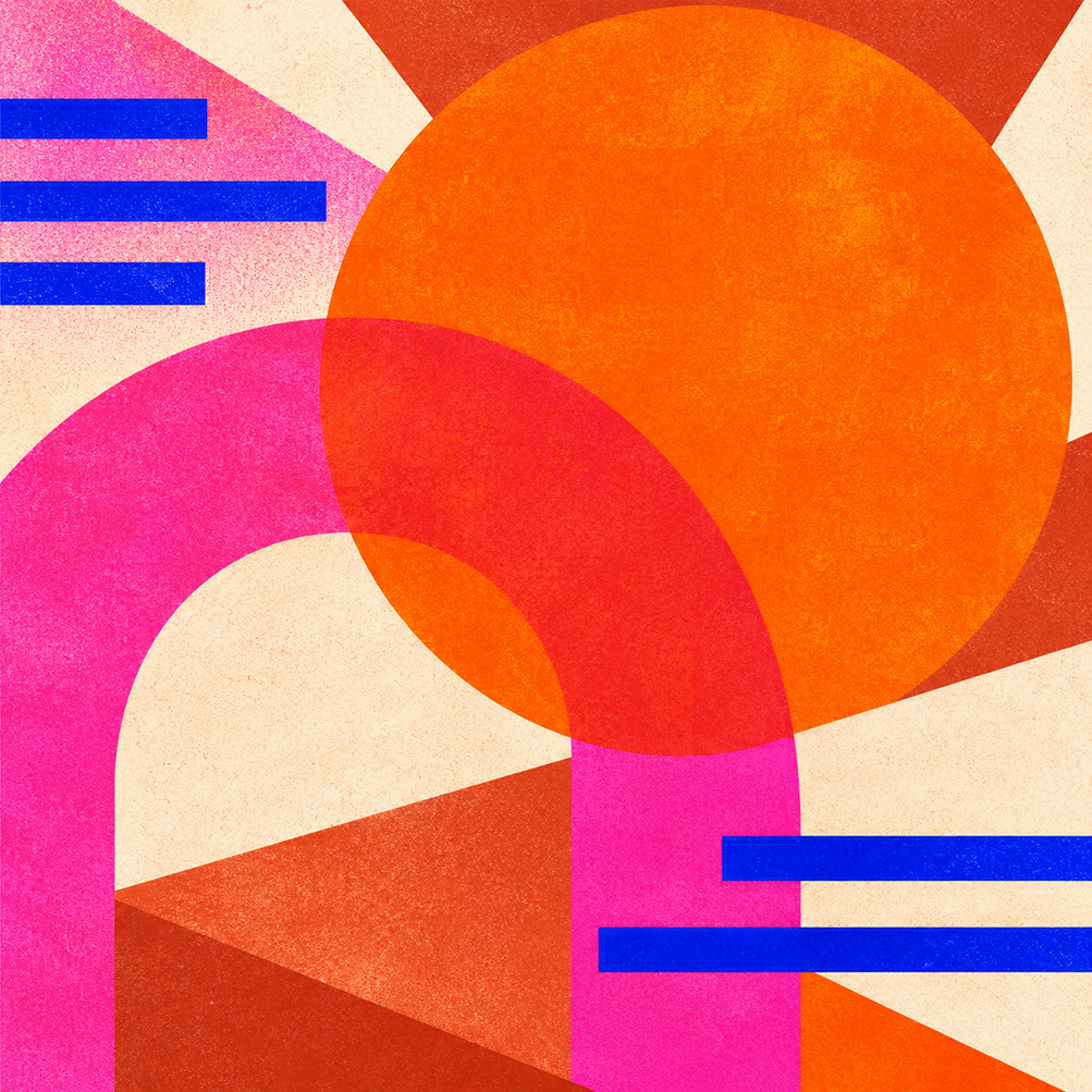
The vitality colour of the palette, Energy Orange provides warmth and optimism as a counterweight to blue's authority. This is not decorative brightness—it is strategic joy. The hue links to resilience and adaptability, offering an emotional lift that feels earned rather than superficial.
Meadowland Green (Coloro 050-61-19)
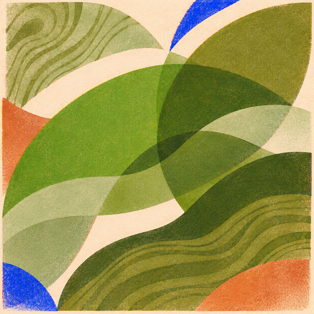
A nourishing mid-green that suggests slower living and connection to natural systems. Meadowland Green makes biophilic design tangible, offering restoration and balance. It is neither the aggressive lime greens of previous decades nor the muddy olives that feel dated—it sits perfectly in a space of contemporary calm.
Clay (Coloro 014-60-13)
This warm, pink-toned earthy neutral replaces clinical grey as the foundation colour of choice. Clay shows touch, age, and material character. It provides tactile grounding that makes electric accents feel inhabitable rather than harsh.
Soft Mineral
The essential working neutral for balance and breathing space. Soft Mineral supports rather than competes with featured colours, preventing visual fatigue whilst maintaining warmth. It is the unsung hero that makes the entire system function.
The crucial insight here is that these colours exist in relationship, not isolation. A swatch book showing them separately tells only half the story. Their power emerges through strategic combination.
 🔍 PLATE 04 — CLICK TO EXPAND
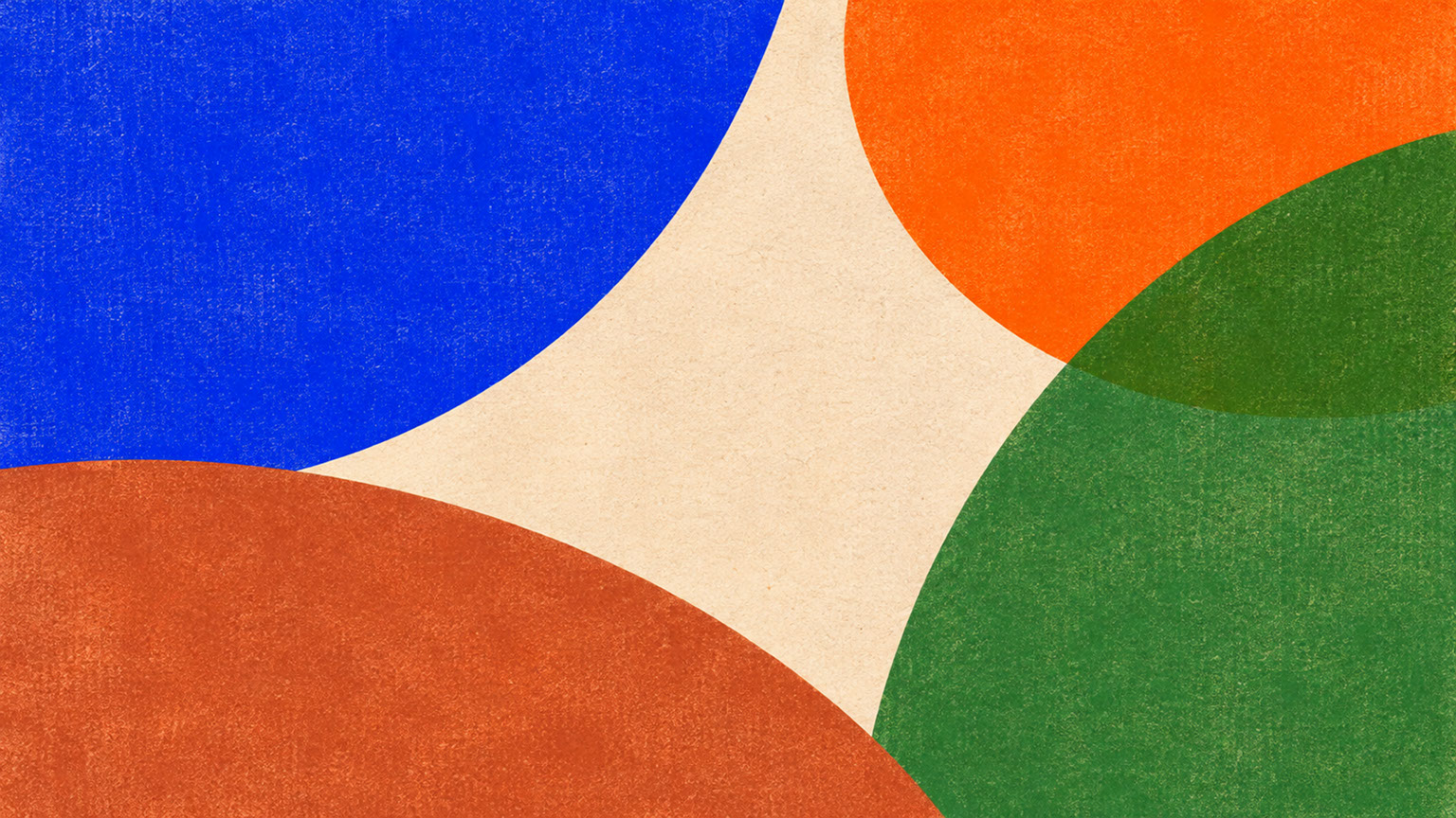
Plate 04 — Meet the 2027 Palette — Luminous Blue, Energy Orange, Meadowland Green, Clay & Soft Mineral: Plate 04 (Meet the 2027 Palette): The five foundational colours defining 2027—Luminous Blue (125-28-38), Energy Orange (018-57-34), Meadowland Green (050-61-19), Clay (014-60-13), and Soft Mineral.
From Screen to Space: How the 2027 Palette Works Across Disciplines
One of the most exciting aspects of this colour shift is its cross-disciplinary applicability. Whether you work in branding, digital interfaces, photography, or physical spaces, the principles translate meaningfully.
Branding and Graphic Design
For brand designers, the opportunity lies in pairing grounded bases (Clay, Soft Mineral) with unmistakable electric accents (Luminous Blue, Energy Orange). This creates distinctive identities that avoid both blandness and visual chaos. The result is systems that feel contemporary yet enduring—brands that stand out without screaming.
UI and Digital Interface Design
In digital spaces, colour hierarchy becomes paramount. Reserve saturated colours like Luminous Blue for navigation, buttons, and selected states where you need to draw attention. Use warm neutrals for backgrounds that reduce eye strain during extended use. The key is restraint—bold colour creates impact precisely because it appears strategically rather than everywhere.
Photography and Art Direction
The palette invites an aesthetic where natural materials meet direct flash and coloured gels. Think authentic texture—linen, raw wood, unglazed ceramic—illuminated with contemporary lighting approaches. Styling celebrates both craft heritage and technological sophistication.
Physical and Spatial Design
For architects, interior designers, and product developers, the critical lesson is testing palettes on actual substrates before committing. Colours behave dramatically differently on unbleached board versus glossy laminate, on matte ceramic versus brushed metal. Physical prototyping remains essential.
 🔍 PLATE 05 — CLICK TO EXPAND
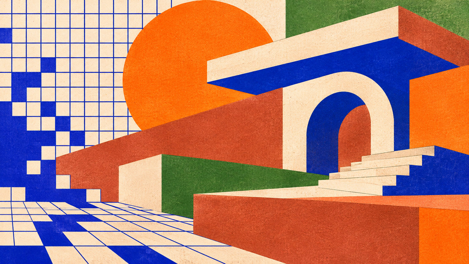
Plate 05 — From Screen to Space — Cross-Disciplinary Applications in Branding, UI, Photo & Interiors: Plate 05 (From Screen to Space): Translating the 2027 five-colour system across graphic identity, digital product interfaces, editorial photography, and spatial design.
Unbleached, Unglazed, Unwashed: How Tactile Materials Ground Bold Colour
Here is something that digital-first designers often overlook: saturated colours on screens can feel flat, synthetic, and overwhelming. Without material context, bold palettes frequently read as aggressive or childish. The gap between a digital swatch and real-world application can be enormous.
This is where raw materials become essential partners. Unbleached board adds warmth and visual texture that softens electric accents. Linen and natural textiles introduce irregularity that makes colour feel handmade rather than factory-produced. Matte ceramic and unglazed clay absorb light rather than reflecting it, creating depth and sophistication. Brushed and oxidised metals add material honesty that resonates with contemporary audiences.
Why does this partnership work so effectively? Raw materials show touch, age, and production process. They communicate authenticity in an era of synthetic perfection. Most importantly, they prevent bold colour from feeling overly digital or sterile—they create the emotional warmth that makes vibrant palettes inhabitable.
Can you simulate texture digitally? To some extent, yes. But physical material testing remains essential because colour behaves fundamentally differently on textured, absorbent, and matte surfaces compared to backlit screens. If you are specifying colours for anything that will exist in the physical world, prototype before committing.
 🔍 PLATE 06 — CLICK TO EXPAND
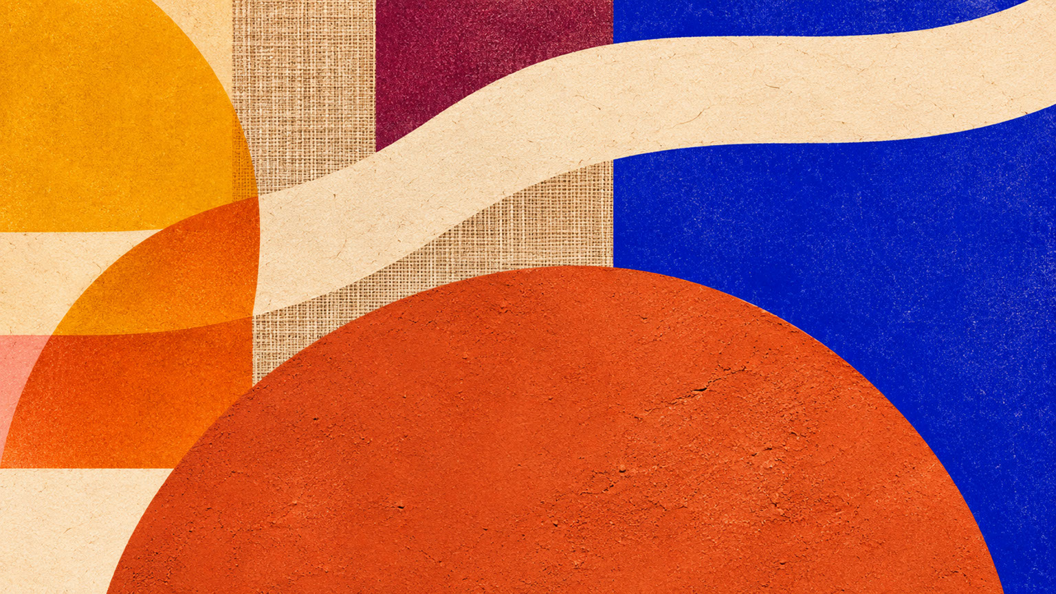
Plate 06 — Unbleached, Unglazed, Unwashed — How Raw Tactile Substrates Ground High-Chroma Pigments: Plate 06 (Tactile Materials Ground Bold Colour): Raw, light-absorbing surfaces prevent electric 2027 pigments from feeling synthetic or visually fatiguing.
Where to Begin: Practical Entry Points for Creative Professionals
If you are ready to embrace chromatic confidence in your own work, here are actionable starting points.
First, choose one anchor colour rather than attempting to use everything simultaneously. Select either Luminous Blue as your electric accent OR a warm neutral (Clay, Soft Mineral) as your foundation, then build outward from that single confident choice.
Second, always evaluate colours on intended materials before finalising specifications. Print, prototype, or sample—remember that screen representation is merely a starting point, not the final word.
Third, embrace the duality consciously. Do not choose between earth and electric—use both intentionally. Consider ratio and proportion: where will bold colour appear, and how much neutral will surround it? Think relationships, not individual colour selection.
Finally, audit your current colour systems through this new lens. Where have you defaulted to safe neutrality? Where might intentional boldness create genuine impact and differentiation?
 🔍 PLATE 07 — CLICK TO EXPAND
Plate 07 — Where to Begin — Practical Palette Audit & Entry Points for Creative Teams: Plate 07 (Practical Entry Points): Step-by-step workflow for auditing legacy grey palettes and introducing a warm mineral base with one high-chroma 2027 anchor.
The Colour Revolution Is Here
The era of digital blanding is ending, and 2027 demands both reassurance and stimulation. Warm earth tones and hyper-saturated accents work together, not separately. Material context is essential for making bold colour feel grounded rather than overwhelming.
This is not about replacing one trend with another—it is about embracing chromatic dualities that reflect genuine human emotional needs. The designers and brands that understand this shift will create work that resonates deeply, whilst those clinging to sterile neutrality will continue blending into an indistinguishable visual landscape.
The choice, as always, is yours. But the colour intelligence you need to make that choice confidently? That is exactly what this series delivers.
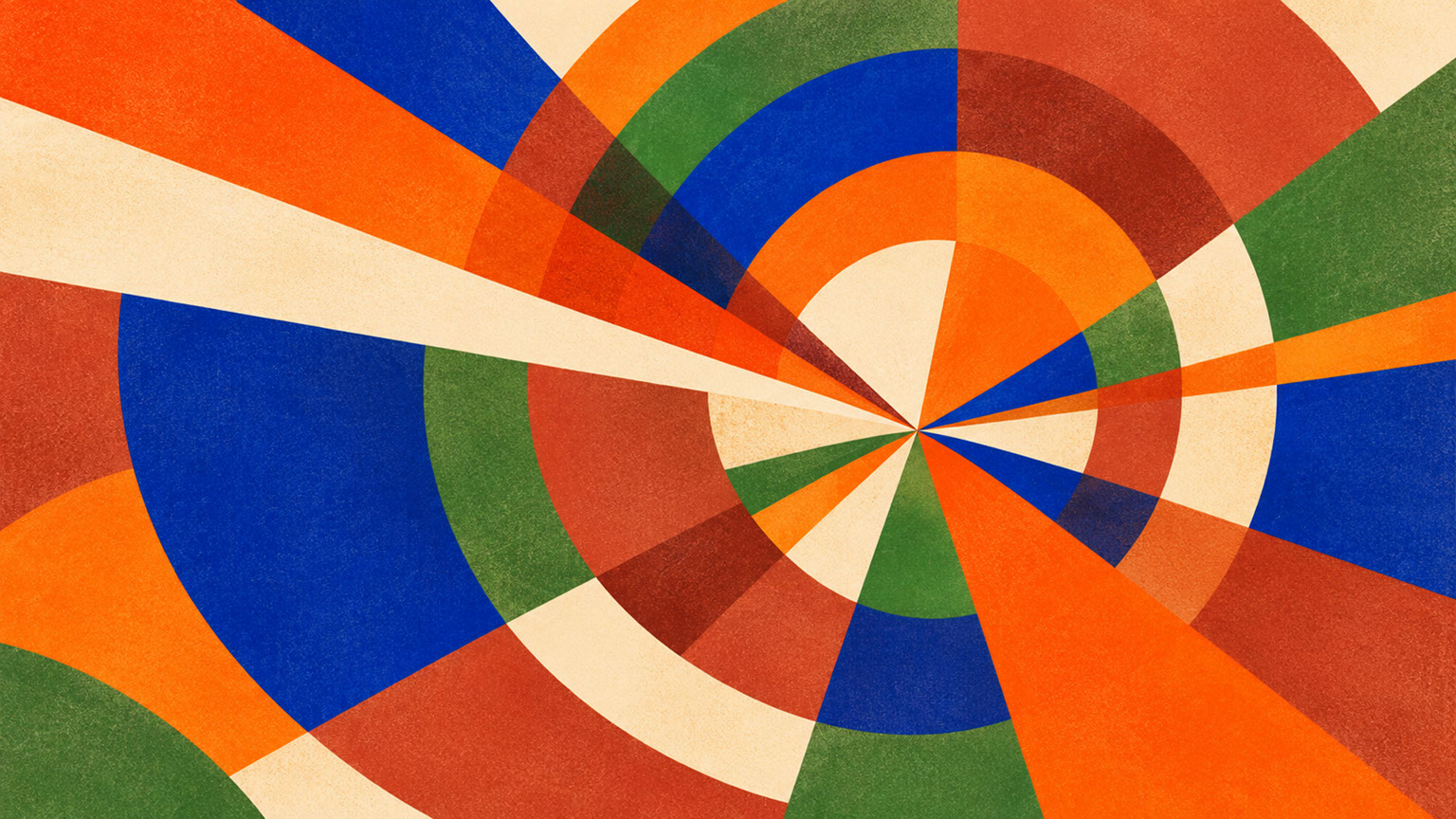 🔍 PLATE 08 — CLICK TO EXPAND
Plate 08 — The Colour Revolution Is Here — Embracing Chromatic Confidence Across Every Medium: Plate 08 (Conclusion — The Colour Revolution Is Here): A unified creative practice where human material warmth and electric chromatic confidence work in harmony.
⚡ 5 Strategies to Consider
STUDIO PLAYBOOK // 5 DIRECTIVES❓ Frequently Asked Questions — 5 Q&As (5 Q&As)
SCHEMA.ORG/FAQPAGE // 5 Q&As (5 Q&As)Q1. What exactly is digital blanding and why is it problematic for designers?
Digital blanding refers to the homogenisation of visual identity across brands and platforms, characterised by ubiquitous cool greys, sterile whites, and muted pastels. It is problematic because it makes brands interchangeable and visually indistinguishable, creating emotional coldness that no longer resonates with audiences seeking meaningful connection and authentic differentiation.
Q2. What are chromatic dualities and how do they define 2027 colour trends?
Chromatic dualities describe the intentional pairing of warm, mineral-based earth tones with hyper-saturated electric accents. This philosophy defines 2027 colour trends by addressing the simultaneous human need for both reassurance (provided by grounding neutrals) and stimulation (delivered by vibrant accents), creating emotionally complete palettes.
Q3. Which five colours make up the official 2027 palette according to WGSN and Coloro?
The complete 2027 palette features Luminous Blue (Coloro 125-28-38) as the Colour of the Year, Energy Orange (Coloro 018-57-34), Meadowland Green (Coloro 050-61-19), Clay (Coloro 014-60-13), and Soft Mineral as the supporting working neutral.
Q4. Why do raw materials like unbleached board and matte ceramic matter for bold colour palettes?
Raw materials are essential because they add warmth, texture, and depth that prevent bold colours from feeling flat, synthetic, or aggressive. Materials like unbleached board, linen, and matte ceramic absorb light and show touch, creating the tactile authenticity that makes vibrant palettes feel inhabitable rather than overwhelming.
Q5. Is minimalism dead according to the 2027 colour forecast?
Minimalism is not dead but evolving. The principles of clarity and restraint remain valuable; however, they are now expressed through intentional colour relationships rather than colour avoidance. The shift is toward emotional intentionality and chromatic confidence whilst maintaining thoughtful design discipline.
EXPLORE RELATED STUDIO TAGS (8):
Glad this piece sparked something — want the matching 4096×4096px .ZIP pack?
Enter your email below for an instant direct download of Studio Seamless Pattern Pack — Drop 01 (WPAY_DROP01.zip) plus new Studio Journal essays & free drops.