
Why Matte Is the New Digital Luxury: 7 Essential Rules for Translating 2027 Colour into Real Materials
Discover why screen colours fail on physical materials and use our 2027 colour-material matrix to translate palettes across lacquer, ceramic, and textiles.
 🔍 COVER PLATE — CLICK TO EXPAND
Episode 7 Hero Cover: Bridging the gap between backlit RGB monitors and physical light-absorbing matte substrates across the 2027 colour palette.
We have all been there, haven't we? You spend hours perfecting a colour palette on your beautifully calibrated monitor, approve the vibrant shades with absolute confidence, and then the printed samples arrive. Or the fabric swatches. Or the ceramic prototypes. And suddenly, that gorgeous Luminous Blue looks muddy, that warm Clay appears washed out, and you are left wondering what on earth happened between your screen and reality.
This frustrating scenario is the dirty secret of colour work that separates amateur execution from professional mastery. And with the 2027 palette from WGSN and Coloro presenting us with both saturated brights like Luminous Blue and Energy Orange alongside subtle warm neutrals like Clay and Bone, the translation challenges have never been more critical to understand.
Today, we are tackling this head-on. By the time you finish reading, you will have a complete colour-material matrix, substrate-specific specification strategies, and a genuine understanding of why matte surfaces have become the professional's secret weapon for consistent colour experiences. Whether you are a brand designer, packaging professional, art director, or anyone responsible for maintaining colour integrity from concept to production, this knowledge is absolutely essential.
 🔍 PLATE 01 — CLICK TO EXPAND
Plate 01 — Introduction — Bridging the Gap Between Backlit Monitors and Physical Substrates: Plate 01 (Introduction): Why a colour approved on a glass screen inevitably shifts when translated into ink, dye, glaze, or powder coat—and how to plan for it.
The Uncomfortable Truth About Digital Colour Specification
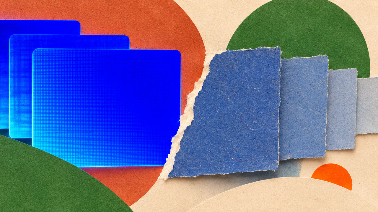
Let us start with the fundamental problem: your screen lies to you. Not maliciously, of course, but the physics simply cannot be avoided. Screens emit light whilst physical surfaces absorb and reflect it. This means screen colours represent an idealised version that materials can never exactly replicate.
Saturated colours suffer most from this translation loss. That stunning Luminous Blue you fell in love with on screen? It exists in a realm of pure emitted light that no ink, no dye, no pigment can fully capture. The gap between RGB and physical reality is not a bug in the system—it is the system itself.
Then there is substrate absorption to consider. Recycled and uncoated board absorbs ink like a sponge, creating noticeably duller results. The exact same Pantone reference prints differently on coated versus uncoated paper—sometimes dramatically so. And fabric? The weave structure breaks up colour at a micro level, affecting perception in ways that flat swatches cannot predict.
Here is something crucial that many designers misunderstand: Coloro codes, such as 125–28–38 for Luminous Blue, are standardised communication tools, not guaranteed outcomes. They provide a shared language for discussing colour, but physical verification through swatch libraries remains absolutely essential. Think of digital references as starting points for conversation, not final specifications.
 🔍 PLATE 02 — CLICK TO EXPAND
Plate 02 — The Uncomfortable Truth About Digital Colour — Emitted Light vs. Reflected Pigment: Plate 02 (Digital Colour Truth): Screens emit transmissive light while physical materials absorb and scatter reflected photons—requiring substrate-specific colour specifications.
Why Single-Spec Palettes Set Projects Up for Failure
Understanding why translation fails is step one. Building systems that anticipate these challenges? That is what separates effective colour management from perpetual disappointment.
The solution lies in thinking about colour families rather than rigid single specifications. Each hero colour needs variants optimised for different substrates. A Luminous Blue family might include separate specifications for screen, coated paper, uncoated paper, and textile—each adjusted to achieve the intended emotional impact on that specific material.
Professional brand systems specify acceptable ranges rather than single values. They document tolerance standards and define precisely when variation becomes unacceptable. Most importantly, they capture the intent behind colour choices, not just the technical specifications. Because sometimes achieving emotional accuracy matters more than numerical precision.
Start building physical reference libraries now. Collect substrate-specific swatches, photograph approved samples under controlled lighting, and retain production samples for consistency over time. This physical archive becomes invaluable when briefing suppliers and maintaining standards across projects.
 🔍 PLATE 03 — CLICK TO EXPAND
Plate 03 — Why Single-Spec Palettes Fail — How One Hex Code Splits Across Four Different Materials: Plate 03 (Why Single-Spec Palettes Fail): Handing a single hex or Pantone code to every vendor without finish compensation leads to disjointed brand touchpoints.
The Colour-Material Matrix: Your 2027 Translation Guide
This is the practical heart of everything we have discussed—actionable guidance for translating each 2027 palette colour into specific material applications. Keep this reference handy.
Luminous Blue (Coloro 125–28–38)
Lacquer achieves the closest match to digital saturation. Specify high-gloss automotive-grade for maximum vibrancy—this is where you can get genuinely close to that screen colour. For ceramics, glazed finishes are essential; unglazed reduces saturation significantly. Wool holds dye beautifully in textiles, though synthetic blends may shift cooler than expected. On coated paper, specify spot colour rather than CMYK build for saturation retention. And on board or uncoated stock? Expect noticeable dulling—you may need to specify a more saturated starting point to compensate.
Clay (Coloro 014–60–13)
This warm neutral has natural material affinities that make translation more forgiving. Ceramics are its natural home, with unglazed terracotta providing authentic expression. Warm-toned uncoated stocks complement rather than fight the colour on paper. Limewash and mineral paints create beautiful textural depth in plaster applications. Linen and cotton absorb naturally in textiles—avoid synthetic sheen here. Recycled kraft boards provide a harmonious base that enhances rather than diminishes the warmth.
Meadowland Green (Coloro 050–61–19)
Textile is the optimal substrate for this biophilic shade; woven fabrics create depth through thread variation that enriches the colour. Specify matte or eggshell for paint applications—gloss shifts perception toward artificial. Glass offers beautiful possibilities for translucent, backlit elements. Consider environmental inks for authentic positioning in printed applications. Unbleached paper stocks create earthy, cohesive results that feel intentional rather than compromised.
Energy Orange (Coloro 018–57–34)
This high-chroma shade demands careful handling. Specify spot colour for maximum impact in ink applications—this is borderline fluorescent territory. Use it for trim and accessories where small applications maintain vibrancy without overwhelming. Moulded plastic offers both translucent and opaque options with different energies. Synthetic performance fabrics hold saturation well in textiles. Coated stocks are essential for paper applications; uncoated will disappoint.
Bone (Natural White/Cream Reference)
Board is Bone's natural home, with recycled and unbleached stocks enhancing its warmth. Natural linen fibres embody the colour's character perfectly. Soft-touch matte laminates preserve subtlety without glare. Unglazed porcelain or stoneware bodies work beautifully in ceramics. For paper, specify warm white or natural stocks and actively avoid optical brighteners—they will fight against the entire point of this colour.
 🔍 PLATE 04 — CLICK TO EXPAND
Plate 04 — The 2027 Colour-Material Matrix — Luminous Blue, Clay, Meadowland Green, Orange & Bone: Plate 04 (The Colour-Material Matrix): Master translation grid showing how each of the five core 2027 colours behaves across paper, textile, ceramic, and coated metal.
Tailored Approaches for Every Creative Application
Different disciplines require different implementation strategies. Let us break this down.
Branding and Production
Create separate specification documents for each primary substrate your brand appears on. Build tolerance standards that define what variation is acceptable versus unacceptable. Communicate with printers and manufacturers using physical references, not just digital files—send actual swatches whenever possible. Know when to prioritise emotional accuracy over numerical precision, and document that decision clearly.
UI and Digital Contexts
Consider how low-glare matte screen protectors affect colour perception for end users. Design restrained gradients that translate meaningfully to physical brand touchpoints. Test across device types and brightness settings before finalising specifications. Document the intended physical-world relationship for digital colours so future designers understand the system.
Photography and Pre-Production
Photograph material samples under both daylight and artificial lighting conditions. Finalise art direction based on physical substrate tests, not screen-only approval. Manage client expectations about translation realities early in projects—before budgets are locked. Build reference image libraries showing colours on actual intended materials.
Packaging and Spatial Production
Prototype finishes at full scale. Tiny swatches cannot predict how colours behave across large surfaces—scale changes perception. Document finish specifications alongside colour specifications. Work collaboratively with fabricators to achieve colour intent, not just colour match. Establish prototype and sign-off processes that include physical material review as a mandatory step.
 🔍 PLATE 05 — CLICK TO EXPAND
Plate 05 — Tailored Approaches Across Print Production, Low-Glare UI, Photography & Packaging: Plate 05 (Tailored Creative Applications): Aligning ink drawdown proofs, UI surface luminance, studio lighting CRI, and spatial finish schedules.
Why Matte Surfaces Create More Consistent Colour Experiences
Here is the secret weapon that professionals increasingly rely upon: matte finishes solve problems that glossy surfaces create.
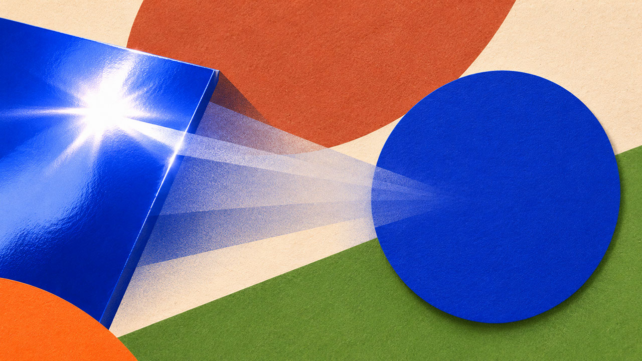
Glossy surfaces produce inconsistent colour perception depending on viewing angle and lighting conditions. That beautiful gloss finish looks different under every light source, from every angle. Matte surfaces distribute light more evenly, creating reliable colour reading regardless of how someone encounters your work. They also reduce environmental reflection interference—no more seeing ceiling lights in your packaging.
The applications are broad. Matte laminates and soft-touch coatings for packaging. Uncoated and unbleached paper stocks for print. Brushed and satin metal finishes for product design. Linen, felt, and natural textile surfaces for interior and fashion applications. Satin ceramic glazes that balance just enough sheen with excellent colour fidelity.
And here is something fascinating: matte has become a contemporary luxury signal. Tactile surfaces invite touch and create memorable experiences. The growing preference for sensory restraint over obvious shine reflects a broader cultural shift we explored in Episode 6—craft visibility and material honesty now signal premium positioning more effectively than high-gloss perfection ever could.
 🔍 PLATE 06 — CLICK TO EXPAND
Plate 06 — Why Matte Is the New Digital Luxury — Diffuse Reflection Eliminates Specular Glare: Plate 06 (Matte Consistency): Because matte micro-textures scatter light evenly rather than creating mirror-like glare, viewers perceive truer, calmer pigment depth from every angle.
Building Your Translation Practice
Colour translation is not a single specification—it is a system. Successful implementation requires understanding substrate behaviour, building colour families with appropriate variants, and embracing matte surfaces for the consistency they provide.
Start immediately: build physical reference libraries using the five 2027 palette colours on your most-used substrates. Document what you learn. Create specification sheets that capture both technical values and intended outcomes. Train yourself and your team to think in terms of colour intent, not just colour codes.
Understanding material translation is essential preparation for where we are heading next. In Episode 8, we synthesise everything from this entire series into accessible, repeatable cross-medium palette systems—including WCAG 2.2 contrast requirements, the 60-30-10 proportion system, and practical testing protocols you can implement immediately.
What colour translation challenges have you encountered? Which substrates consistently surprise you? Share your discoveries—because building colour mastery is genuinely a community endeavour.
 🔍 PLATE 07 — CLICK TO EXPAND
Plate 07 — Building Your Translation Practice — Physical Drawdowns, D65 Viewing & Multi-Spec Systems: Plate 07 (Building Your Translation Practice): Establishing physical master standards, multi-lighting evaluations, and substrate-specific tolerances in your studio workflow.
⚡ 5 Strategies to Consider
STUDIO PLAYBOOK // 5 DIRECTIVES❓ Frequently Asked Questions — 5 Q&As (5 Q&As)
SCHEMA.ORG/FAQPAGE // 5 Q&As (5 Q&As)Q1. How different will my screen colour look when printed on various materials?
The difference varies significantly by substrate. Coated papers retain vibrancy best, whilst uncoated and recycled stocks may appear noticeably duller due to ink absorption. Saturated colours like Luminous Blue suffer most from translation loss. Always request printed proofs on your actual production substrate before approving final specifications.
Q2. Are Coloro codes universal across all materials?
No, Coloro codes provide standardised reference points for communication, but physical results vary considerably by substrate and production method. Use codes as starting points for conversation, then verify with physical samples on your intended materials. Physical verification through swatch libraries remains essential for accurate colour matching.
Q3. Why do matte finishes work better for colour consistency than glossy surfaces?
Matte surfaces scatter light evenly, reducing glare and environmental reflections that distort colour perception on glossy finishes. This creates more consistent viewing experiences regardless of angle or lighting conditions. Glossy surfaces produce variable colour perception depending on how light hits them, making reliable colour communication more challenging.
Q4. What is a colour family approach and why should designers use it?
A colour family approach means designing multiple variants of each hero colour optimised for different substrates, rather than specifying a single rigid value. For example, a Luminous Blue family might include separate specifications for screen, coated paper, uncoated paper, and textile. This approach acknowledges that achieving consistent emotional impact requires different technical specifications across materials.
Q5. Which substrates work best for translating saturated colours like Energy Orange?
Coated paper stocks, high-gloss lacquer, and synthetic performance fabrics hold saturation best for high-chroma colours like Energy Orange. Specify spot colours rather than CMYK builds for ink applications. Avoid uncoated stocks for this shade, as they will absorb ink and significantly dull the vibrancy you are trying to achieve.
EXPLORE RELATED STUDIO TAGS (8):
Glad this piece sparked something — want the matching 4096×4096px .ZIP pack?
Enter your email below for an instant direct download of Studio Seamless Pattern Pack — Drop 01 (WPAY_DROP01.zip) plus new Studio Journal essays & free drops.