2027 Colour Trends: The 8-Part Creative Forecast Designers Need Now
Explore our 8-part 2027 colour trends forecast covering Luminous Blue, warm clay neutrals, restorative greens, joy accents, heritage pigments, and WCAG rules.
 🔍 COVER PLATE — CLICK TO EXPAND
Series Hero Cover: Curated 2027 chromatic forecast studio table combining electric Luminous Blue and Energy Orange swatches with raw terracotta clay, botanical greens, and unbleached linen.
Welcome to the most comprehensive colour intelligence series you will read for the 2027 creative cycle. Over eight interconnected deep-dive essays, we examine the seismic chromatic shift reshaping design culture: the end of safe, clinical digital blanding and the rise of expressive chromatic dualities. Across branding, digital product interfaces, commercial photography, packaging, and spatial architecture, designers are pairing grounding mineral earths with electric high-chroma anchors to meet a dual human need for tactile reassurance and kinetic optimism.
This eight-part editorial forecast, 2027 Colour Trends: The 8-Part Creative Forecast Designers Need Now, moves beyond surface-level mood boards to deliver a complete, cross-disciplinary specification system. From WGSN and Coloro's Colour of the Year—Luminous Blue—to raw clay neutrals, layered biophilic greens, strategic joy accents in Energy Orange and Pop Pink, post-luxury heritage pigments, matte material translation, and WCAG 2.2 accessible 60-30-10 ratios, each chapter equips you with actionable palettes and material pairings.
 🔍 PLATE 01 — CLICK TO EXPAND
Plate 01 — Series Introduction — Multidisciplinary Creative Studio Reviewing 2027 Colour & Material Forecast: Plate 01 (Series Introduction): Multidisciplinary design studio mapping the 2027 shift from sterile digital blanding to tactile mineral earths and high-chroma electric accents.
Episode 1: Chromatic Dualities & The Bold Shift From Digital Blanding
Episode 1 establishes the macro cultural thesis of 2027 colour theory: why sterile cool greys, stark whites, and corporate pastel washes have lost their emotional authority, and why contrasting colour pairs now define contemporary visual identity. We introduce the core five-colour 2027 foundation—Luminous Blue, Energy Orange, Meadowland Green, Clay, and Soft Mineral—and explore how unbleached board, unglazed ceramics, and raw linen ground electric digital pigments across screen and physical space.
 🔍 PLATE 02 — CLICK TO EXPAND
Plate 02 — Episode 1 Preview — Chromatic Dualities Pairing Grounding Earth Tones With Electric Accents: Plate 02 (Episode 1 — Chromatic Dualities): Visual study of 2027's core tension between grounding mineral substrates and hyper-saturated electric focal points.
Episode 2: Luminous Blue — Mastering the Colour of 2027 Without Overwhelm
Episode 2 dives deep into Coloro's Luminous Blue (125-28-38), the defining electric anchor of 2027. Bridging ancient lapis lazuli pigment heritage with lithium-ion digital luminosity, Luminous Blue projects authority without corporate coldness. We detail exact proportion rules, warm mineral counterweights, dark-mode UI contrast safeguards, and physical material translations across cobalt ceramic glazes, anodised aluminium, and matte paper stocks.
 🔍 PLATE 03 — CLICK TO EXPAND
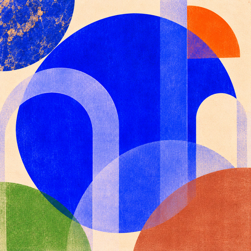
Plate 03 — Episode 2 Preview — Coloro Luminous Blue (125-28-38) Across Digital UI and Physical Pigments: Plate 03 (Episode 2 — Luminous Blue): Coloro's 2027 Colour of the Year bridging ancient lapis lazuli depth with high-chroma digital interface authority.
Episode 3: Clay, Sandstone & Rose-Brown — Rebuilding the Neutral Palette
Episode 3 chronicles the death of clinical blankness and the rise of the warm earth neutral foundation. Led by Coloro's Clay (014-60-13), baked terracotta, sandstone, and rose-brown replace sterile #FFFFFF backgrounds and cool slate greys with sun-baked architectural warmth. We show how to deploy warm mineral neutrals across uncoated packaging, low-glare reading interfaces, low-gloss editorial photography, and limewashed interiors.
 🔍 PLATE 04 — CLICK TO EXPAND
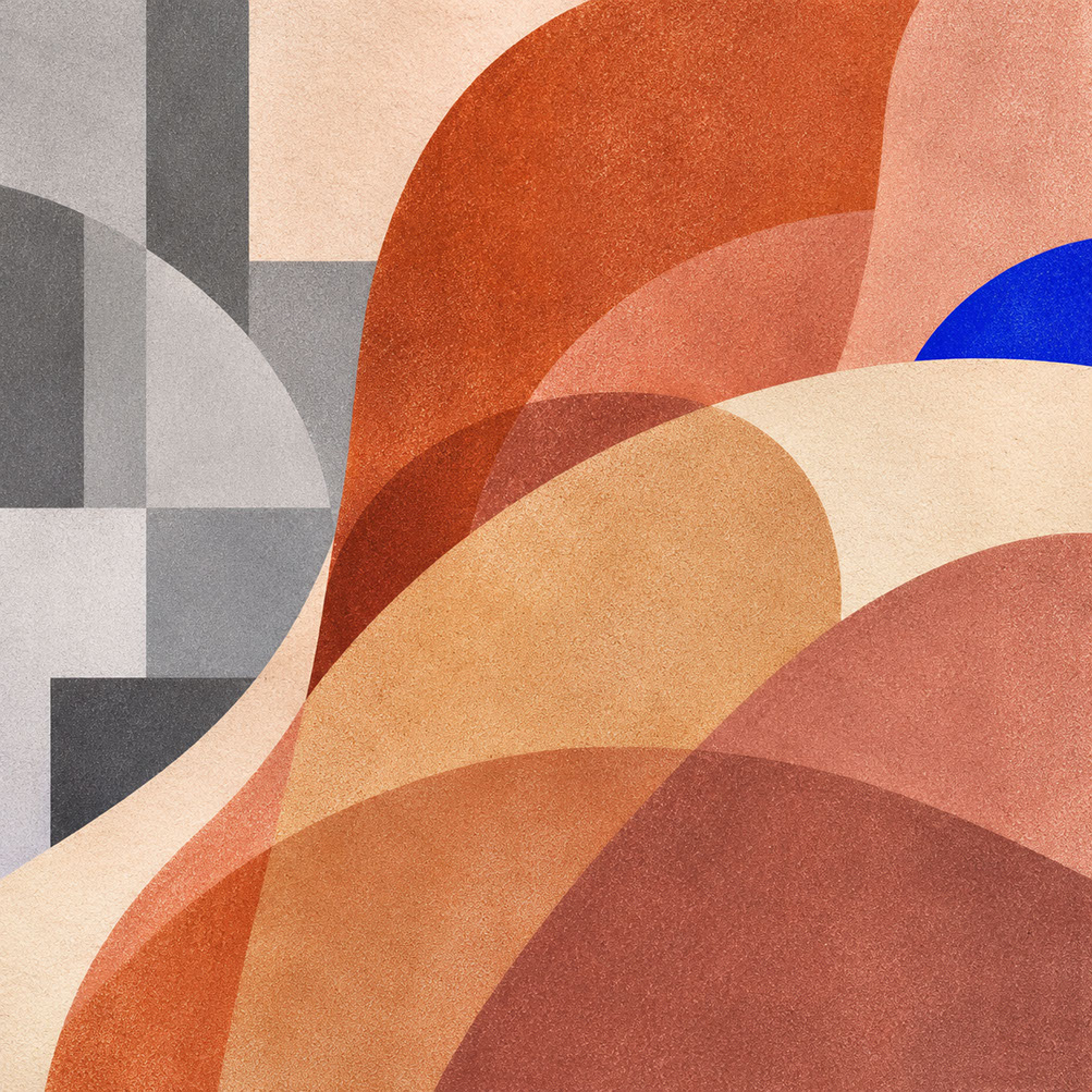
Plate 04 — Episode 3 Preview — Warm Clay, Sandstone & Rose-Brown Tactile Neutral Palette: Plate 04 (Episode 3 — Clay & Sandstone Neutrals): Warm mineral earth tones replacing sterile whites and cool greys across packaging, UI backgrounds, and interior surfaces.
Episode 4: The Restorative Green Palette — Meadowland, Olive & Herbal Tones
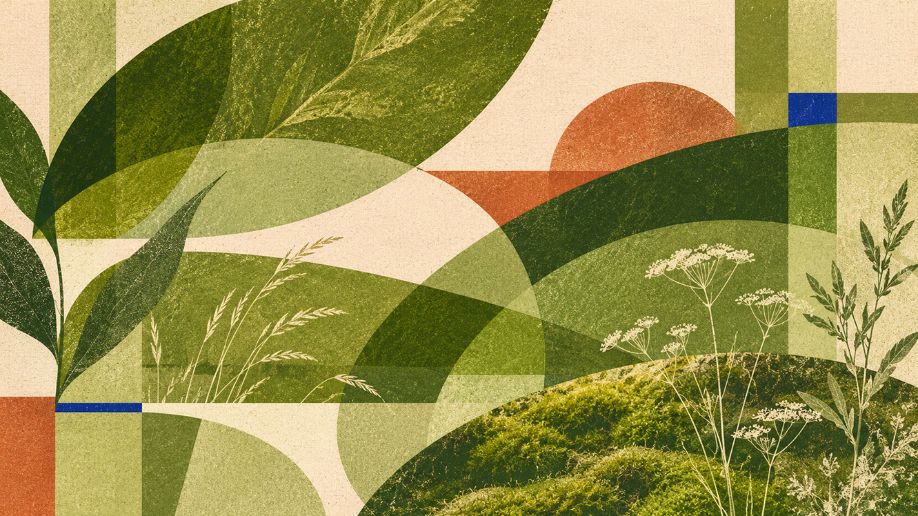
Episode 4 moves beyond flat, cliché sustainability greens to explore multi-tonal biophilic depth. By layering Meadowland Green (Coloro 050-61-19) with deep mossy olive, dry sage, and fresh celery undertones, designers create restorative visual ecosystems that lower cognitive fatigue. We examine practical applications across wellness branding, calm digital interfaces, botanical art direction, and timber-and-aged-brass spatial design.
 🔍 PLATE 05 — CLICK TO EXPAND
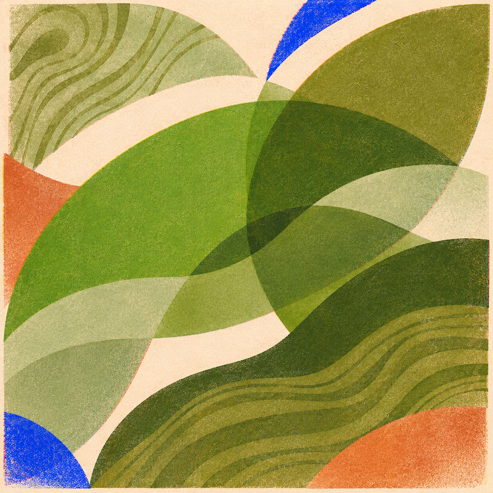
Plate 05 — Episode 4 Preview — Layered Meadowland Green, Deep Olive & Herbal Botanical Swatches: Plate 05 (Episode 4 — Restorative Greens): Multi-tonal green systems combining Meadowland Green, deep olive, and herbal tones with raw timber and aged brass.
Episode 5: 2027's Joy Colours — Energy Orange & Pop Pink in Practice
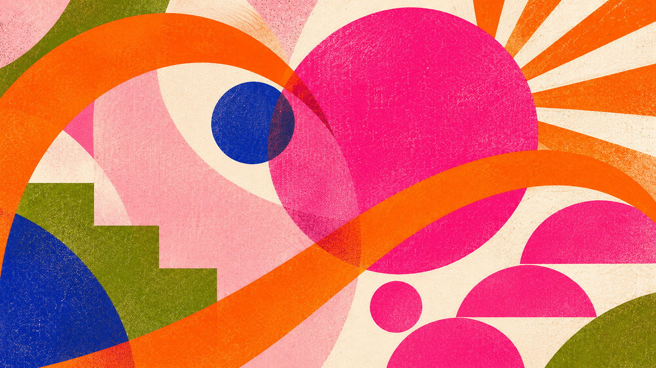
Episode 5 investigates the psychology of strategic joy: how high-chroma Energy Orange (Coloro 018-57-34) and lilac-infused Pop Pink (Coloro 151-73-22) serve as deliberate emotional counterweights to cultural anxiety. Rather than chaotic neon overload, 2027's joy colours succeed through disciplined 5–10% focal interventions across kinetic typography, UI micro-interactions, direct-flash photography, and risograph or translucent packaging accents.
Read Episode 5: 2027's Joy Colours: How Energy Orange and Pop Pink Make Design Feel Alive Again →
 🔍 PLATE 06 — CLICK TO EXPAND
Plate 06 — Episode 5 Preview — Strategic Joy With High-Chroma Energy Orange and Pop Pink Accents: Plate 06 (Episode 5 — Energy Orange & Pop Pink): Controlled bursts of citrus warmth and playful pink anchored by warm neutrals for high-impact calls to action and packaging.
Episode 6: Oxblood, Russet & Antique Plum — Crafted Post-Luxury Pigments
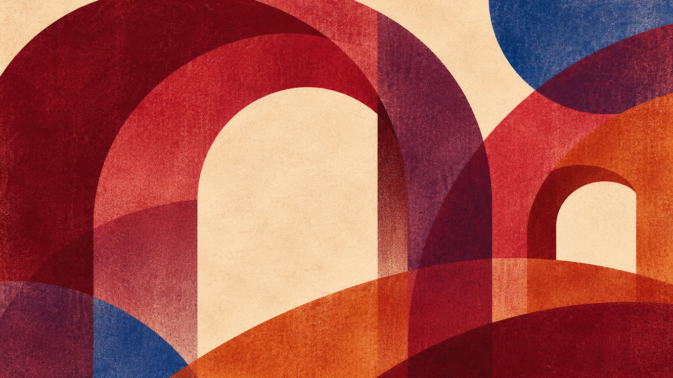
Episode 6 examines why premium branding in 2027 is abandoning flashy metallic foils and high-gloss black in favour of archival heritage pigments. Deep oxblood, carmine, russet, and antique plum communicate permanence, provenance, and accumulated craft knowledge. We explore how to pair these nocturnal tones with blind debossing, vegetable-tanned leather, heavy cotton rag stock, and low-key chiaroscuro photography.
Read Episode 6: Oxblood, Russet and Antique Plum: Why 2027 Luxury Looks Crafted, Not Glossy →
 🔍 PLATE 07 — CLICK TO EXPAND
Plate 07 — Episode 6 Preview — Post-Luxury Heritage Pigments in Oxblood, Russet & Antique Plum: Plate 07 (Episode 6 — Heritage Pigments): Archival oxblood, deep carmine, russet, and antique plum replacing ostentatious metallics with tactile craftsmanship.
Episode 7: Why Matte Is the New Digital Luxury — The Material Translation Matrix
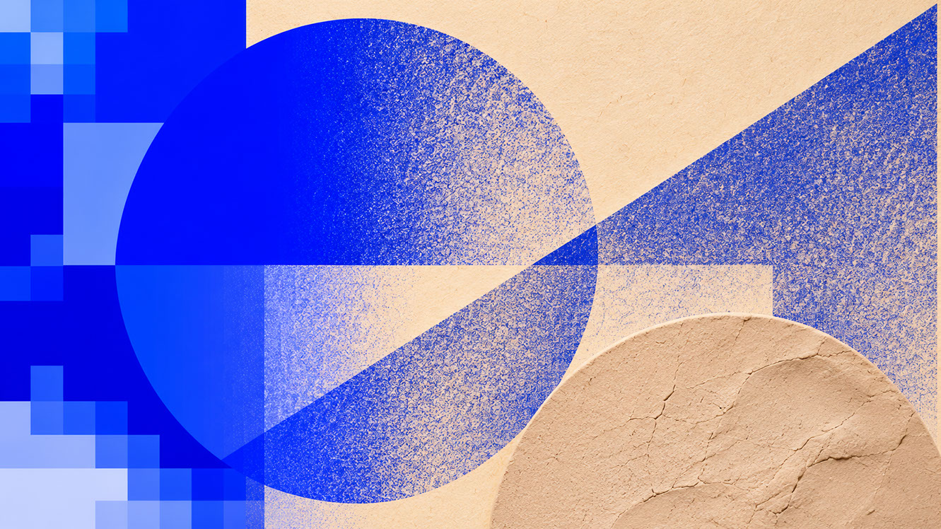
Episode 7 confronts one of design's costliest production traps: specifying a single RGB hex code on a backlit glass monitor and expecting it to survive on physical substrates. We provide the complete 2027 Colour-Material Translation Matrix—mapping Luminous Blue, Clay, Meadowland Green, Energy Orange, and Bone across matte lacquer, unglazed stoneware, slubbed linen, and uncoated board—and explain why matte finishes create superior chromatic fidelity.
 🔍 PLATE 08 — CLICK TO EXPAND
Plate 08 — Episode 7 Preview — Translating 2027 Screen Colours Into Matte Lacquer, Ceramic & Uncoated Board: Plate 08 (Episode 7 — Matte Material Revolution): Cross-substrate colour translation showing how low-sheen matte textures stabilize pigment perception across digital and physical media.
Episode 8: Building an Accessible 2027 Colour Palette — Ratios & WCAG Rules
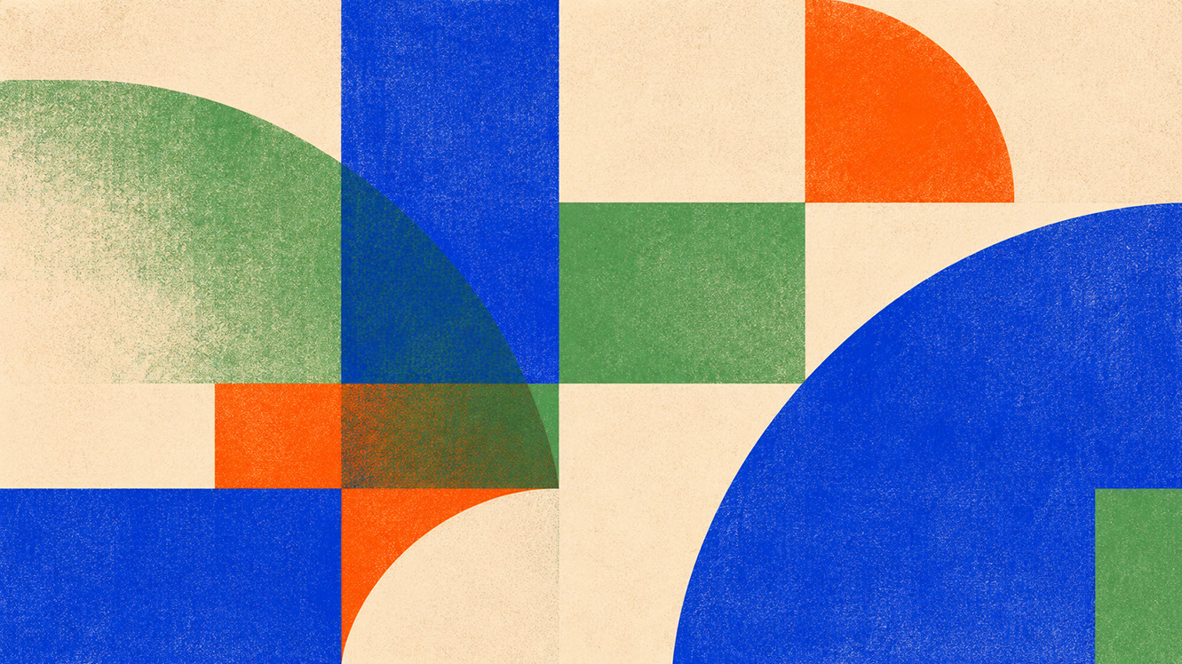
Episode 8 synthesizes the entire eight-part forecast into a practitioner's technical field guide. Combining WCAG 2.2 AA/AAA contrast compliance with the classic 60-30-10 architectural proportion rule, we assign five functional roles—Dark Soil text, Bone canvas, Luminous Blue brand anchor, Meadowland Green secondary support, and Energy Orange focal accent—complete with a five-point cross-medium testing protocol.
 🔍 PLATE 09 — CLICK TO EXPAND
Plate 09 — Episode 8 Preview — 60-30-10 Proportion Hierarchy & WCAG 2.2 Accessible Contrast System: Plate 09 (Episode 8 — Accessible Palettes): Practitioner framework uniting the 60-30-10 ratio rule with WCAG 2.2 AA/AAA contrast compliance across digital and print.
Explore All 8 Episodes of the 2027 Colour Trends Forecast
Jump directly to any episode in this 8-part forecast examining chromatic dualities, Coloro's Luminous Blue, clay and sandstone neutrals, restorative biophilic greens, strategic joy accents, post-luxury heritage pigments, matte material translation, and WCAG 2.2 accessible 60-30-10 systems.
Episode 01 of 08Read Episode →Why 2027 Colour Trends Are Splitting in Two: The Bold Shift from Digital Blanding to Chromatic Confidence Episode 02 of 08Read Episode →Luminous Blue Is the Colour of 2027: How to Use It Without Overwhelming Your Audience Episode 03 of 08Read Episode →Forget Clinical Grey: Why Clay, Sandstone and Rose-Brown Are Rebuilding the Neutral Palette for 2027 Episode 04 of 08Read Episode →The Restorative Green Palette for 2027: Meadowland, Olive and Herbal Colour in Practice Episode 05 of 08Read Episode →2027's Joy Colours: How Energy Orange and Pop Pink Make Design Feel Alive Again Episode 06 of 08Read Episode →Oxblood, Russet and Antique Plum: Why 2027 Luxury Looks Crafted, Not Glossy Episode 07 of 08Read Episode →Why Matte Is the New Digital Luxury: 7 Essential Rules for Translating 2027 Colour into Real Materials Episode 08 of 08Read Episode →How to Build an Accessible 2027 Colour Palette: Ratios, Contrast and Cross-Medium Rules⚡ 5 Strategies to Consider
STUDIO PLAYBOOK // 5 DIRECTIVES❓ Frequently Asked Questions — 5 Q&As (5 Q&As)
SCHEMA.ORG/FAQPAGE // 5 Q&As (5 Q&As)Q1. What exactly is digital blanding and why is it problematic for designers?
Digital blanding refers to the homogenisation of visual identity across brands and platforms, characterised by ubiquitous cool greys, sterile whites, and muted pastels. It is problematic because it makes brands interchangeable and visually indistinguishable, creating emotional coldness that no longer resonates with audiences seeking meaningful connection and authentic differentiation.
Q2. What are chromatic dualities and how do they define 2027 colour trends?
Chromatic dualities describe the intentional pairing of warm, mineral-based earth tones with hyper-saturated electric accents. This philosophy defines 2027 colour trends by addressing the simultaneous human need for both reassurance (provided by grounding neutrals) and stimulation (delivered by vibrant accents), creating emotionally complete palettes.
Q3. Which five colours make up the official 2027 palette according to WGSN and Coloro?
The complete 2027 palette features Luminous Blue (Coloro 125-28-38) as the Colour of the Year, Energy Orange (Coloro 018-57-34), Meadowland Green (Coloro 050-61-19), Clay (Coloro 014-60-13), and Soft Mineral as the supporting working neutral.
Q4. Why do raw materials like unbleached board and matte ceramic matter for bold colour palettes?
Raw materials are essential because they add warmth, texture, and depth that prevent bold colours from feeling flat, synthetic, or aggressive. Materials like unbleached board, linen, and matte ceramic absorb light and show touch, creating the tactile authenticity that makes vibrant palettes feel inhabitable rather than overwhelming.
Q5. Is minimalism dead according to the 2027 colour forecast?
Minimalism is not dead but evolving. The principles of clarity and restraint remain valuable; however, they are now expressed through intentional colour relationships rather than colour avoidance. The shift is toward emotional intentionality and chromatic confidence whilst maintaining thoughtful design discipline.
EXPLORE RELATED STUDIO TAGS (6):
Glad this piece sparked something — want the matching 4096×4096px .ZIP pack?
Enter your email below for an instant direct download of Studio Seamless Pattern Pack — Drop 01 (WPAY_DROP01.zip) plus new Studio Journal essays & free drops.