The Restorative Green Palette for 2027: Meadowland, Olive and Herbal Colour in Practice
Discover why layered green palettes feel sophisticated whilst single shades feel dated. Master Meadowland Green for wellness branding, UI design and interiors.
 🔍 COVER PLATE — CLICK TO EXPAND
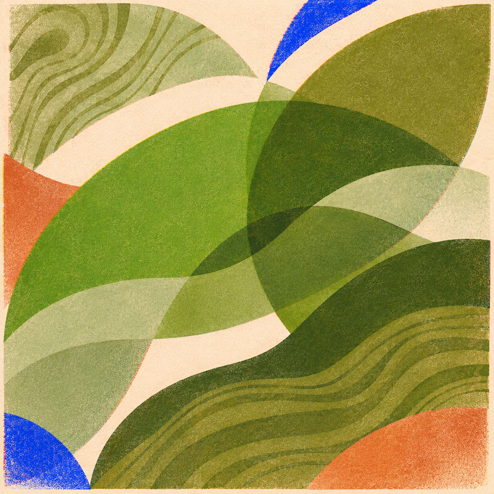
Episode 4 Hero Cover: Multi-tonal biophilic greens—Meadowland Green (Coloro 050-61-19), deep olive, and herbal sage—bringing botanical complexity to 2027 design.
Introduction: Why Single-Shade Green No Longer Cuts It
Let me ask you something that has probably crossed your mind during a recent project: why do some green palettes feel utterly sophisticated and restorative, whilst others feel like tired environmental clichés we have seen a thousand times before? You know the ones—that single, predictable 'eco-green' slapped onto packaging or branding as lazy shorthand for sustainability. It is reductive, it is overused, and frankly, it is a missed opportunity.
Here is the truth: green occupies a central position in 2027's colour story, but not in the way you might expect. WGSN and Coloro have positioned green as the primary vehicle for communicating rest, wellness, and genuine connection to natural systems. At the heart of this movement sits Meadowland Green (Coloro 050-61-19)—a nourishing, mid-toned green that serves as the anchor for building layered, nuanced palettes that actually resonate with audiences seeking slower living and authentic restoration.
In this episode, you will learn precisely how to build layered green palettes that feel considered rather than clichéd. We are covering practical applications across wellness branding, digital interfaces, botanical photography, and spatial design, plus essential material partnership guidance for bringing these palettes into physical reality. Ready to move beyond the single-shade trap? Let us dive into the biophilic imperative.
 🔍 PLATE 01 — CLICK TO EXPAND
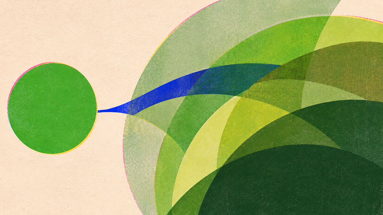
Plate 01 — Introduction — Why Flat Single-Shade Eco Green Feels Dated Compared to Layered Foliage: Plate 01 (Introduction): Nature never presents green as a uniform flat hex code—2027 sophistication requires layering multiple green values, undertones, and temperatures.
The Biophilic Imperative: Why Green Holds Such Power in 2027
Meadowland Green as Your Nourishing Anchor
Meadowland Green (Coloro 050-61-19) is not just another green—it is strategically positioned as a mid-green that sits neither too yellow nor too blue. This precise balance matters enormously. Yellower greens can feel acidic or aggressive, whilst bluer greens lean cold and clinical. Meadowland Green hits the sweet spot: warm enough to feel inviting, calm enough to communicate genuine rest without any sense of chill.
Think of it as the foundation upon which everything else builds. It is the colour equivalent of a deep breath in a quiet garden—present, supportive, and fundamentally restorative.
The Psychology Behind Green's Restorative Qualities
Green occupies a unique position in human perception, and this is not simply aesthetic preference—it is evolutionary. Our ancestors survived by reading green landscapes as signs of water, food, and safety. That deep-rooted response means green activates our parasympathetic nervous system, shifting us from stress into recovery mode.
This is why green feels fundamentally different from blue calm or beige warmth. Blue carries authority and trust (as we explored with Luminous Blue in Episode 2), whilst warm earth tones provide tactile grounding (Episode 3's focus). Green, however, speaks directly to rest, recovery, and connection with living systems. It is inherently restorative in ways other colours simply cannot replicate.
Moving Beyond Superficial 'Green Equals Sustainable' Signalling
Here is the problem: the equation 'green equals sustainable' has become meaningless through sheer overuse. When every product making even the most tenuous environmental claim reaches for the same predictable shade, that colour loses all communicative power. It becomes visual noise rather than genuine signal.
The opportunity in 2027 lies in sophistication through considered green application. Rather than reaching for one predictable shade, we build complexity, depth, and authentic connection through layered green thinking. This is where the real magic happens.
 🔍 PLATE 02 — CLICK TO EXPAND
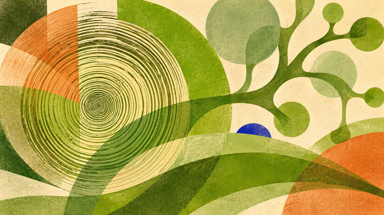
Plate 02 — The Biophilic Imperative — Meadowland Green (Coloro 050-61-19) & Nervous System Recovery: Plate 02 (The Biophilic Imperative): How Meadowland Green and mineral foliage tones tap into evolutionary visual recovery to counter high-density digital urbanism.
Layered Green Thinking: Building Complexity That Resonates
Why Single-Green Palettes Feel Flat and Reductive
Consider this: nature itself never presents single-shade green environments. Walk through any woodland, meadow, or garden, and you encounter dozens of green variations simultaneously—from the deep olive of shadow to the bright celery of new growth, from mossy undertones to sun-warmed sage. Single-green approaches ignore this fundamental truth about how we actually experience green in the natural world.
Monochromatic green palettes feel flat because they lack the visual and emotional complexity our brains expect. They read as artificial, simplified, and ultimately unconvincing.
Building Complexity Through Multiple Green Values
The solution is working with multiple green values simultaneously, varying both depth and temperature:
Value Range: Move from deep olive (your anchor for depth and seriousness) through mid-range meadow greens (your restorative core) to light celery tints (your fresh accents).
Temperature Variation: Balance cooler moss tones against warmer olive undertones. This creates visual interest and prevents palettes from feeling monotonous.
The Curated Green Palette for 2027
Here is a working palette you can adapt immediately:
- Meadowland Green (Coloro 050-61-19) — The restorative anchor; your primary green for establishing biophilic connection
- Deep Olive — Working depth colour; grounds the palette and adds sophistication
- Moss — Working herbal tone; introduces cooler variation and natural complexity
- Celery Tint — Working light accent; brings freshness and prevents heaviness
- Dark Soil — Working text colour; provides necessary contrast without resorting to black
Historical Precedent for Layered Green
This approach is not new—Georgian and Victorian interiors understood green complexity intuitively. Think of those richly layered rooms combining olive drapery with sage wallpapers and deeper green accents. The principle remains sound; we are simply reinterpreting it for contemporary application.
 🔍 PLATE 03 — CLICK TO EXPAND
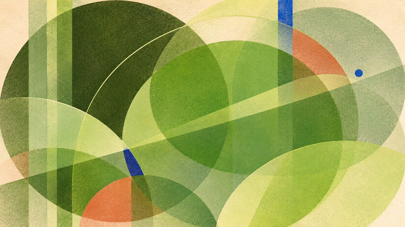
Plate 03 — Layered Green Thinking — Combining Canopy Dark, Meadowland Mid-Tone & Herbal Highlight: Plate 03 (Layered Green Thinking): Constructing tonal depth by combining cool blue-greens, warm yellow-olives, and silvery herbal neutrals within a single cohesive system.
Discipline-Specific Applications: Green in Practice
Branding and Graphic Design
Wellness, hospitality, and food brands are natural candidates for layered green palettes, but the key is avoiding clichéd environmental signalling. Use olive to ground your brand system with seriousness, Meadowland Green for primary brand moments, and celery for hierarchy and lift.
Green typography presents legitimate challenges—legibility suffers on certain backgrounds, so test extensively. For packaging in organic, natural, and wellness categories, layered greens communicate authenticity far more effectively than single-shade approaches. Consider how olive grounds a design whilst celery lifts secondary elements in hierarchical brand systems.
UI and Digital Interfaces
Green excels for calm states in dashboards and wellbeing tool interfaces. Health, meditation, and productivity applications benefit enormously from considered green application—but remember the accessibility imperative: never rely on colour alone to communicate status.
One critical consideration: avoid associations with system success/error colours through careful hue selection. Your interface green should feel distinct from the greens users associate with positive/negative feedback. Dark mode requires particular attention—ensure your greens maintain their restorative quality without becoming murky or losing contrast.
Photography and Art Direction
Botanical photography benefits from shooting through foliage and using filtered daylight techniques. Olive textiles and botanical props create depth through layered green elements within single frames.
Capturing green accurately presents technical challenges—oversaturation in post-production is a common trap that kills authenticity. Aim for faithful reproduction rather than enhanced vibrancy. Consider seasonal variation in natural green photography, and remember that consistent green reproduction across devices remains genuinely difficult. Test extensively.
Spatial and Product Design
Green-painted walls combined with timber, stone, and aged brass create authentic biophilic environments. Hospitality applications—hotels, spas, wellness centres, restaurants—benefit enormously from considered green application.
In retail environments, green's commercial behaviour varies significantly based on proportion. As a dominant colour, green works beautifully in wellness-focused spaces; as a supporting element, it provides biophilic connection without overwhelming commercial messaging. Consider outdoor/indoor transitions carefully—biophilic design principles suggest green can ease these thresholds remarkably effectively.
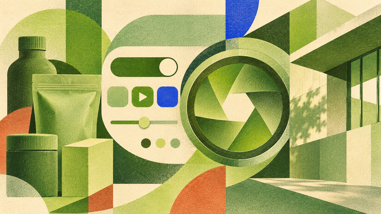 🔍 PLATE 04 — CLICK TO EXPAND
Plate 04 — Discipline-Specific Applications — Wellness Branding, Calm UI, Editorial Photo & Interiors: Plate 04 (Discipline-Specific Applications): Deploying layered greens across botanical packaging, low-strain digital interfaces, editorial photography, and hospitality architecture.
Material Partnerships: Bringing Green Palettes Into Physical Reality
Mossed Surfaces and Living Wall Adjacency
Preserved moss and living greenery interact fascinatingly with painted greens. Creating authentic biophilic environments requires understanding how actual plant material relates to colour choices—they should complement rather than compete.
Woven Raffia and Herbal Paper Textures
Natural fibre materials reinforce green's organic character brilliantly. Woven raffia, herbal paper textures, and unbleached natural fibres all communicate the same values as your green palette—authenticity, natural processes, tactile warmth. Texture becomes a value signal in green-focused design.
Timber Grain Relationships
Timber selection matters enormously with green palettes. Warmer tones—oak, walnut—complement cooler moss greens beautifully, creating temperature balance. Consider which timber tones complement versus compete with your specific green values.
Aged Brass as Metallic Partner
Why does brass succeed where chrome and silver feel disconnected? Historical resonance plays a significant role—green and brass combinations have centuries of precedent in architectural detailing, furniture hardware, and decorative objects. This pairing feels established rather than arbitrary, sophisticated rather than trendy.
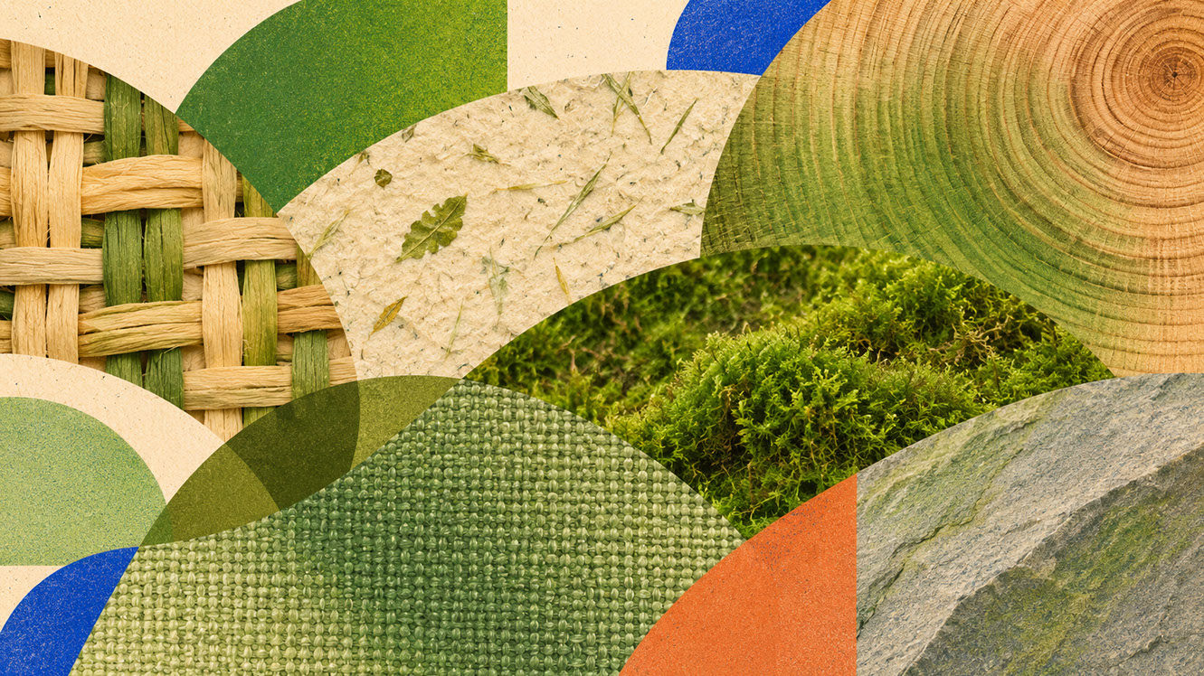 🔍 PLATE 05 — CLICK TO EXPAND
Plate 05 — Material Partnerships — Preserved Moss, Woven Raffia, Herbal Paper, Walnut & Aged Brass: Plate 05 (Material Partnerships): Pairing layered greens with organic timber grain, woven plant fibres, and warm aged brass rather than cold chrome.
Frequently Asked Questions
How do I avoid my green palette looking dated or 'eco-cliché'?
Focus on layering multiple green values rather than relying on a single shade. Combine depth (olive), core (meadow), and accent (celery) greens. Pair with sophisticated materials like aged brass and timber rather than obvious 'eco' materials.
Which green shade works best for wellness app interfaces?
Meadowland Green (Coloro 050-61-19) serves as an excellent anchor, but ensure you meet accessibility requirements and avoid hues that overlap with system success/error colours.
What materials partner best with Meadowland Green in spatial design?
Timber (especially oak and walnut), natural stone, aged brass, woven raffia, and herbal paper textures all reinforce green's organic character whilst adding tactile sophistication.
Can green work as a primary brand colour outside wellness sectors?
Absolutely. Finance brands seeking trustworthy calm, technology companies emphasising sustainability credentials, and hospitality brands creating restorative environments all benefit from layered green approaches.
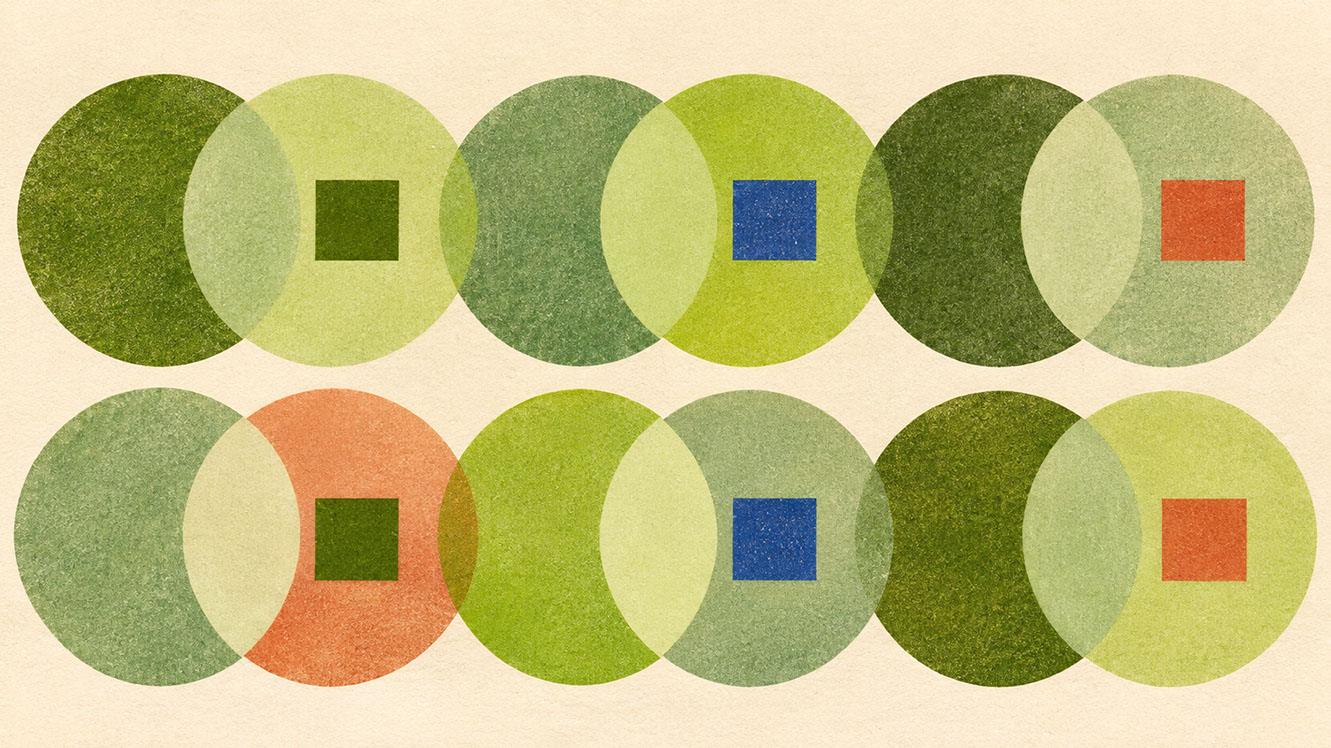 🔍 PLATE 06 — CLICK TO EXPAND
Plate 06 — Practitioner Q&A — Avoiding Eco-Clichés & Ensuring Contrast With Layered Green Palettes: Plate 06 (Practitioner FAQ Guide): Practical solutions for differentiating restorative green branding from generic eco-marketing while maintaining crisp typographic contrast.
Conclusion: Investing in Sophisticated, Restorative Design
You now understand the fundamental shift from single-green thinking to layered green complexity. Meadowland Green (Coloro 050-61-19) serves as your nourishing anchor, but the real sophistication comes from building palettes that incorporate depth, variation, and considered material partnerships.
Start with three green values—anchor, depth, and light—before expanding. Test your combinations against timber and natural materials before finalising any palette. Always consider context: what sits adjacent to green in the final environment matters as much as the green itself.
The earth tones we explored in Episode 3—clay, sandstone, and rose-brown—serve as green's perfect grounding partner. Together, these palettes create environments that feel genuinely restorative and authentically connected to natural systems.
But rest requires vitality as its complement. In Episode 5, we introduce Energy Orange (Coloro 018-57-34) and Pop Pink (Coloro 151-73-22)—the strategic joy colours that make design feel alive again. You will discover why high-chroma warmth works as a counterweight to anxiety when deployed with intentional proportion and placement. If restful green anchors calm, these vitality colours deliver the necessary spark.
Layered green is not trend-following—it is an investment in sophisticated, restorative design that communicates genuine connection to natural systems. Your audiences are ready for this depth. Are you?
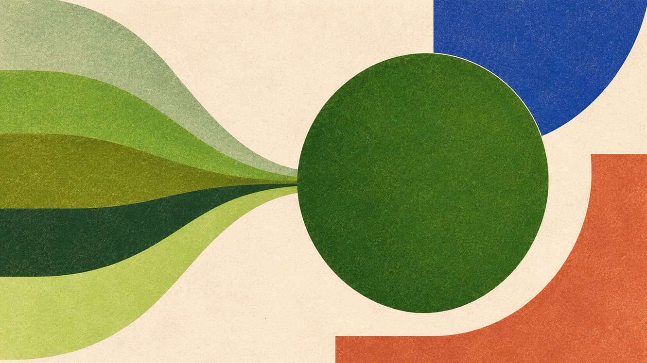 🔍 PLATE 07 — CLICK TO EXPAND
Plate 07 — Conclusion — Investing in Sophisticated, Restorative Biophilic Colour Systems: Plate 07 (Conclusion): Layered green systems reward slow observation and create enduring emotional sanctuary across both physical and digital environments.
⚡ 5 Strategies to Consider
STUDIO PLAYBOOK // 5 DIRECTIVES❓ Frequently Asked Questions — 5 Q&As (5 Q&As)
SCHEMA.ORG/FAQPAGE // 5 Q&As (5 Q&As)Q1. How do I avoid my green palette looking dated or eco-cliché?
Focus on layering multiple green values rather than relying on a single shade. Combine depth tones like olive, core greens like Meadowland, and light accents like celery. Pair with sophisticated materials such as aged brass and timber rather than obvious eco materials, and avoid the predictable single-green approach that has become meaningless through overuse.
Q2. Which green shade works best for wellness app interfaces?
Meadowland Green (Coloro 050-61-19) serves as an excellent anchor due to its balanced mid-tone that communicates calm without coldness. Ensure you meet accessibility requirements by never relying on colour alone to communicate status, and select hues that feel distinct from system success/error colours to avoid confusing associations.
Q3. What materials partner best with Meadowland Green in spatial design?
Timber (especially warmer tones like oak and walnut), natural stone, aged brass, woven raffia, and herbal paper textures all reinforce green's organic character whilst adding tactile sophistication. These materials create authentic biophilic environments rather than surface-level references to nature.
Q4. Can green work as a primary brand colour outside wellness sectors?
Absolutely. Finance brands seeking trustworthy calm, technology companies emphasising sustainability credentials, and hospitality brands creating restorative environments all benefit from layered green approaches. The key is sophistication through considered application rather than defaulting to clichéd environmental signalling.
Q5. Why do single-green palettes feel flat and unconvincing?
Nature never presents single-shade green environments—any natural setting contains dozens of green variations simultaneously. Single-green approaches ignore this fundamental truth, creating palettes that lack the visual and emotional complexity our brains expect, reading as artificial and simplified rather than authentic.
EXPLORE RELATED STUDIO TAGS (8):
Glad this piece sparked something — want the matching 4096×4096px .ZIP pack?
Enter your email below for an instant direct download of Studio Seamless Pattern Pack — Drop 01 (WPAY_DROP01.zip) plus new Studio Journal essays & free drops.