Oxblood, Russet and Antique Plum: Why 2027 Luxury Looks Crafted, Not Glossy
Discover why 2027 luxury favours oxblood, russet, and antique plum over glossy finishes, using heritage pigments and tactile craft to build brand authority.
 🔍 COVER PLATE — CLICK TO EXPAND
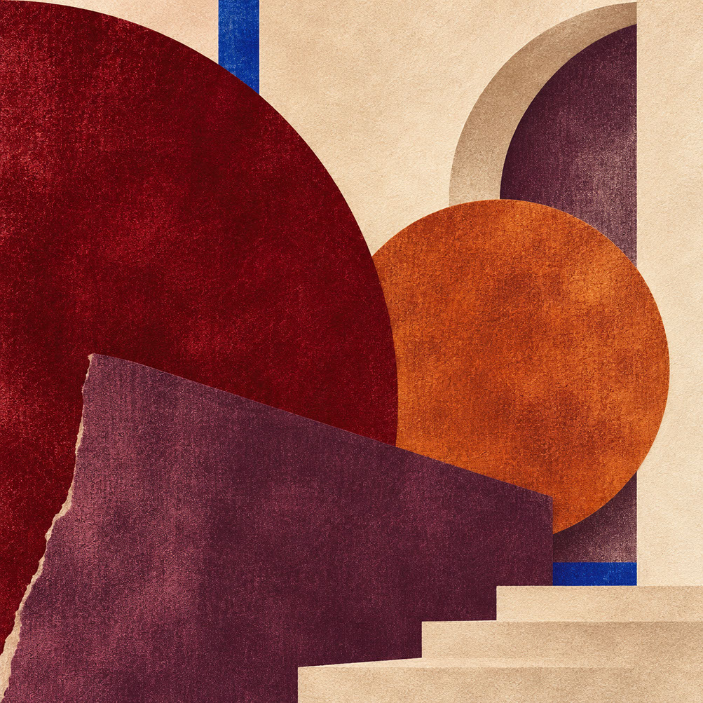
Episode 6 Hero Cover: Archival heritage pigments—Oxblood, Deep Carmine, Russet, and Antique Plum—redefining 2027 luxury through tactile craft rather than glossy ostentation.
Introduction: The Quiet Revolution in Premium Design
Here's something fascinating happening in design right now: the shiny, logo-heavy markers of traditional luxury have completely lost their lustre with contemporary audiences. Where once a gleaming gold foil or high-gloss finish signalled premium positioning, today's discerning consumers—particularly younger demographics—find themselves drawn to something altogether different. They're reaching for the muted depth of oxblood leather, the warm complexity of russet, and the sophisticated shadow of antique plum.
In Episode 5, we explored the strategic deployment of joy colours—Energy Orange and Pop Pink as intentional tools for creating delight and emotional resilience within restrained design systems. We discovered how high-chroma warmth serves as a counterweight to anxiety when deployed with careful proportion and placement.
Today, we're taking a rather dramatic turn. We're looking backwards to heritage pigments that communicate something altogether different: accumulated knowledge, continuity, and the kind of depth that simply cannot be faked. Welcome to the post-luxury shift, where craft visibility, material honesty, and historical depth have replaced synthetic perfection as the true markers of value.
By the end of this episode, you'll understand precisely why heritage colour palettes resonate so powerfully with contemporary audiences. More importantly, you'll have practical guidance for applying oxblood, carmine, russet, and plum across branding, digital design, photography, and packaging contexts. Let's explore why looking crafted, not glossy, defines 2027 luxury.
 🔍 PLATE 01 — CLICK TO EXPAND
Plate 01 — Introduction — The Quiet Revolution From Glossy Flash to Archival Pigment Depth: Plate 01 (Introduction): Why discerning 2027 audiences reject shiny metallic status symbols in favour of deep, pigment-rich surfaces that reward touch.
The Post-Luxury Shift: Understanding the Cultural Context
The Rejection of Synthetic Perfection
Younger consumers increasingly distrust the polished homogeneity of traditional luxury branding. Think about it—when every premium brand can achieve the same high-shine finish, that finish ceases to communicate genuine quality or distinction. The interchangeable glossy aesthetics across fashion, hospitality, and product design have created what we might call a credibility gap. Consumers are savvy enough to recognise that surface perfection often masks a lack of substance beneath.
Craft Visibility as the New Value Signal
WSGN has identified craft appreciation as a dominant cultural force shaping 2027 and beyond. Visible process, material honesty, and the marks of human hands have become considerably more compelling than machine-perfect uniformity. Here's the thing: the deliberate choice to show texture, variation, and handwork signals confidence rather than imperfection. It says, 'We're proud of how this was made, and we want you to see it.'
Archival Depth Over Trend-Chasing
Heritage pigments serve as markers of continuity and accumulated knowledge. Brands and designers who reference historical colour traditions communicate depth of understanding—their aesthetic choices emerge from considered research rather than arbitrary trend-following. There's intellectual rigour behind the decision to use oxblood rather than cherry red.
The Paradox of Digital Natives
Perhaps counterintuitively, younger audiences—often characterised as digitally native and trend-focused—gravitate most strongly toward archival aesthetics. Having grown up surrounded by disposable digital imagery and ephemeral content, these audiences place heightened value on physical permanence and historical connection. They crave the tangible in an increasingly intangible world.
 🔍 PLATE 02 — CLICK TO EXPAND
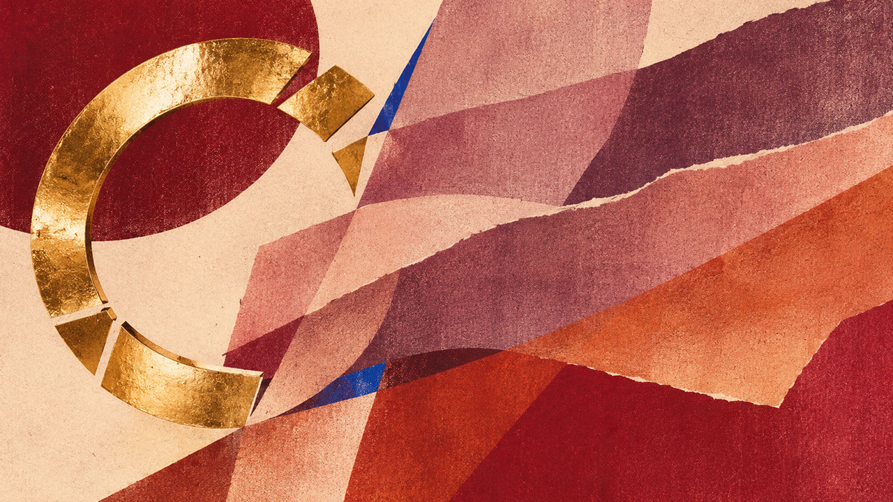
Plate 02 — The Post-Luxury Shift — Craft Visibility & Provenance Over Synthetic Perfection: Plate 02 (The Post-Luxury Shift): In an era of effortless synthetic gloss, visible material lineage and archival colour depth become the ultimate markers of value.
Heritage Colour Psychology: Why These Pigments Resonate
Oxblood: Authority and Accumulated Knowledge
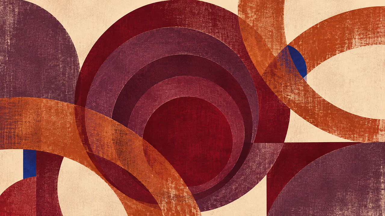
Oxblood carries the psychological weight of aged book bindings, worn Chesterfield sofas, and vintage leather goods. This deep, brownish-red communicates longevity, seriousness, and intellectual depth. Unlike bright reds that demand immediate attention, oxblood suggests patient authority—the confidence of something that has endured.
Deep Carmine: Richness Without Ostentation
Carmine functions as oxblood's more saturated sibling. Historically derived from cochineal insects and associated with precious textiles reserved for royalty and clergy, carmine communicates richness whilst avoiding the aggressive brightness of contemporary reds. It's luxurious without shouting about it.
Russet: Warm Approachability Within Premium Contexts
Russet occupies a unique position as a warm, inviting earth tone that nonetheless carries premium associations. Unlike corporate browns that feel safe and boring, russet references autumn leaves, aged copper, and natural dye traditions. It brings approachability to heritage palettes without diluting their sophistication.
Antique Plum: The Sophisticated Dark
Plum serves as a working dark—sophisticated enough for premium contexts yet warmer and more complex than pure black. Its associations with velvet, aged wine, and twilight atmospheres make it invaluable for creating depth without the harshness that pure black can introduce.
 🔍 PLATE 03 — CLICK TO EXPAND
Plate 03 — Heritage Colour Psychology — Oxblood, Deep Carmine, Russet & Antique Plum: Plate 03 (Heritage Colour Psychology): How each pigment carries distinct emotional weight—from Oxblood's scholarly authority to Russet's earthen warmth and Antique Plum's nocturnal mystery.
Curated Heritage Palette: Building the Complete System
The Five-Colour Foundation
Your complete heritage palette works as an interconnected system:
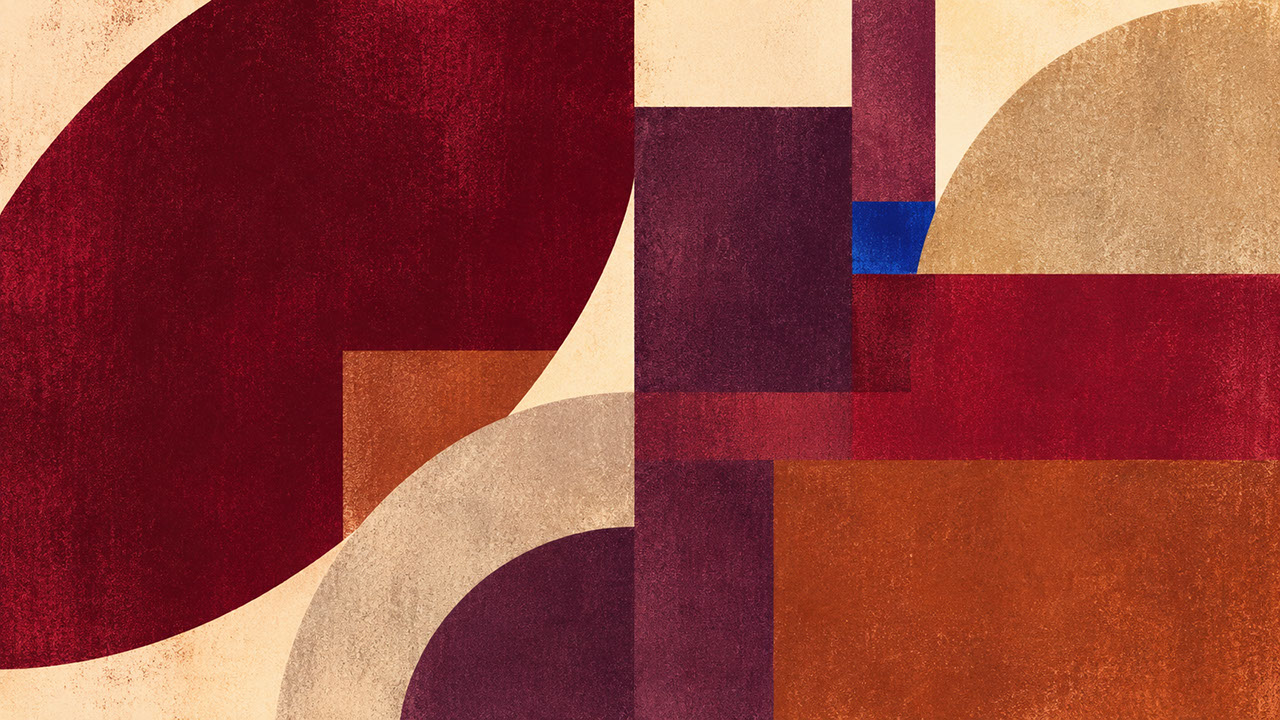
Oxblood serves as your heritage anchor, providing luxurious depth and quiet authority. Deep Carmine brings pigment richness with saturated warmth and preciousness. Russet functions as your warm earth tone, offering approachability and natural connection. Antique Plum provides sophisticated darkness without harshness. Finally, Bone acts as your balancing neutral, creating essential breathing space and contrast.
Relationship Dynamics
Understanding how these colours interact is crucial. Bone provides essential breathing space—without it, the palette becomes oppressively dark. Russet prevents the overall effect from feeling overly sombre, bringing necessary warmth. The three darker tones—oxblood, carmine, and plum—create layered depth when used in varying proportions, with each appearing to recede or advance differently.
Avoiding Costume-Drama Nostalgia
A word of caution: heritage colours can easily tip into period-piece pastiche if you're not careful. The goal is contemporary relevance informed by historical depth, not historical recreation. You're designing for 2027, not 1827.
 🔍 PLATE 04 — CLICK TO EXPAND
Plate 04 — Curated Heritage Palette — The Five-Colour Post-Luxury Specification System: Plate 04 (Curated Heritage Palette): Pairing deep heritage tones with generous warm parchment and contemporary Swiss grids so the palette feels modern rather than nostalgic.
Branding and Graphic Design Applications
Deep Colour Paired With Restrained Typography
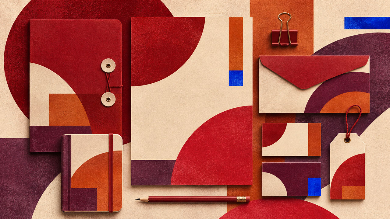
The fundamental principle here is letting heritage colour do the expressive work whilst typography remains elegant and understated. Condensed serifs, generous letter-spacing, and minimal type weights complement these rich backgrounds beautifully. Don't fight your colours with elaborate typography—let each element do what it does best.
Generous Paper Texture as Value Signal
Paper selection becomes integral to the colour story. Uncoated stocks absorb ink differently, creating depth that coated papers simply cannot achieve. Visible paper texture itself becomes a luxury marker—it's tactile evidence of considered material choices.
Heritage Colour in Contemporary Brand Systems
Incorporating archival tones without creating dated-looking identities requires balance. Pair heritage anchors with contemporary structural elements—clean grids, generous white space, and modern typographic hierarchy. The colour says 'heritage'; the structure says 'now'.
Print Production Realities
These dark, saturated colours behave differently across substrates. Ink density matters enormously, and draw-downs before committing to full production runs are essential. Heritage palettes demand craft in their execution, not just their specification.
 🔍 PLATE 05 — CLICK TO EXPAND
Plate 05 — Branding & Graphic Design — Deep Heritage Inks With Restrained Contemporary Typography: Plate 05 (Branding & Graphic Design): Letting toothy paper texture and architectural negative space modernize oxblood and antique plum brand identities.
UI and Digital Design Applications
Plum and Oxblood for Premium Editorial Sections
Heritage colours work exceptionally well for membership areas, premium content sections, and subscription tiers in digital products. These tones signal elevated content without aggressive visual interruption—they create quiet exclusivity.
Dark-Mode Sophistication
Heritage colours provide sophisticated alternatives to pure black in dark-mode interfaces. Oxblood or plum-tinted dark backgrounds feel warmer and more inhabitable than stark charcoal whilst maintaining excellent readability for extended use.
Reader-Mode Applications
Heritage backgrounds can reduce screen fatigue during long-form reading, provided contrast ratios remain accessible. The warmth of these tones proves less harsh than cool greys over extended reading sessions.
Accessibility Considerations
Dark heritage backgrounds require careful attention to text contrast. Use bone or warm white text rather than pure white, and test all combinations against WCAG 2.2 requirements. Accessibility isn't optional, even for premium aesthetics.
 🔍 PLATE 06 — CLICK TO EXPAND
Plate 06 — UI & Digital Design — Nocturnal Antique Plum & Oxblood Dark-Mode Editorial Interfaces: Plate 06 (UI & Digital Design): Replacing flat #000000 dark mode with velvety antique plum and oxblood surface tokens for intimate, salon-like digital experiences.
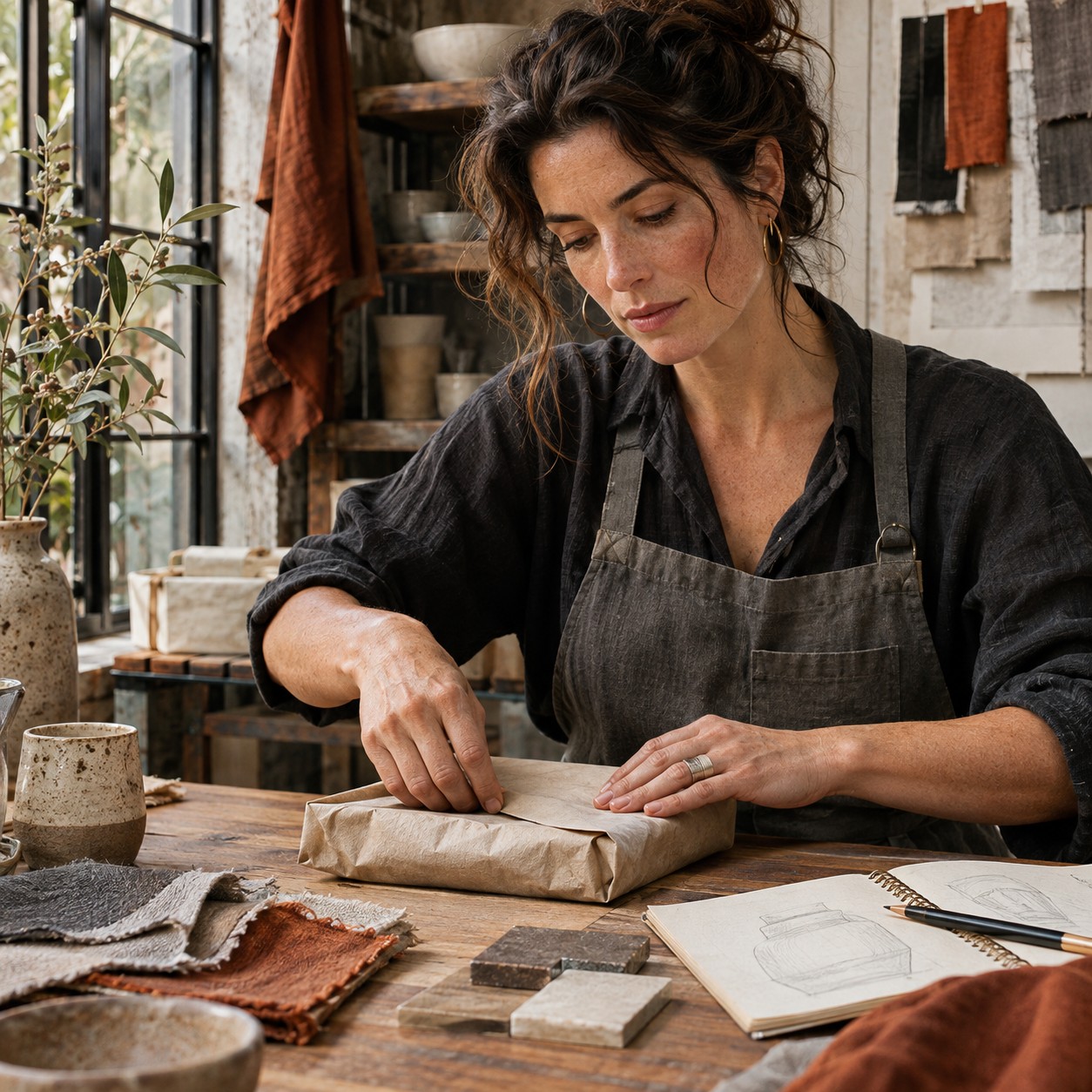
Photography and Art Direction
Low-Key Lighting and Dramatic Shadow
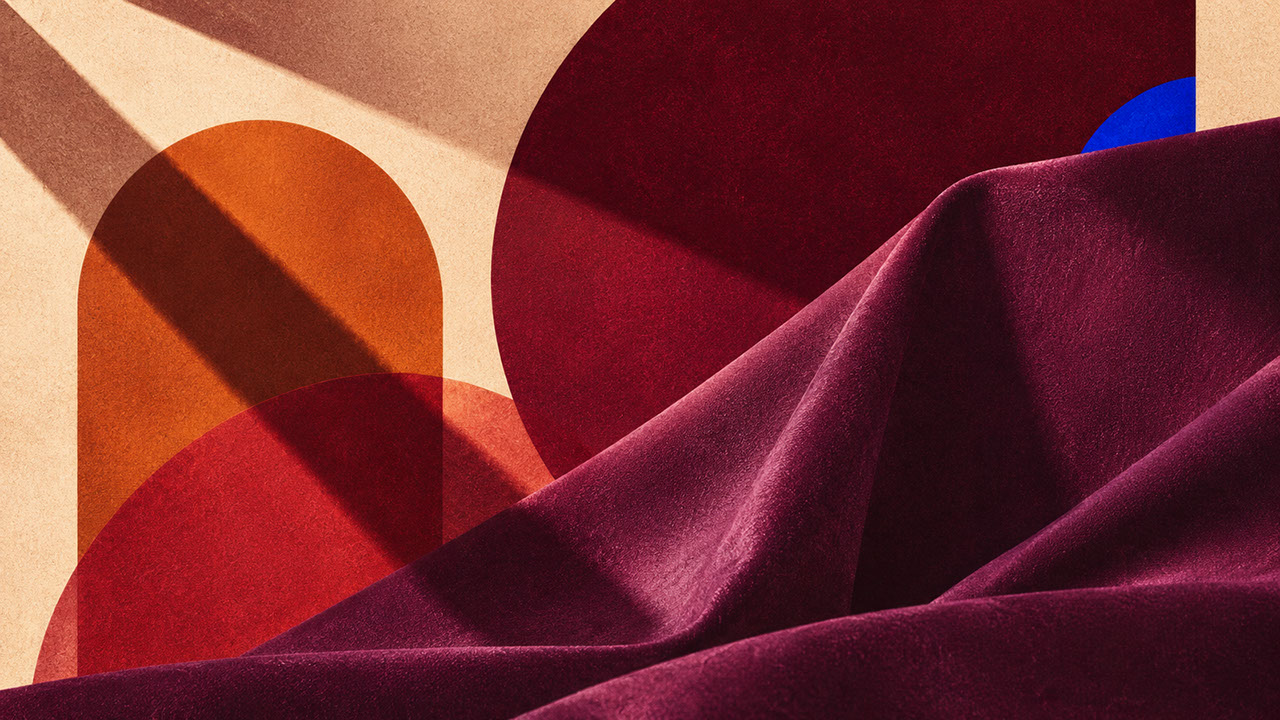
The photographic approach that best serves heritage palettes involves controlled, directional lighting that creates depth and shadow rather than flat, even illumination. This lighting philosophy references classical painting and analogue photography traditions—it's about sculptural light, not clinical documentation.
Material Props: Velvet, Leather, and Wood
Specific materials become essential to heritage-palette photography. Vegetable-tanned leather with its evolving patina, velvet with its light-absorbing qualities, and stained timber with its warm undertones all reinforce the palette narrative beautifully.
Archival Objects and Styling
Incorporate objects with visible history—worn books, antique brass, aged ceramics. These props reinforce the palette's narrative of accumulated knowledge and continuity. Each object should look like it has a story.
Technical Considerations for Dark Colour
Photographing dark, saturated colours presents specific challenges. Exposure requires careful attention to maintain tonal separation in shadow areas. Shooting in RAW format is essential, and colour management in post-production must preserve the subtle distinctions between oxblood, carmine, and plum.
 🔍 PLATE 07 — CLICK TO EXPAND
Plate 07 — Photography & Art Direction — Low-Key Chiaroscuro Lighting With Velvet, Leather & Wood: Plate 07 (Photography & Art Direction): Using directional raking light and deep shadow to reveal the pile of carmine velvet, the grain of stained timber, and the patina of leather.
Packaging and Material Applications
Blind Debossing and Tactile Finishing
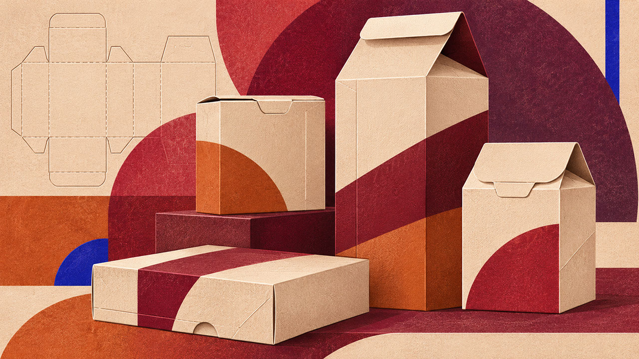
Touch becomes central to heritage-palette packaging. Blind debossing—pressing patterns or type into paper without ink or foil—creates subtle, sophisticated dimension that rewards close inspection and physical handling. It's luxury you can feel before you can fully see it.
Uncoated Stock Selection
Heritage colours behave differently on uncoated paper, absorbing more deeply and appearing more muted. The result is colour that feels inherent to the material rather than applied to its surface—an essential distinction for craft-led positioning.
Cotton Labels and Restrained Metallics
Fabric labelling extends craft-led positioning naturally. When metallic elements are desired, specify warm-toned foil—aged brass rather than bright gold. The metallic should whisper, not shout.
Category Applications
Heritage palettes prove particularly appropriate for wine and spirits, premium food products, artisanal homewares, and limited-edition releases. Any category where perceived age and craftsmanship add value benefits from this approach.
 🔍 PLATE 08 — CLICK TO EXPAND
Plate 08 — Packaging & Material Applications — Blind Debossing, Dyed Pulp Board & Cotton Labels: Plate 08 (Packaging & Material Applications): Replacing plastic lamination and loud metallic foils with deep blind impression, dyed-through board, and tactile cotton labels.
Material Partnerships: The Craft Connection
Vegetable-Tanned Leather
Vegetable-tanned leather's capacity to develop patina over time perfectly embodies the heritage-palette philosophy. Its appropriate applications span packaging, accessories, and branded environments where the material can age gracefully.
Wool and Woven Textiles
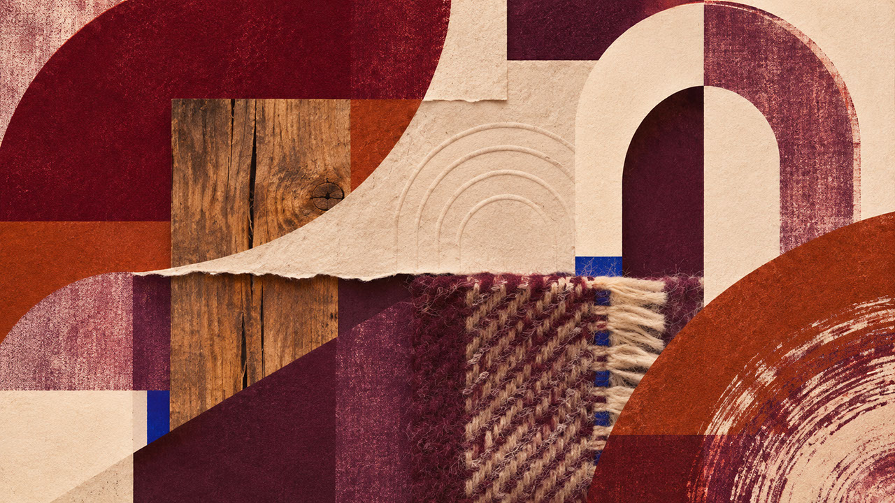
Wool textiles serve as natural partners for heritage colours. Wool absorbs dye to create depth that synthetic materials cannot achieve, and woven texture adds dimensional interest that reinforces the handcraft narrative.
Stained Timber
Timber stained in oxblood, russet, or plum tones connects to furniture-making traditions and creates warm, inhabitable spatial environments. The grain shows through, reinforcing material honesty.
Letterpress Techniques
Letterpress represents the archetypal heritage-palette production method. The impression of type into paper creates tactile evidence of process, and letterpress ink density produces richness that digital printing approximates but never quite matches.
 🔍 PLATE 09 — CLICK TO EXPAND
Plate 09 — Material Partnerships — Vegetable-Tanned Leather, Merino Wool, Stained Timber & Letterpress: Plate 09 (Material Partnerships — The Craft Connection): Natural substrates that age gracefully and deepen the emotional authority of heritage pigments.
Conclusion: Craft as the New Currency
Post-luxury positioning is fundamentally about visible craft, material honesty, and historical depth rather than synthetic perfection. Heritage pigments—oxblood, carmine, russet, and plum—communicate accumulated knowledge and continuity in ways that glossy finishes simply cannot.
Start by selecting one heritage anchor colour—perhaps oxblood—and pair it with bone or warm cream. Test on uncoated stock or natural material before scaling. Feel the difference between applied colour and absorbed colour. That tactile distinction is exactly what contemporary audiences are seeking.
In Episode 7, we'll tackle the critical challenge you're probably already thinking about: how do you actually translate these colours from digital specification to physical material? We'll examine why saturated screen colours become unexpectedly dull on recycled board, how fabric dramatically changes colour perception, and why designing colour families rather than fixed specifications is essential for success. If you've ever been disappointed by how your carefully chosen palette looks in production, Episode 7 delivers the solutions you need.
 🔍 PLATE 10 — CLICK TO EXPAND
Plate 10 — Conclusion — Craft as the New Currency in 2027 Luxury Brand Design: Plate 10 (Conclusion — Craft as the New Currency): In 2027, true luxury whispers through archival pigment depth, honest substrates, and unmistakable human touch.
⚡ 5 Strategies to Consider
STUDIO PLAYBOOK // 5 DIRECTIVES❓ Frequently Asked Questions — 5 Q&As (5 Q&As)
SCHEMA.ORG/FAQPAGE // 5 Q&As (5 Q&As)Q1. How do I prevent heritage palettes from looking dated or costume-like?
Balance archival colour with contemporary typography, generous white space, and modern structural design elements. The key is using heritage colour to inform a contemporary aesthetic rather than attempting to recreate a historical one. Clean grids and modern typographic hierarchy keep the overall effect fresh whilst the colour provides depth and sophistication.
Q2. Can heritage palettes work for technology or innovation brands?
Yes, when positioned carefully. Heritage tones can communicate that innovation emerges from deep knowledge rather than disposable trend-following. Pair these colours with restrained, modern typography and contemporary structural elements to maintain forward-looking positioning whilst suggesting intellectual depth and accumulated expertise.
Q3. What neutral colours best complement heritage pigments like oxblood and plum?
Bone, warm cream, and natural linen tones work considerably better than stark white or cool grey. These warmer neutrals maintain the palette's overall warmth whilst providing necessary breathing space. Pure white can appear harsh against heritage colours, whilst cool greys create jarring temperature conflicts.
Q4. How do heritage colours perform on screen versus in print?
These deep, saturated colours often appear more vibrant on screen than in print, particularly on uncoated stocks where ink absorption mutes intensity. Always prototype on your intended substrates before finalising colour specifications, and build appropriate expectations with clients about the difference between digital previews and physical results.
Q5. Why are younger audiences drawn to archival aesthetics and heritage colours?
Having grown up surrounded by disposable digital imagery and ephemeral content, younger audiences place heightened value on physical permanence and historical connection. Heritage colours signal accumulated knowledge and continuity—qualities that feel increasingly precious in a world of constant change and surface-level trends.
EXPLORE RELATED STUDIO TAGS (8):
Glad this piece sparked something — want the matching 4096×4096px .ZIP pack?
Enter your email below for an instant direct download of Studio Seamless Pattern Pack — Drop 01 (WPAY_DROP01.zip) plus new Studio Journal essays & free drops.