Luminous Blue Is the Colour of 2027: How to Use It Without Overwhelming Your Audience
Master Coloro's Luminous Blue, the Colour of 2027. Practical guidance for branding, UI, photography and spatial design without overwhelming audiences.
 🔍 COVER PLATE — CLICK TO EXPAND
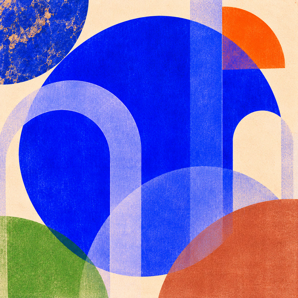
Episode 2 Hero Cover: Coloro's Luminous Blue (125-28-38)—an electric, high-chroma cobalt bridging ancient mineral craftsmanship and digital-age authority.
There is a particular moment when you encounter true Luminous Blue for the first time. It commands your attention without demanding it—a saturated, confident blue that feels simultaneously ancient and utterly contemporary. This is not the pale corporate blue of tired branding systems or the aggressive electric blue of early digital interfaces. Luminous Blue occupies a rare space where authority meets approachability, where historical reverence meets technological optimism.
WGSN and Coloro have officially designated Coloro 125-28-38 as the Colour of the Year 2027, and for good reason. This particular shade represents a meeting point between inherited craft traditions and synthetic innovation, arriving precisely when design culture needs both grounded authenticity and confident direction. But here is the challenge every creative professional faces: how do you deploy such a commanding colour without creating visual fatigue or overwhelming your audience?
That is exactly what we are unpacking today. Whether your discipline is branding, digital interfaces, photography, or spatial design, you will leave this post understanding precisely how to use Luminous Blue with strategic restraint—because confident colour requires confident editing.
 🔍 PLATE 01 — CLICK TO EXPAND
Plate 01 — Introduction — Why Luminous Blue Captures the Cultural Mood of 2027: Plate 01 (Introduction): Luminous Blue (Coloro 125-28-38) commands immediate visual attention while maintaining depth, poise, and cross-medium versatility.
From Lapis Lazuli to Lithium-Ion: The Historical and Material Context
Luminous Blue carries weight that extends far beyond contemporary colour forecasting. Its connection to lapis lazuli—the semi-precious stone that produced ultramarine pigment—places it within a tradition where blue was genuinely precious. During the Renaissance, true ultramarine was more valuable than gold in certain contexts, reserved exclusively for the most significant elements in paintings. The Virgin Mary's robes were painted in ultramarine whilst lesser subjects made do with cheaper azurite.
This historical significance quietly informs contemporary readings of saturated blue. When you specify Luminous Blue, you are tapping into centuries of associating this particular colour family with value, importance, and careful intention.
But Luminous Blue also resonates with distinctly contemporary concerns. The cobalt compounds that produce similar hues are essential components in lithium-ion batteries—the technology enabling our energy transition. WGSN explicitly positions this blue as bridging past, present, and future, connecting ancient pigment traditions with the visual language of technological transformation.
This temporal bridging provides psychological comfort during periods of rapid change. Luminous Blue feels both forward-looking and historically rooted, which explains why it resonates so powerfully in an era seeking both innovation and authenticity.
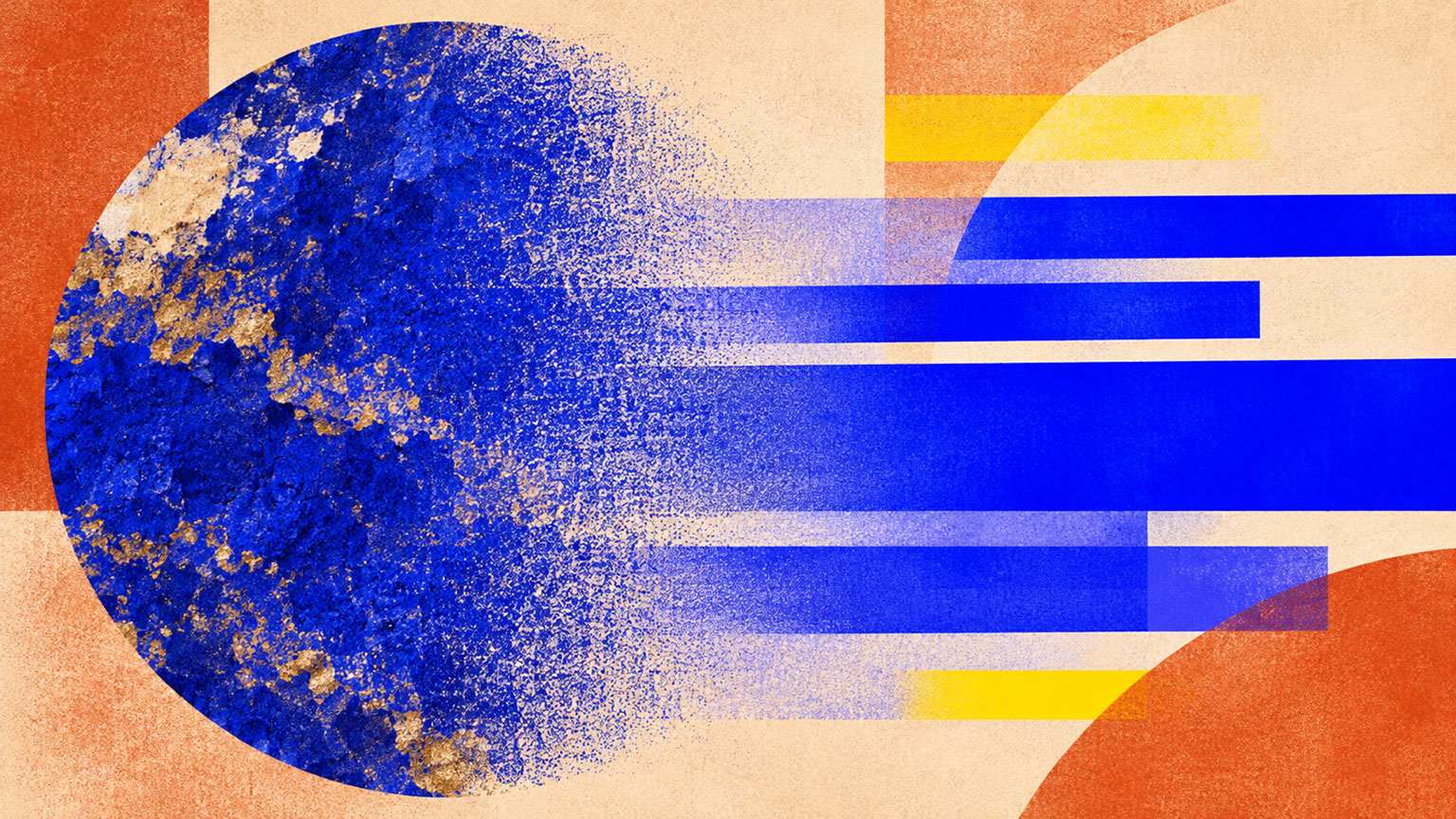 🔍 PLATE 02 — CLICK TO EXPAND
Plate 02 — From Lapis Lazuli to Lithium-Ion — Ancient Mineral Pigment Meets Digital Luminosity: Plate 02 (From Lapis Lazuli to Lithium-Ion): Tracing the lineage of high-chroma blue from Renaissance ultramarine pigment to contemporary digital and clean-tech innovation.
The Psychology of Authority: Confidence Without Aggression
Understanding why Luminous Blue works requires examining how saturated blue communicates psychologically. Blue consistently signals confidence, competence, and trustworthiness across cultural contexts. But the crucial distinction lies between authoritative presence and aggressive domination.
Luminous Blue achieves this balance through its particular saturation and tone. It is bold enough to command attention without the harsh edge that makes certain blues feel cold or intimidating. This makes it remarkably versatile across sectors:
Technology: Luminous Blue signals forward-thinking innovation without the sterile coldness that plagued earlier tech branding. It suggests capability and vision rather than impersonal efficiency.
Finance: The colour communicates stability and trustworthy expertise—essential qualities in financial services where confidence matters enormously.
Culture and Arts: Luminous Blue reads as creative confidence and institutional credibility, making it suitable for museums, galleries, and cultural organisations seeking to balance accessibility with authority.
Education: The shade signals knowledge authority and intellectual ambition without the stuffiness of traditional academic palettes.
The saturation question matters here. Full saturation works where diluted versions feel weak or indecisive. However, the fine line between commanding presence and visual overwhelm depends entirely on context and proportion—which brings us to practical application.
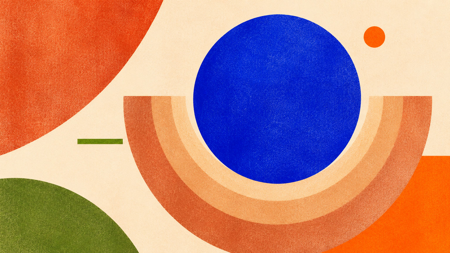 🔍 PLATE 03 — CLICK TO EXPAND
Plate 03 — The Psychology of Authority — Projecting Confidence Without Visual Aggression: Plate 03 (The Psychology of Authority): Unlike conservative corporate navy or harsh neon cyan, Luminous Blue signals clarity, intellect, and forward-looking assurance.
Building the Luminous Blue Palette: The Supporting Cast
Luminous Blue cannot succeed alone. It requires specific supporting colours to prevent fatigue and create workable systems. Here is the curated palette that allows this commanding blue to thrive:
| Colour | Role | Function |
|--------|------|----------|
| Luminous Blue (Coloro 125-28-38) | Primary anchor | Brand distinction and confident direction |
| Ink Navy | Working dark | Depth, contrast, and sophisticated grounding |
| Mineral White | Neutral space | Breathing room and visual rest |
| Energy Orange (Coloro 018-57-34) | Complementary accent | Strategic moments of vitality |
| Brushed Silver | Metallic note | Contemporary, technological reference |
Ink Navy provides depth without competing for attention. Mineral White creates essential breathing space that prevents visual fatigue. Energy Orange serves as the complementary accent that activates the entire palette when you need dynamic contrast. Brushed Silver adds contemporary metallic notes that reinforce technological associations.
The philosophy here is simple: Luminous Blue needs room to breathe and partners that support rather than compete.
 🔍 PLATE 04 — CLICK TO EXPAND
Plate 04 — Building the Luminous Blue Palette — Warm Mineral Counterweights & Accent Ratios: Plate 04 (Building the Luminous Blue Palette): Pairing high-chroma cobalt with warm mineral grounds (Bone, Sandstone, Clay) so the blue sings without fatiguing the eye.
Branding and Graphic Design Applications: Distinctive Without Exhausting
When positioning Luminous Blue as your primary brand colour, restraint becomes your greatest ally. The temptation to saturate every touchpoint with this gorgeous blue is real—resist it.
Use full saturation for your distinctive brand anchor: the logo, key brand elements, and signature moments. Pair these with generous neutral space using Mineral White or bone tones. The 60-30-10 principle serves brilliantly here: 60% neutral, 30% supporting colour (Ink Navy or your secondary palette), 10% Luminous Blue.
Typography requires particular attention. Blue-heavy brand systems create legibility challenges. Reserve Luminous Blue for headlines and display text rather than body copy. When reversing text out of blue backgrounds, ensure sufficient contrast through careful weight selection.
Print reproduction presents real challenges. Achieving true Luminous Blue in CMYK requires careful calibration—always proof physically before finalising brand materials. Screen calibration matters equally for digital applications where monitor variation can dramatically affect how your blue appears to audiences.
 🔍 PLATE 05 — CLICK TO EXPAND
Plate 05 — Branding & Graphic Design — Deploying Luminous Blue Across Identity & Packaging: Plate 05 (Branding & Graphic Design): Using Luminous Blue as a precision structural signature against generous warm-neutral paper stocks.
UI and Digital Interface Applications: Reserved for What Matters Most
In digital interfaces, Luminous Blue earns its power through scarcity. Reserve this saturated blue for navigation elements, buttons, and selected states. The principle is simple: attention earned through restraint carries more weight than attention demanded through saturation.
What to embrace:
- Primary navigation elements and calls to action
- Selected and active states
- Key interactive moments
- Brand signature elements
What to avoid:
- Large glowing blue surfaces that create visual fatigue
- Blue for long-form text or extended reading
- Overuse in notification systems (which diminishes impact)
- Background applications that overwhelm content
Accessibility considerations favour blue in certain respects—blue-yellow colour blindness affects fewer users than red-green deficiency. However, never communicate meaning through colour alone. Reference WCAG 2.2 contrast standards and ensure interactive elements remain distinguishable through multiple cues.
Dark mode applications require luminosity adjustments. Luminous Blue behaves differently on dark backgrounds, often appearing more vibrant. Consider reducing saturation slightly for comfortable viewing across extended sessions and varying screen brightness conditions.
 🔍 PLATE 06 — CLICK TO EXPAND
Plate 06 — UI & Digital Interfaces — Discipline in High-Chroma Interactive States & Dark Mode: Plate 06 (UI & Digital Interfaces): Reserving Luminous Blue for high-intent interactive elements (10–15% screen area) to preserve hierarchy and prevent eye strain.
Photography and Art Direction Applications: Capturing Confident Blue
Photographic applications of Luminous Blue offer tremendous creative potential through props and materials:
Blue lacquer objects provide reflective qualities that catch light beautifully. Cobalt glass serves as a distinctive element with historical resonance. Blue textiles—silk, wool, cotton—each behave differently under studio conditions, offering variety within your colour story. Painted surfaces and architectural blue elements ground the colour in spatial context.
Pairing considerations matter enormously. Luminous Blue works beautifully against warm stone and earth-toned surfaces, creating natural complementary relationships. Orange and amber elements provide dynamic contrast. Metallic surfaces add contemporary sophistication.
Lighting presents challenges. Saturated blue is notoriously difficult to capture accurately. Colour temperature considerations affect how blue subjects render under different light sources. Avoid oversaturation in capture or post-production that makes the colour read as artificial rather than confident.
Colour management through your entire workflow—from capture through editing to delivery—ensures consistent blue reproduction across outputs. Monitor calibration is essential for accurate evaluation, and colour profile management becomes critical when delivering across print and digital channels.
 🔍 PLATE 07 — CLICK TO EXPAND
Plate 07 — Photography & Art Direction — Styling Single-Garment & Prop Anchors in Luminous Blue: Plate 07 (Photography & Art Direction): Letting a single Luminous Blue hero garment or sculptural prop anchor an otherwise warm, earthy photographic frame.
Spatial and Product Design Applications: Blue That Lives in Space
Luminous Blue translates beautifully into physical environments when proportion receives careful attention.
Painted surfaces offer immediate impact. Cabinetry in kitchens and bathrooms provides a signature moment without overwhelming entire spaces. Lacquered accessories and furniture pieces introduce the colour as focal points. Wall applications require particular restraint—consider a single feature wall or alcove rather than entire rooms.
Technical materials extend the palette into contemporary contexts. Anodised metal finishes provide a sophisticated, technological reading. Blue tiles work brilliantly in hospitality and residential applications. Technical fabrics offer upholstery options that feel current and confident.
Proportion guidelines prevent overwhelming spaces. The 60-30-10 principle applies spatially: 60% neutral, 30% secondary colours, 10% Luminous Blue. Consider whether blue serves better as a single statement piece versus distributed accent elements. Light conditions dramatically affect how blue behaves—north-facing rooms and south-facing rooms will read the same blue very differently.
In hospitality and commercial contexts, Luminous Blue creates memorable spatial moments. Use it strategically for wayfinding, signage, and brand touchpoints rather than overwhelming entire environments.
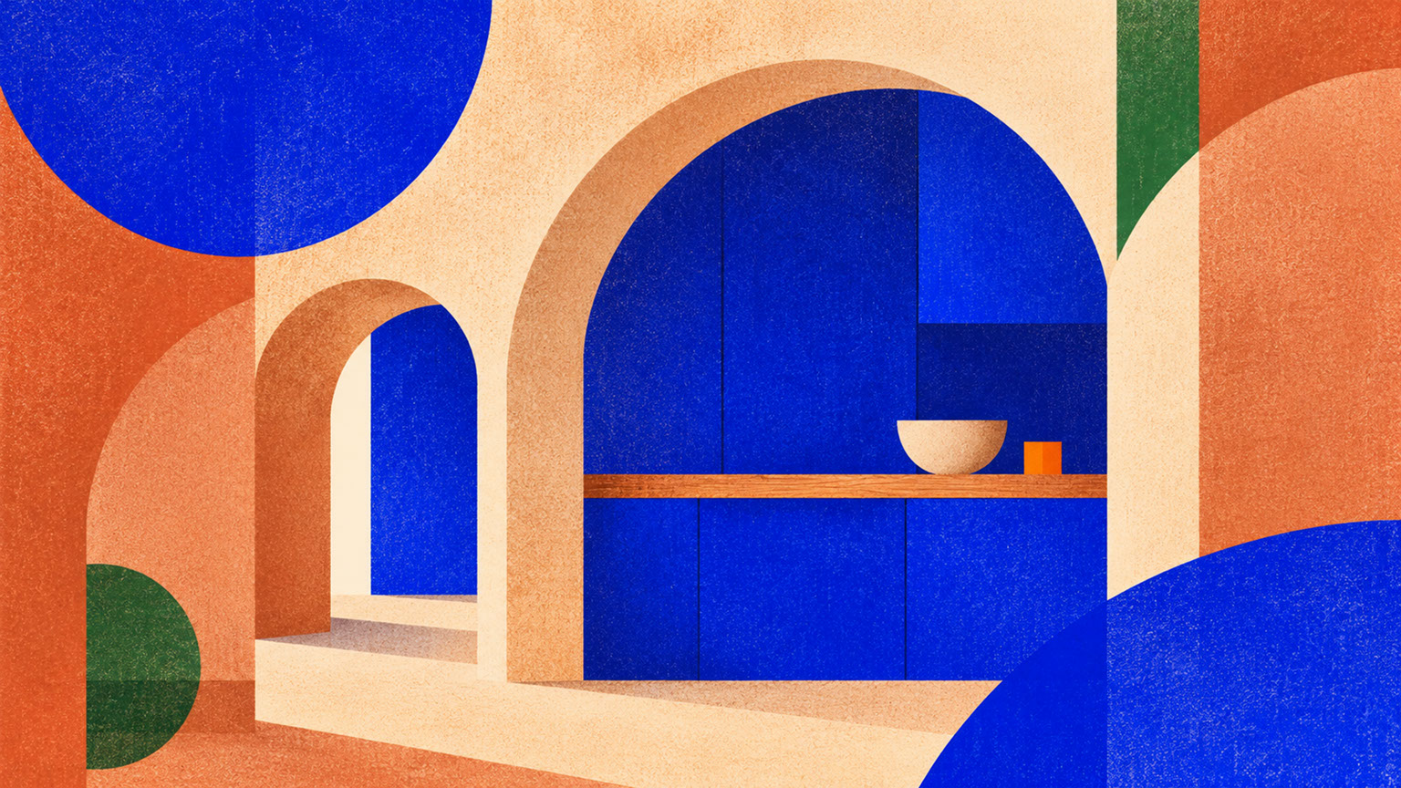 🔍 PLATE 08 — CLICK TO EXPAND
Plate 08 — Spatial & Product Design — Architectural Joinery & Sculptural Furniture in Cobalt: Plate 08 (Spatial & Product Design): Using Luminous Blue on architectural focal furniture and threshold joinery within warm timber and plaster interiors.
Material Translation: From Screen Swatch to Physical Reality
The journey from digital colour reference to physical material transforms how Luminous Blue reads:
Glossy and lacquered finishes create futuristic, technological readings. High-gloss surfaces enhance saturation and create reflective qualities that feel contemporary and premium. Automotive-style paint finishes translate beautifully to product design.
Craft and textile applications connect to artisanal tradition. Hand-dyed cloth creates variation that feels human and intentional. Natural fibres behave differently than synthetics—wool absorbs colour with subtle variation whilst synthetics achieve more uniform saturation. Batch variation in dyed textiles requires management but can become a feature rather than a flaw.
Ceramic and hard surface applications offer durability and presence. Glazes behave unpredictably with saturated blue, requiring testing and refinement. Enamel finishes work brilliantly for signage and product applications. Glass applications from tableware to architectural elements introduce transparency and light interaction.
The matte alternative provides different readings entirely. Matte finishes feel more grounded and less technological. Brushed metal and satin surfaces create sophistication without high-shine associations. Fabric and textile naturally provide matte blue surfaces that feel warmer and more approachable.
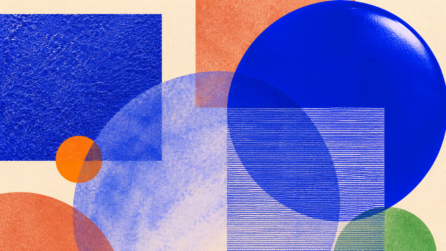 🔍 PLATE 09 — CLICK TO EXPAND
Plate 09 — Material Translation — How Luminous Blue Shifts Across Velvet, Ceramic, Metal & Paper: Plate 09 (Material Translation): Comparing how light absorption and surface micro-texture alter Luminous Blue across textiles, ceramics, metals, and paper stocks.
Conclusion: Authority Through Restraint
The central lesson of Luminous Blue is paradoxical: this commanding colour succeeds through strategic restraint rather than maximum saturation. The power lies not in how much you use, but in how deliberately you place it.
Across branding, digital interfaces, photography, and spatial design, the principle remains consistent. Reserve Luminous Blue for moments that deserve authority. Surround it with breathing space. Support it with complementary partners. Trust that confidence does not require dominance.
You now have the framework to deploy the Colour of the Year 2027 with intelligence and intention. But confident colour also needs grounding—which brings us to our next exploration.
 🔍 PLATE 10 — CLICK TO EXPAND
Plate 10 — Conclusion — Authority Through Restraint With the Colour of 2027: Plate 10 (Conclusion — Authority Through Restraint): True chromatic confidence comes from giving Luminous Blue the breathing room and warm material support it deserves.
⚡ 5 Strategies to Consider
STUDIO PLAYBOOK // 5 DIRECTIVES❓ Frequently Asked Questions — 5 Q&As (5 Q&As)
SCHEMA.ORG/FAQPAGE // 5 Q&As (5 Q&As)Q1. What exactly is Luminous Blue and why was it chosen as the Colour of the Year 2027?
Luminous Blue (Coloro 125-28-38) is WGSN and Coloro's official Colour of the Year 2027—a saturated, confident blue that bridges ancient pigment traditions with contemporary technological optimism. It was chosen because it represents the meeting point of inherited craft and synthetic innovation, resonating during a period when design culture seeks both grounded authenticity and forward-looking confidence.
Q2. How do I prevent Luminous Blue from overwhelming my design projects?
Reserve Luminous Blue for key moments—navigation elements, primary calls to action, hero imagery, or signature brand elements. Pair it with generous neutral space using Mineral White or bone tones. Apply the 60-30-10 principle: 60% neutral colours, 30% supporting colours like Ink Navy, and just 10% Luminous Blue for maximum impact without visual fatigue.
Q3. What colours pair best with Luminous Blue in a cohesive palette?
The optimal supporting palette includes Ink Navy for sophisticated depth and contrast, Mineral White for essential breathing space, Energy Orange (Coloro 018-57-34) for dynamic complementary contrast, and Brushed Silver for contemporary metallic notes. Avoid pairing with competing saturated colours that create visual discord.
Q4. How should I use Luminous Blue in UI and digital interface design?
Reserve Luminous Blue for navigation elements, buttons, and selected states—attention earned through scarcity carries more weight. Avoid large glowing blue surfaces, blue for long-form text, and overuse in notification systems. Adjust luminosity for dark mode applications and always ensure WCAG 2.2 contrast compliance without communicating meaning through colour alone.
Q5. What are the challenges of reproducing Luminous Blue in print?
Achieving true Luminous Blue in CMYK printing requires careful calibration due to the limitations of process printing with saturated blues. Always physically proof materials before finalising brand collateral, as screen representations rarely match printed output perfectly. Consider Pantone spot colours for critical brand applications where colour accuracy is essential.
EXPLORE RELATED STUDIO TAGS (8):
Glad this piece sparked something — want the matching 4096×4096px .ZIP pack?
Enter your email below for an instant direct download of Studio Seamless Pattern Pack — Drop 01 (WPAY_DROP01.zip) plus new Studio Journal essays & free drops.