Forget Clinical Grey: Why Clay, Sandstone and Rose-Brown Are Rebuilding the Neutral Palette for 2027
Discover why warm earth tones like clay, sandstone and rose-brown are replacing clinical whites and cool greys in 2027 design. Practical applications inside.
 🔍 COVER PLATE — CLICK TO EXPAND
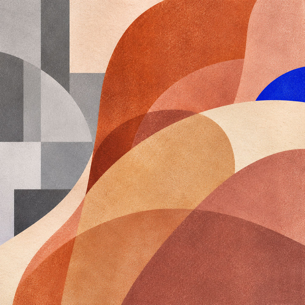
Episode 3 Hero Cover: Tactile mineral earths—Clay (Coloro 014-60-13), Sandstone, and Rose-Brown—replacing sterile clinical grey as the foundational neutral system of 2027.
Introduction: The End of Blank
Cast your mind back to every brand refresh, website redesign, and interior scheme you have encountered over the past decade. What colour dominated? Stark white walls. Cool grey brand systems. Clinical minimalist packaging that whispered professionalism but shouted absolutely nothing else. These design staples served their purpose—they felt clean, modern, and universally safe. But here is the thing: safe has become stale.
Welcome to Episode 3 of our comprehensive 2027 colour intelligence series. In Episode 1, we established the foundational tension defining next year's chromatic landscape—the decisive movement away from sterile white space toward a fascinating duality of warm, mineral-based earth tones paired with hyper-saturated electric accents. Episode 2 took us deep into Luminous Blue (Coloro 125-28-38), the official Colour of the Year 2027, exploring how this authoritative shade communicates confidence without aggression across every creative discipline.
But whilst Luminous Blue provides direction and punch, it demands an earthy counterweight to feel truly inhabitable. Bold colour needs a foundation—and that foundation is shifting dramatically from cold to warm.
Today, we are diving into Coloro's Clay (014-60-13) and the broader movement toward warm, earthy neutrals that are actively replacing clinical whites and cool greys across design disciplines. This is not merely an aesthetic preference shift; it reflects a deeper cultural yearning for warmth, authenticity, and visible material character. By the time you finish reading, you will understand precisely why warm neutrals are claiming territory from their cooler counterparts, and you will have actionable strategies for applying this shift across branding, digital interfaces, photography, and spatial design.
 🔍 PLATE 01 — CLICK TO EXPAND
The End of Blank — Leaving Sterile #FFFFFF and Cool Greys Behind: Plate 01 (Introduction — The End of Blank): Why blank white and cool corporate grey no longer read as neutral—they read as emotionally vacant.
The Anti-Blank Movement: Understanding the Cultural Shift
Why Clinical Minimalism Lost Its Appeal
Stark white and cool grey became default choices during the 2010s for good reason. They projected cleanliness, professionalism, and modernity. They felt universally safe—unlikely to offend, easy to approve in committee meetings, and simple to replicate across touchpoints. The problem? Overuse created visual homogeneity so complete that every brand, every website, and every interior began to look interchangeable.
Scroll through any design portfolio from that era and you will notice the same aesthetic repeated endlessly: white backgrounds, grey typography, perhaps a single accent colour fighting for attention. This approach stripped surfaces of personality, removed evidence of human touch, and created environments that felt more like operating theatres than spaces people actually wanted to inhabit.
The Post-Pandemic Demand for Warmth
After extended periods of digital isolation, something fundamental shifted in how people respond to designed environments. Surfaces that show no evidence of human touch—no brushstrokes, no texture, no variation—began feeling cold rather than clean. People started craving spaces and objects that feel warm and inhabited, that suggest someone actually made them rather than merely outputting them from a template.
This is where the concept of material honesty enters the conversation. Surfaces that reveal their construction, age gracefully, and show character communicate something fundamentally different from those that hide their origins behind perfect uniformity. A limewashed wall tells a story. A terracotta tile shows evidence of firing. An unglazed ceramic cup reveals fingerprints. These are not flaws—they are features.
The Shift to Tactile Warmth
Warm neutrals communicate touch before you physically interact with them. Pink-undertoned earth tones like Clay feel inherently more human than blue-undertoned greys because they reference skin, fired earth, and handcraft rather than industrial materials and digital screens. The appeal of imperfection—visible brushstrokes, natural variation, evidence of process—signals authenticity in ways that clinical perfection simply cannot.
Why are cool greys suddenly feeling dated? Cool greys reference industrial materials and digital screens. Warm neutrals reference natural materials, craft traditions, and embodied experiences. The cultural moment decisively favours the latter.
 🔍 PLATE 02 — CLICK TO EXPAND
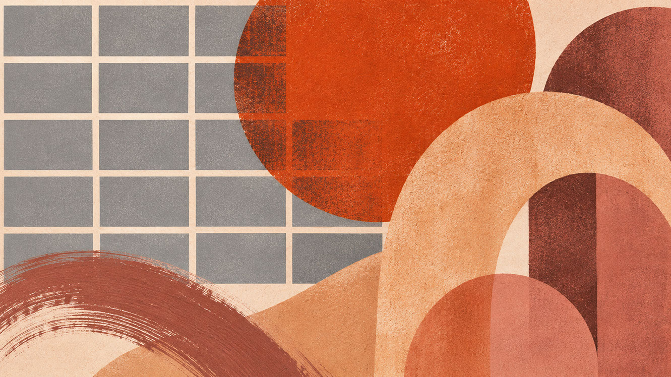
Plate 02 — The Anti-Blank Movement — The Cultural Shift Toward Tactile Mineral Warmth: Plate 02 (The Anti-Blank Movement): How screen fatigue and synthetic imagery have fuelled consumer demand for warm, grounded, earthen base palettes.
The Warm Earth Palette: Colours That Ground Bold Design
Introducing Coloro's Clay (014-60-13)
Coloro's Clay (014-60-13) functions as a warm, pink-toned earthy neutral with surprisingly versatile cooling properties. WGSN and Coloro positioned this specific shade as a key working neutral for 2027 because it bridges multiple applications effortlessly. It works beautifully as a background colour, a packaging surface, an interior wall treatment, and a fashion textile.
The pink undertone distinguishes Clay from muddier browns or ochres. It reads as warm without veering into orange territory, sophisticated without feeling cold. This balance makes it an ideal foundation for the saturated accents (Luminous Blue, Energy Orange) we explored in previous and forthcoming episodes.
The Supporting Earth Tones
Clay does not work alone. A complete 2027 warm neutral palette includes:
1. Clay (Coloro 014-60-13) — The anchor neutral with warming pink undertones, suitable for large surface areas and foundational brand applications.
2. Raw Terracotta — A working earth for warmth and depth, referencing fired clay and Mediterranean architecture. Stronger than Clay, ideal for accents within the warm neutral family.
3. Sandstone — A working mineral for lighter applications, suggesting natural stone and desert landscapes. Excellent for packaging and digital backgrounds where Clay might feel too saturated.
4. Rose-Brown — A working depth colour for sophisticated contrast, bridging pink and brown territories. Perfect for typography, borders, and detail work.
5. Chalk — A working light neutral for breathing space, softer than stark white. Replaces pure white in applications where warmth matters.
How These Colours Work Together
The beauty of this palette lies in layering. Rather than relying on a single feature colour against stark white, you build warmth through gradation. Each tone references natural materials that age gracefully. Together, they create foundations that make bold accent colours feel grounded rather than jarring. Luminous Blue against chalk and clay feels intentional; Luminous Blue against clinical white feels arbitrary.
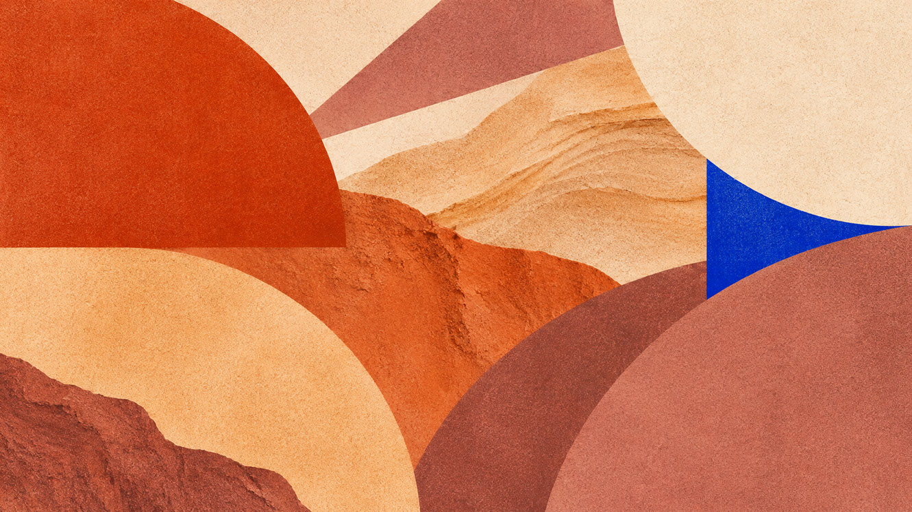 🔍 PLATE 03 — CLICK TO EXPAND
Plate 03 — The Warm Earth Palette — Coloro Clay (014-60-13), Sandstone, Rose-Brown & Bone: Plate 03 (The Warm Earth Palette): The complete 2027 warm-neutral specification system designed to harmonize with both subtle heritage tones and electric accents.
Discipline Applications: Branding and Graphic Design
Replacing Stark White in Packaging
The shift from bleached white boxes to chalk, sandstone, or clay-toned packaging is not merely aesthetic—it signals quality and environmental consciousness. Unbleached and warm-toned packaging suggests thoughtfulness about materials and production processes. This approach works particularly well for food and beverage, beauty, lifestyle products, and stationery brands seeking to communicate craft and care.
Building Warm-Neutral Brand Systems
Creating visual identities that use clay or sandstone as the primary background colour fundamentally changes how everything else reads. Pair warm neutrals with a single bold accent—Luminous Blue or deep Olive—for clear hierarchy. Warm backgrounds make typography feel more approachable and less corporate.
When selecting typography colours, avoid overly warm text on warm backgrounds (the result reads muddy). Dark Soil or charcoal tones work better than pure black for accessible, warm-feeling type that maintains sufficient contrast.
Paper Stock Selection
Material choices reinforce palette intentions. Uncoated, recycled, and naturally toned papers reproduce earth tones accurately, whilst coated bright white papers fight against warm palette intentions. Consider cotton papers, kraft stocks, and papers with visible fibre for print collateral that embodies the tactile neutral philosophy.
 🔍 PLATE 04 — CLICK TO EXPAND
Plate 04 — Branding & Graphic Design — Replacing Stark White With Uncoated Clay & Sandstone Stocks: Plate 04 (Branding & Graphic Design): Letting dyed-in-the-pulp clay, sandstone, and cotton papers carry warmth and tactile credibility before a single drop of ink is applied.
Discipline Applications: UI and Digital Interfaces
Creating Cosy Digital Experiences
Moving beyond stark white backgrounds in apps and websites requires subtlety. Use warm off-whites (chalk, sandstone tints) as default backgrounds. Users perceive warm-toned interfaces as more welcoming and less clinical—a meaningful distinction when screen fatigue affects nearly everyone.
Maintaining Readability
Warm backgrounds require careful contrast management. Ensure sufficient contrast ratios (WCAG 2.2 recommends 4.5:1 for body text). Use Dark Soil or charcoal for primary text rather than pure black. Reserve pure white for interactive highlights or focus states where you need maximum differentiation.
Will warm backgrounds make interfaces feel dated or unprofessional? Execution matters more than temperature. Clean typography, generous whitespace, and functional clarity work regardless of whether the background is warm or cool. Users are increasingly receptive to warmer digital environments—the clinical aesthetic is what feels dated now.
 🔍 PLATE 05 — CLICK TO EXPAND
Plate 05 — UI & Digital Interfaces — Paper-Inspired Bone, Sandstone & Rose-Brown Screen Layouts: Plate 05 (UI & Digital Interfaces): Replacing harsh #FFFFFF screen backgrounds with warm mineral Bone and Sandstone tokens to reduce eye strain and elevate digital editorial calm.
Discipline Applications: Photography and Art Direction
Styling Clay, Timber, Linen, and Skin Together
Building sets that layer natural materials in related warm tones creates compelling tonal photography where everything exists within a narrow colour range. Skin tones naturally harmonise with clay, sandstone, and rose-brown, making portrait and lifestyle photography feel cohesive and intentional.
Low-Gloss Image Language
Matte surfaces photograph differently from glossy ones. Embracing texture over reflection—unglazed ceramics, natural stone, linen textiles—creates images that feel more intimate and tactile. This approach photographs better with warm-toned or natural lighting; cool-toned lighting fights the palette and creates muddy results.
Propping Strategies
Source authentic materials wherever possible. Actual terracotta, real stone, and genuine linen photograph better than synthetic approximations. The camera detects authenticity in ways that are difficult to articulate but impossible to ignore. Building a props library of earth-toned basics pays dividends across multiple projects.
 🔍 PLATE 06 — CLICK TO EXPAND
Plate 06 — Photography & Art Direction — Styling Clay, Timber, Linen & Warm Skin Tones: Plate 06 (Photography & Art Direction): Low-gloss photographic art direction where clay, sandstone, and rose-brown backdrops flatter human skin tones and natural textures.
Discipline Applications: Spatial and Product Design
Specifying Surfaces
Limewash: Breathable, matte paint finish with natural variation and visible brushwork. Each wall becomes unique.
Terracotta tile: Unglazed, warm-toned flooring with inherent imperfection. Shows wear beautifully rather than catastrophically.
Plaster: Hand-applied wall finishes that show craft and age gracefully. The antithesis of perfect drywall.
Cork: Sustainable, warm, and tactile surface material for walls, floors, and product details.
Matte Painted Surfaces
Matte finishes feel more tactile than gloss. Chalky paint formulations create particular visual quality that reads as honest and handmade. Maintenance differs from gloss surfaces—matte shows touch differently—but these surfaces also hide minor wear better and age more gracefully. The aesthetic embraces evidence of use rather than fighting it.
Combining Earth Tones with Other Palette Elements
Use Luminous Blue or Meadowland Green as accent colours against clay walls. Follow proportion guidelines: earth tones as the dominant 60-70%, accent colours as 10-20%. Avoid themed interiors by mixing warm neutrals with contemporary furniture and unexpected accents. The goal is sophisticated warmth, not rustic nostalgia.
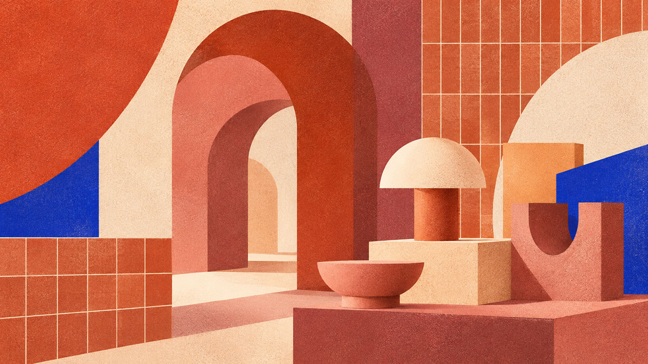 🔍 PLATE 07 — CLICK TO EXPAND
Plate 07 — Spatial & Product Design — Limewashed Clay Walls, Travertine & Matte Ceramic Industrial Design: Plate 07 (Spatial & Product Design): Specifying matte mineral paints, rammed earth, and honed sandstone to build cocooning residential and hospitality environments.
Material Partnerships: Substrates That Reinforce Warm Neutrals
The physical materials you specify either reinforce or undermine your colour intentions:
Unglazed Ceramic: Natural variation in colour, matte surface, shows fingerprints and touch. Applications include tableware, tiles, decorative objects, and packaging vessels.
Natural Stone: Limestone, sandstone, travertine—materials with inherent warmth that feel grounded and permanent.
Linen and Natural Textiles: Breathable, textured, available in natural warm tones. Applications span packaging wraps, retail interiors, and brand collateral.
Cork: Sustainable, warm, tactile. Works for packaging inserts, wall surfaces, and product details.
Chalky Paint Finishes: Formulations that create matte, powdery surfaces complement the warm neutral palette across spatial applications.
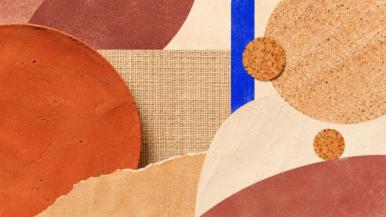 🔍 PLATE 08 — CLICK TO EXPAND
Plate 08 — Material Partnerships — Uncoated Cotton Rag, Unglazed Stoneware, Cork & Raw Timber: Plate 08 (Material Partnerships): Physical substrates whose inherent mineral and plant fibres naturally embody the 2027 warm-neutral spectrum.
Conclusion: Building Your Warm Foundation
The rejection of clinical minimalism reflects genuine cultural desire for warmth, touch, and authenticity. Coloro's Clay (014-60-13) represents a broader movement toward pink-toned, earthy neutrals that communicate human presence rather than corporate anonymity. These colours work across branding, digital interfaces, photography, and spatial design because they reference universal human experiences: warmth, shelter, craft, and care.
Material partnerships matter as much as colour selection. Unglazed ceramic, natural stone, linen, cork, and chalky finishes reinforce the palette's honest character in ways that synthetic materials cannot replicate.
Audit your current neutral palette. Does it feel warm or clinical? Start with one substrate swap—unbleached paper, warm-toned digital background—and observe the difference. The shift from cold to warm neutrals is not merely aesthetic; it is communicative. And in 2027, warmth communicates exactly what audiences want to hear.
 🔍 PLATE 09 — CLICK TO EXPAND
Plate 09 — Conclusion — Building Your 2027 Warm Mineral Foundation Across Every Touchpoint: Plate 09 (Conclusion — Building Your Warm Foundation): Replacing clinical grey with clay, sandstone, and rose-brown transforms the neutral 60% of your palette into an active asset.
⚡ 5 Strategies to Consider
STUDIO PLAYBOOK // 5 DIRECTIVES❓ Frequently Asked Questions — 5 Q&As (5 Q&As)
SCHEMA.ORG/FAQPAGE // 5 Q&As (5 Q&As)Q1. Why are cool greys suddenly feeling dated in contemporary design?
Cool greys reference industrial materials and digital screens, associations that feel clinical and impersonal after years of overuse. Warm neutrals reference natural materials, craft traditions, and embodied human experiences. The cultural moment favours authenticity and touch over sterile perfection, making cool greys read as corporate relics rather than sophisticated choices.
Q2. Can earth tones work for modern, contemporary brands without feeling rustic?
Absolutely. Contemporaneity comes from application and context, not from avoiding warmth. Earth tones paired with bold typography, clean layouts, generous whitespace, and strategic saturated accents feel current rather than nostalgic. The key is sophisticated execution—clay backgrounds with Luminous Blue accents read as modern, not farmhouse.
Q3. How do I transition an existing brand from cool grey to warm neutrals?
Start with secondary materials such as packaging inserts, social media backgrounds, and internal documents before committing to primary identity elements. Test audience response across these touchpoints. This phased approach allows you to gauge reception and refine your warm neutral palette before a full brand rollout.
Q4. What accent colours work best with warm earth tones?
Luminous Blue provides striking contrast and contemporary authority against clay and sandstone backgrounds. Meadowland Green creates natural, tonal harmony that feels biophilic. Energy Orange amplifies warmth for playful, high-energy applications. Each accent brings different character whilst grounding beautifully against warm neutrals.
Q5. Will warm backgrounds make digital interfaces feel unprofessional?
Not when executed properly. Clean typography, generous whitespace, and functional clarity work regardless of background temperature. Users are increasingly receptive to warmer digital environments—the clinical stark white aesthetic is what feels dated now. Ensure WCAG 2.2 contrast compliance (4.5:1 for body text) and use charcoal rather than pure black for text.
EXPLORE RELATED STUDIO TAGS (8):
Glad this piece sparked something — want the matching 4096×4096px .ZIP pack?
Enter your email below for an instant direct download of Studio Seamless Pattern Pack — Drop 01 (WPAY_DROP01.zip) plus new Studio Journal essays & free drops.